Mentoring can be a great way to share knowledge and help someone be successful in their personal or professional life. But many potential mentors are often too busy to commit to regular meetings, or they have a hard time connecting with people seeking help.
Design an experience where prospective mentors and mentees can be matched, based on similar interests, location, and availability. Show your process and how you arrived at your solution.
Google Design Challenge – Mentor Connection
Overview
In this design exercise, I'll take you through my process and a sufficiently in-depth look at my reasoning behind the decisions I made.
I found that many existing solutions attempt to match mentors and mentees. Even if the best possible match was made, there are several factors that inhibit a mentor–mentee relationship.
In my solution, I attempt to solve the problem of matching mentors for mentees. I also discovered that the actual problem lies in establishing a relationship between the two.
Design Process

My approach started with research to uncover the root cause. In brainstorming, I distilled findings into actionable design goals, then used those goals to map the user journey and create initial rough sketches. In the design phase, I iterated over the journey and designs, building wireframes and high-fidelity. Finally, in the evaluation phase, I reflected on design decisions, noted assumptions, and identified ways to improve.
Research

Mentoring is typically a gradual relationship established between a mentor and a mentee. It isn't like "I have a crisis and I immediately need help" — better suited options for the latter would include chat rooms or forums.
Understanding the Problem
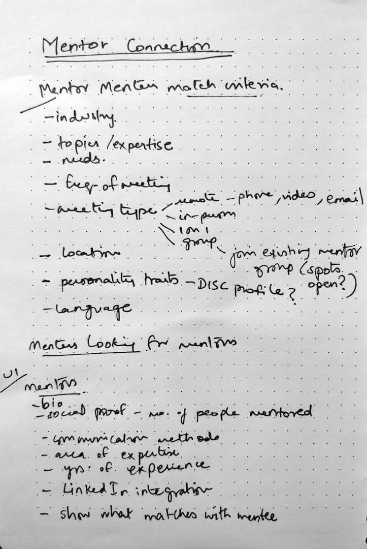
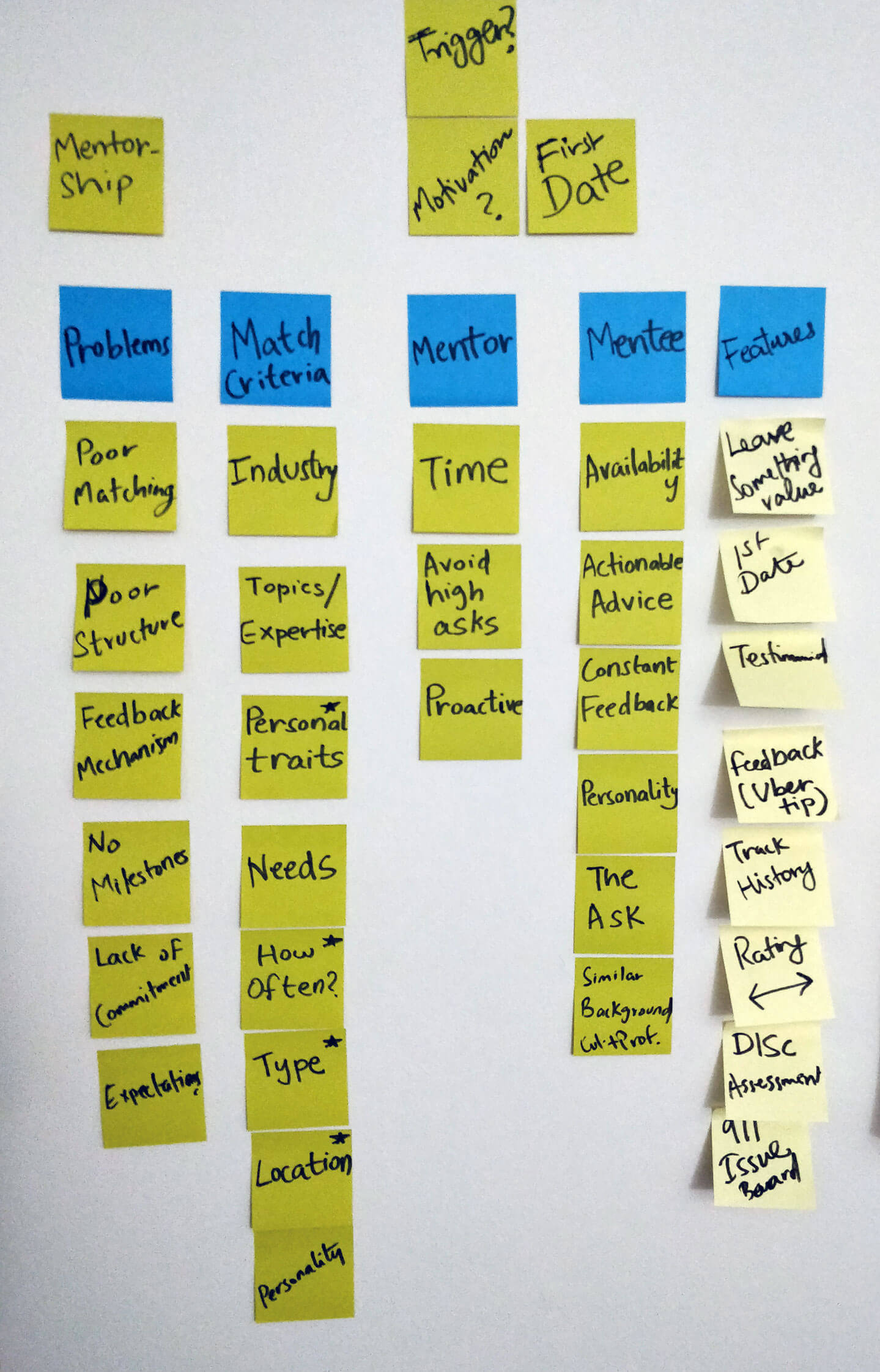
Many existing solutions attempt to match mentors and mentees. Competitive analysis showed how they onboard users. But after a successful match, for it to have value, the mentor and mentee must foster a meaningful relationship — that defines successful mentoring. This repeatedly came up as a complaint with existing solutions.
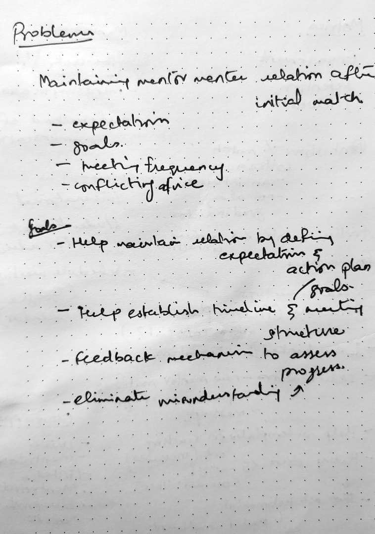
Matching is only part of the problem. What happens after the match is the real issue. The root causes that inhibit their relationship:
- unclear needs
- misunderstanding expectations from each other
- keeping track of feedback and acknowledging progress
- not being respectful of time
If this were analogous to lead generation: the focus is on capturing leads but not retaining them. The underlying issue is the lack of a framework that helps lay a foundation for the relationship. Without this, both parties could fall out quickly.
Putting thoughts quickly down into notes
Mentors
Typically senior in their respective professions carrying years of experience. They seek other avenues of growth and wish to make an impact. Mentoring provides recognition and impact. However, they don't always have enough time or flexibility, and can be selective about who they mentor.
Mentees
Young and early in their careers. They need advice on how to navigate and progress personally and professionally. They want to speak to someone who inspires them — someone who shares their career trajectory and who they aspire to be like.
Brainstorm

After research, I interpreted the data and distilled findings into design goals. Understanding the needs of impact (mentor) and support (mentee) helped shape the solution.
Approach
The app can be experienced from both mentor and mentee perspectives. For this exercise, I chose to design the mentee's perspective.
The attributes of an ideal mentor for a mentee include:
- having expert knowledge in their domain
- being accessible in terms of time
- using a preferred mode of communication
- having a similar education and career path
Goals
How might we help people find inspiring mentors to establish a meaningful relationship with them?
- Help find an inspiring mentor who shares similarities
- Clarify the needs and expectations of both parties
- Reduce miscommunication by encouraging and improving feedback
Ideation

With the previous phases complete, I sought to materialise what the journey would look like for mentees.
Initial user journey idea
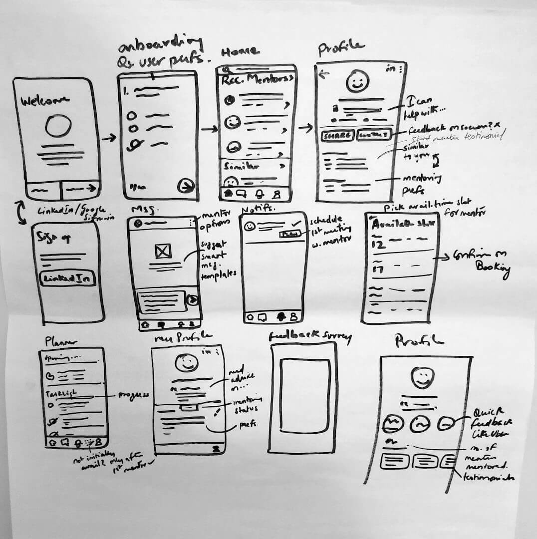
Initial rough sketch of app
Design

With screens defined and the journey mapped, I wanted to better visualise the user journey and build the wireframes. I designed from a mentee's perspective, but kept it flexible enough to accommodate the mentor's experience too.
Journey Maps
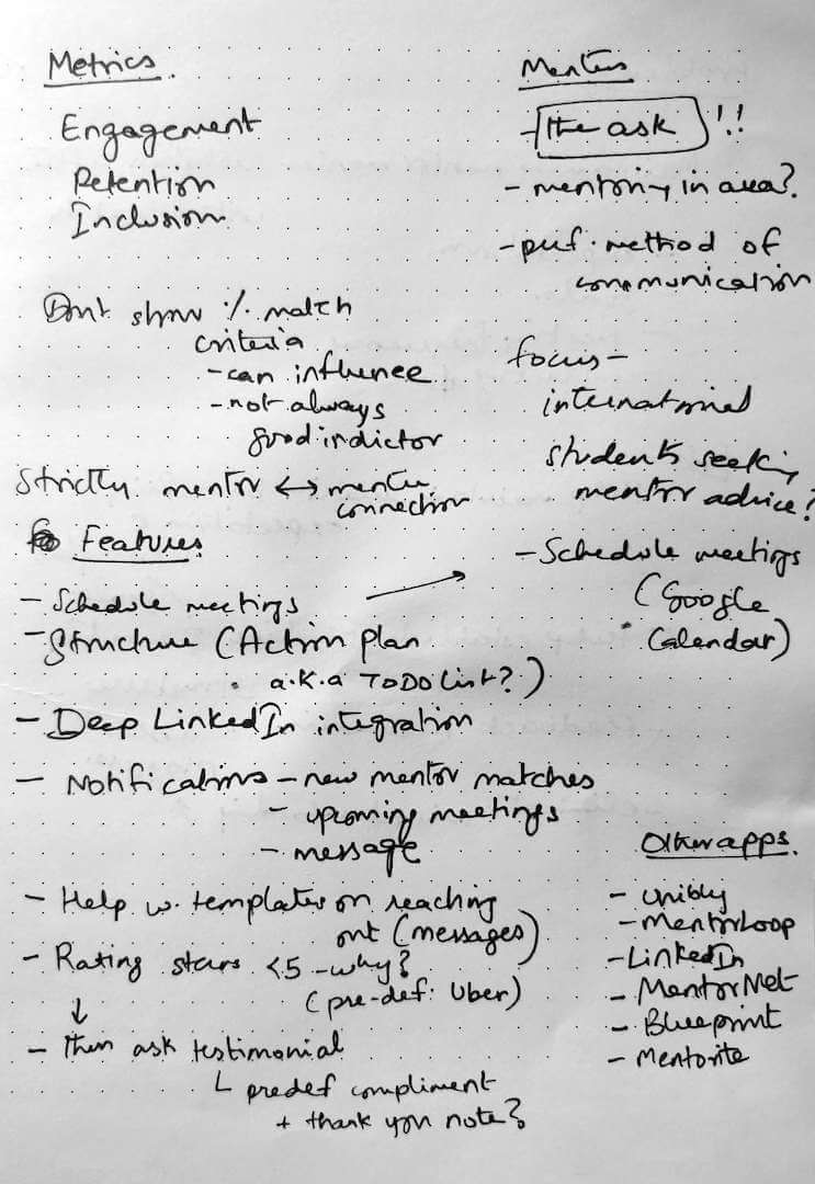
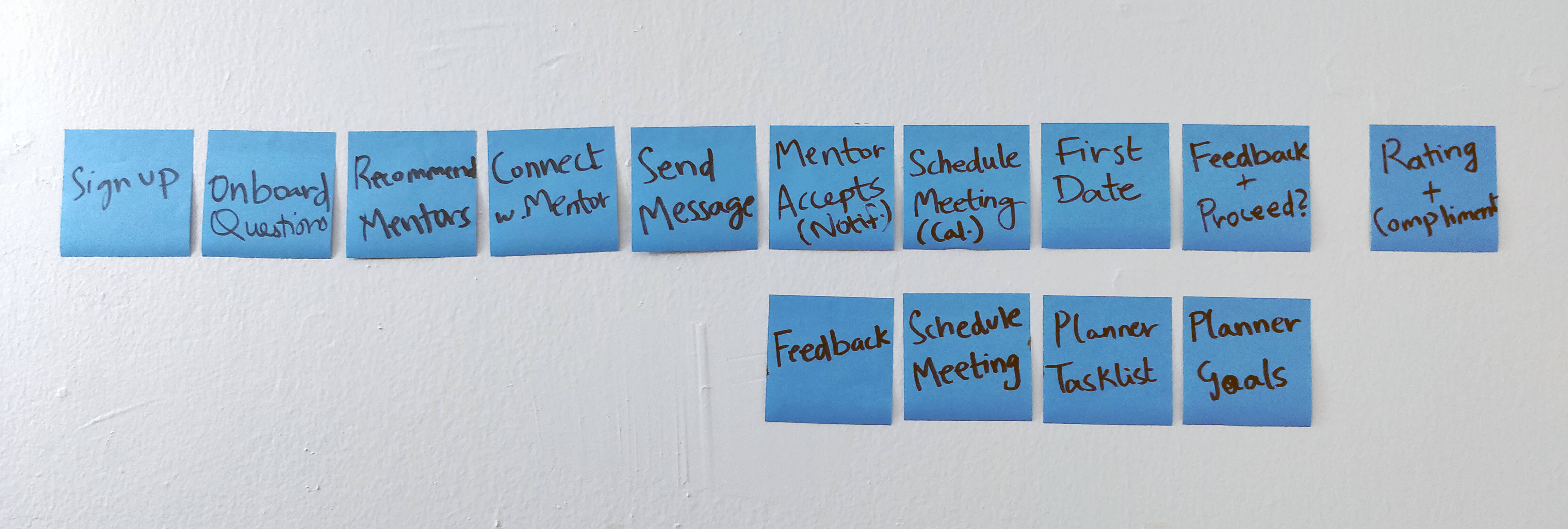
The user journeys focus on two key flows:
- Onboarding — from sign up to finding your first mentor and scheduling a meeting
- Feedback — rating your mentor and setting up future meetings
Flow 1 — Onboarding flow: from sign up to finding your first mentor and scheduling a meeting
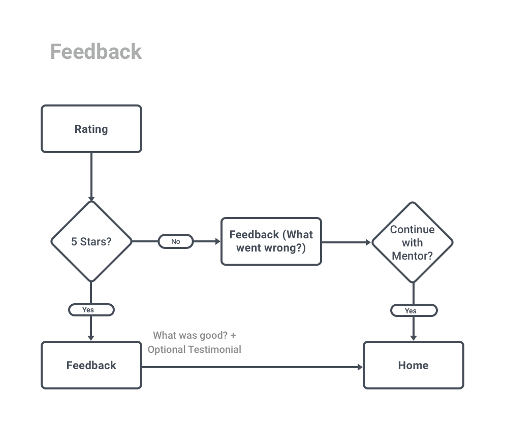
Flow 2 — Rating and feedback flow after meetings
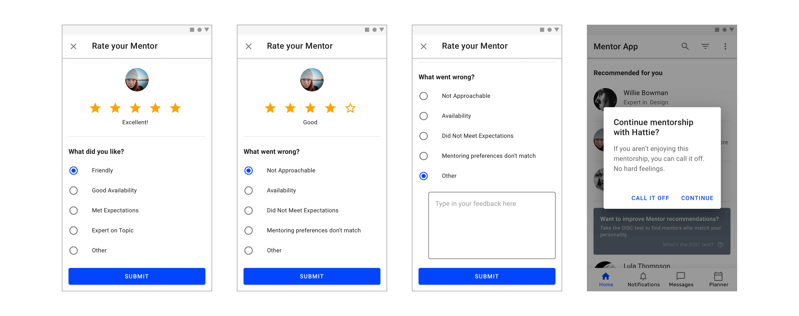
If a mentee rates a mentor below 5 stars, they must specify why. After the first meeting, if the mentee gives a less-than-5-star rating, they are given the choice of continuing or stopping the mentorship.
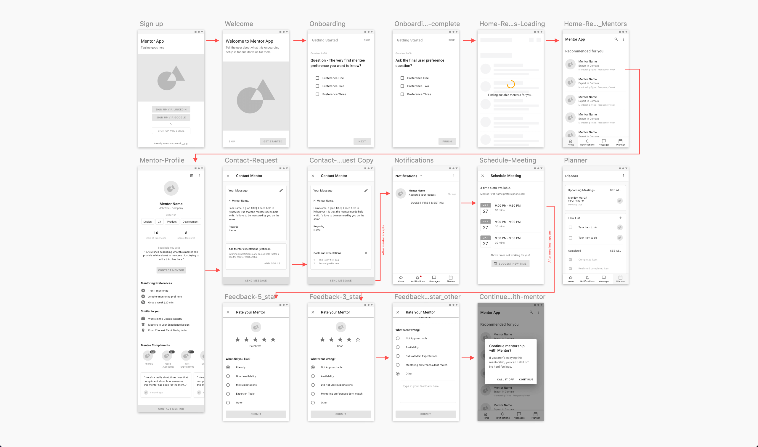
Sketch wireframes demonstrating the simplified user journey from onboarding to feedback
I opted for a Bottom Navigation since there weren't many top-level screens. The Planner screen allows mentees to keep track of upcoming meetings and associated tasks.
High-Fidelity Designs
I prefer a single primary color, using color when needed to guide the eye to important parts of the UI.
Onboarding
The onboarding addresses goals 1 and 2. It starts by encouraging mentees to sign in via LinkedIn — allowing the app to learn about their background and reduce onboarding length.
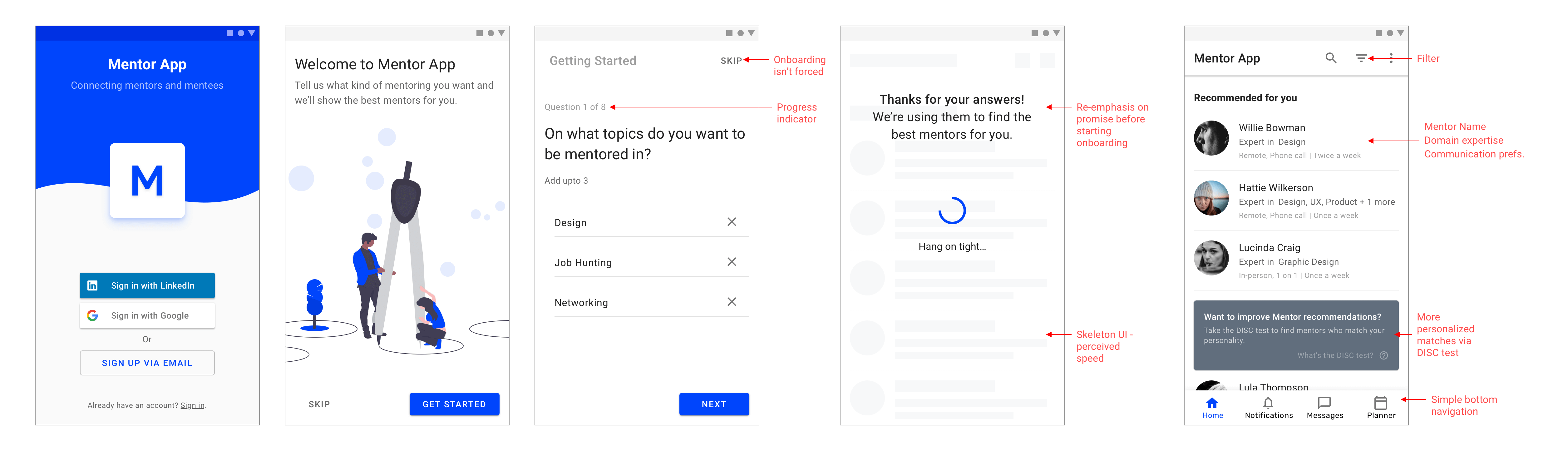
Onboarding from sign up to personalised recommendations
A loading screen between the survey and recommendations helps deliver on the promise of personalisation. A skeleton screen further improves perceived speed.
Deeper Personalisation with DISC
The DISC assessment provides a tested way of determining personality types. Prompting users to take this test at a later point provides an opportunity for more personalised mentor recommendations. If users skip onboarding, a Banner re-engages them.
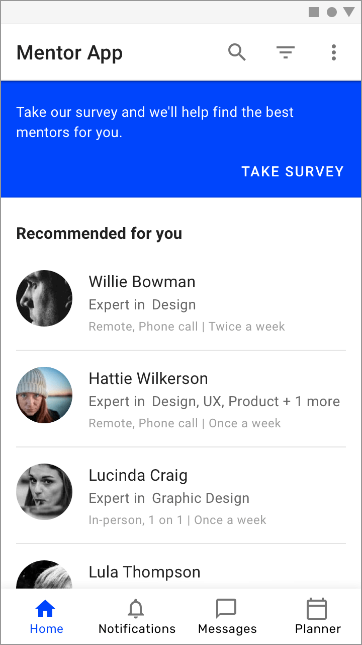
Asking users to take the skipped onboarding survey
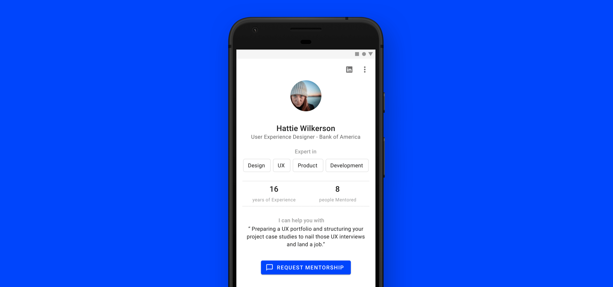
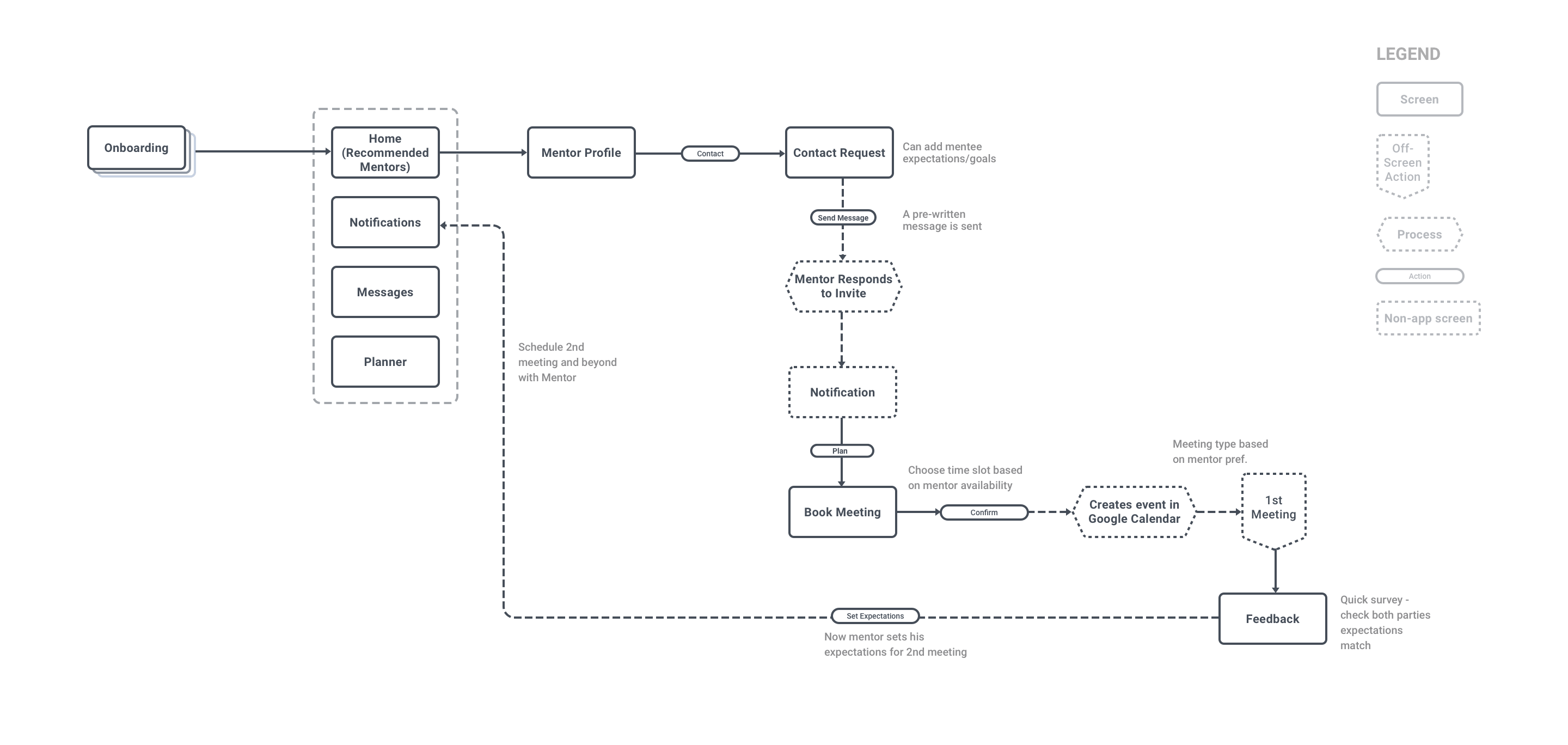
Mentor Profile
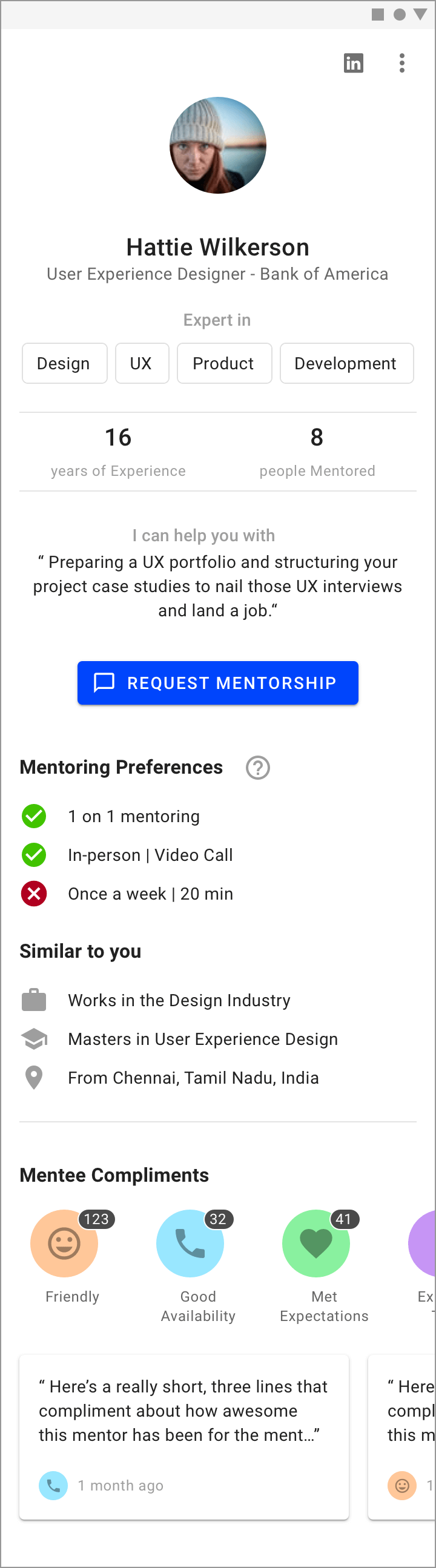
All essential information is above the fold: expertise, experience, and a prominent CTA. Each mentor indicates what they can help with ("I can help you with…"). The LinkedIn icon allows deeper exploration of professional history.
Mentor preferences are outlined with checks and crosses indicating a match with the mentee's preferences set during onboarding (goal #2). The "Similar to you" section highlights anything similar between mentor and mentee to make it personal (goal #1).
Requesting Mentorship
A structured way to greet a mentor increases the mentee's chances of being accepted. "Your Message" is pre-constructed based on onboarding answers.
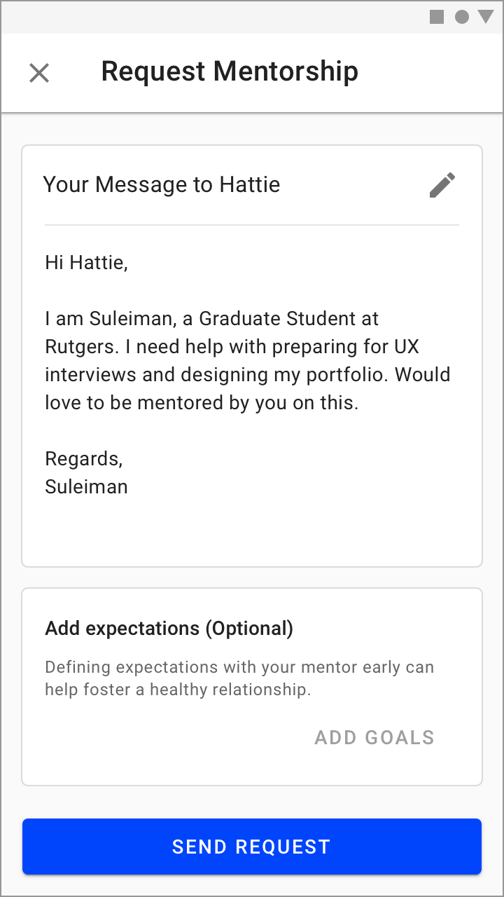
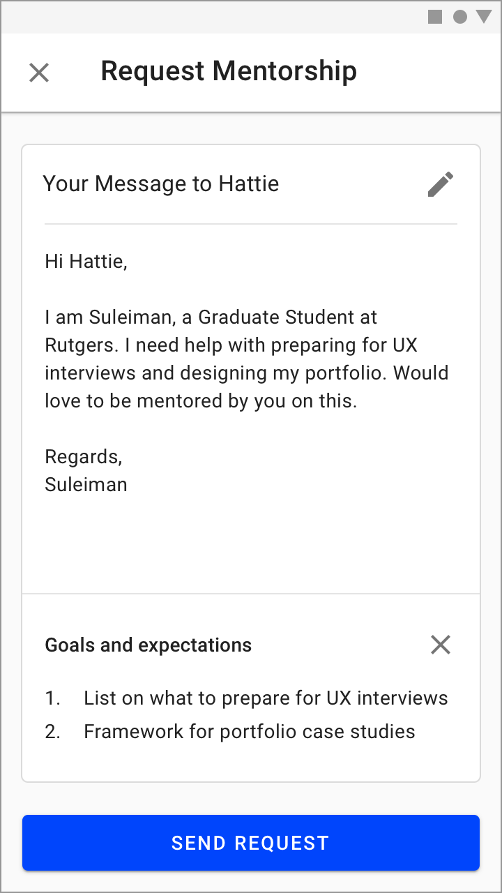
Mentees indicate "I need help with…" on their profile, clearly conveying their needs and addressing goal #3. They can also add their expectations or goals to increase the likelihood of acceptance.
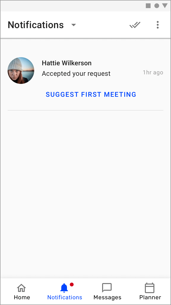
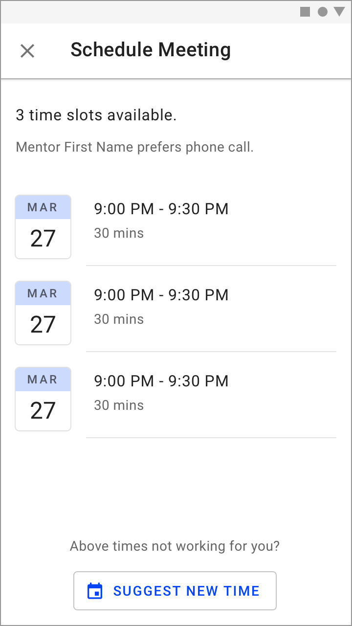
Schedule First Meeting
Once the mentor accepts, the mentee receives a notification to schedule their first meeting, picking from the mentor's available time slots (respecting their time — goal #2).
Rating System and Feedback
Feedback kicks in right after the first meeting, helping both sides evaluate fit (goal #3). Inspired by Uber's rating mechanism, mentees must leave a testimonial along with a star rating. A below-5-star rating prompts the mentee to specify what went wrong, and after the first meeting they can choose to continue or stop the mentorship.
Evaluate

Second Meeting and Beyond
Matching is only part of the problem. The real value lies in establishing a relationship. Scheduling, calendar integrations, and the Planner all help facilitate this without being too rigid. After each meeting, feedback from both parties helps evaluate and improve.
Future Possibilities
Google Assistant integration with the Planner would be powerful — taking a mentor call on your TV, or updating a task via Google Home on the go.
Limited Prototype
Play around with the limited prototype on Sketch Cloud. All design files are available on Google Drive.