Material Design Snackbar in Android – How and When to Use
Snackbar was introduced in Material Design. It is available via the Design Support Library. Code-wise, it is similar to a Toast.
In this article, we’ll first clear the confusion around using Snackbar and Toast. Next, we’ll look at implementation and customizing.
But before that, let’s clarify what exactly a Snackbar is.
Already know what it is? Jump straight to the code.
What is Snackbar?
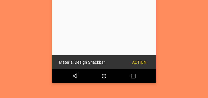
A lightweight component that gives feedback to users. It optionally provides an action to users.
Behavior
Snackbars are displayed at the bottom of the screen. It stays there for the specified interval. Or, you can dismiss it by swiping.
However, there arises a confusion with our ‘ol pal, the Toast.
Snackbar VS Toast Confusion
The addition of a Snackbar created ambiguity. When do we use it and when to use Toast?
Its important that we know what to use when. So before moving on to actual code implementation, let’s clear the confusion.
The Difference
Snackbar
Contain a single line of text directly related to the operation performed. They may contain a text action, but no icons.
- Lightweight feedback about an operation
- Optionally includes a single action
- Can optionally stay on-screen permanently, until swiped off screen
Toast

Primarily used for system messaging. They also display at the bottom of the screen, but may not be swiped off-screen.
- System-level messaging
- No user action can be performed
- Can only stay on screen temporarily. Cannot be swiped
Moving forward
Now that we’re clear about difference between the two, we can start implementing.
First, we’ll look at using a simple usage, right off the bat. Next I’ll tell you how to include a primary action. Then we’ll learn how to style it. Finally, we’ll go over its do’s and don’ts.
Usage
Displaying is relatively simple. In fact, it is similar to how you would write a Toast. We use the class android.support.design.widget.Snackbar .
Snackbar
    .make(view, "Your message here",
                Snackbar.LENGTH_SHORT)
    .show();
The view (1st parameter) doesn’t have to be your parent layout. It can be any View.
TIP
Ideally, Snackbar works best if your parent layout is a CoordinatorLayout. This ensures that it plays nice with other UI elements (such as FAB). More on that later.
Next, the duration for displaying (3rd parameter), can be any of the following:
- LENGTH_INDEFINITE
- LENGTH_LONG
- LENGTH_SHORT
I hope the duration types above are self-explanatory.
LENGTH_INDEFINITE will show the Snackbar for and indefinite period of time. But you can dismiss it by swiping.
Finally, don’t forget to call Snackbar.show() .
NOTE
For Snackbar to work, your Activity must inherit from (extend) AppCompatActivity. Otherwise, consider a third-party alternative.
Adding a Primary Action
As stated in the Material Design spec, we can optionally include an action.
Adding a user action is relatively simple. Simply modify your existing call as follows.
Snackbar
.make(view, "Your message here",
Snackbar.LENGTH_SHORT)
.setAction("YourAction", new View.OnClickListener() {
@Override
public void onClick(View v) {
// TODO: Your Action
}
});
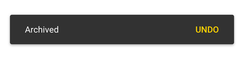
.show()Ideal use-cases for a primary action include:
- UNDO – for deleted message, archive, etc
- CONNECT – to enable internet if disconnected
- RETRY – an action that failed (e.g. API call)
NOTE
Do not include an action for DISMISS. This is of no use. Just auto-dismiss your Snackbar by setting a short duration. Or it can simply be swiped away.
Styling
The Snackbar class follows the Builder pattern which allows for easy styling.
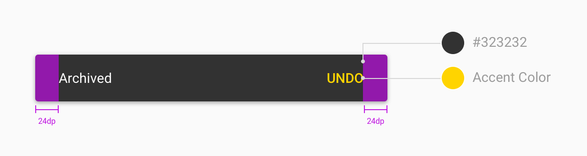
Action Text color
snackbar.setActionTextColor(
      ContextCompat.getColor(
          context, R.color.yourColor)
      );
To style properties such as text colors, you’ll have to fetch the View first.
View snackbarView = snackbar.getView();Then get the TextView from it.
TextView textView = (TextView) snackbarView.findViewById(
       android.support.design.R.id.snackbar_text);

// For multi-line text, limit max line count.
textView.setMaxLines(3);

 // Snackbar text color (not action button)
 textView.setTextColor(yourColor);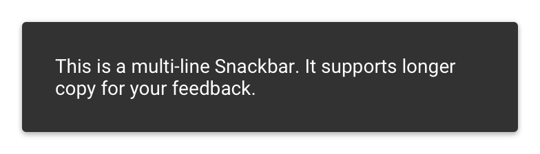
Background color
First, you’ll need a reference. Then apply all your style properties and finally call snackbar.show().
snackbarView.setBackgroundColor(yourColor);Playing nice with Floating Action Button
Have you seen this behavior before?
The FAB translates up, giving space for the Snackbar to rise from the bottom.
This is the ideal, recommended behavior. Because the last thing we want is the FAB overlap!
So to avoid that, just keep one thing in mind.
Your parent layout (root layout) must be a CoordinatorLayout. It ensures that the correct Behavior is applied to its child Views. In other words, it ensures that UI elements ‘behave’ or ‘coordinate’ correctly.
Here’s an example of how such an XML layout would look like.
<androidx.coordinatorlayout.widget.CoordinatorLayout
        android:layout_width="match_parent"
        android:layout_height="match_parent">

    <com.google.android.material.floatingactionbutton.FloatingActionButton
            android:layout_width="wrap_content"
            android:layout_height="wrap_content"
            android:layout_gravity="end|bottom"
            android:src="@drawable/ic_your_icon"/>

</androidx.coordinatorlayout.widget.CoordinatorLayout>
Creating a Custom Layout
With v25.1.0 of Android Design Support Library, creating a custom layout is now possible.
That’s right, I’m talking about creating an XML layout of your own.
We can do this in 4 simple steps.
1. Create XML layout
Now I’m going to leave this to you. Let loose your imagination!
As for me, I’ll just roll in a simple layout this time.
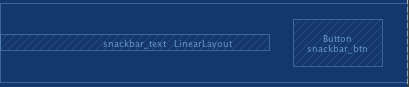
<LinearLayout xmlns:android="http://schemas.android.com/apk/res/android"
              xmlns:tools="http://schemas.android.com/tools"
              android:layout_width="match_parent"
              android:layout_height="wrap_content"
              android:background="#efefef"
              android:gravity="center_vertical"
              android:orientation="horizontal"
              android:paddingBottom="16dp"
              android:paddingTop="16dp">

    <TextView
        android:id="@+id/snackbar_text"
        android:layout_width="0dp"
        android:layout_height="wrap_content"
        android:layout_weight="75"
        android:ellipsize="end"
        android:maxLines="3"
        android:paddingLeft="16dp"
        android:paddingRight="16dp"
        android:textAppearance="@style/TextAppearance.Design.Snackbar.Message"
        tools:text="This is a custom Snackbar text"/>

    <Button
        android:id="@+id/snackbar_btn"
        style="@style/Widget.AppCompat.Button.Borderless"
        android:layout_width="0dp"
        android:layout_height="wrap_content"
        android:layout_marginEnd="24dp"
        android:layout_marginLeft="24dp"
        android:layout_marginRight="24dp"
        android:layout_marginStart="24dp"
        android:layout_weight="25"
        android:text="Action"
        android:textColor="@color/colorAccent"/>

</LinearLayout>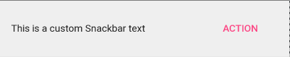
2. Create a Custom class
Create a CustomSnackbar final class that extends BaseTransientBottomBar.
Next, create an inner, static class ContentViewCallback. Implement the BaseTransientBottomBar.ContentViewCallback interface.
public class CustomSnackbar
        extends BaseTransientBottomBar<CustomSnackbar> {

    ...

     private static class ContentViewCallback
            implements BaseTransientBottomBar.ContentViewCallback {

     // view inflated from custom layout
        private View view;

        public ContentViewCallback(View view) {
            this.view = view;
        }

        @Override
        public void animateContentIn(int delay, int duration) {
            // TODO: handle enter animation
        }

        @Override
        public void animateContentOut(int delay, int duration) {
            // TODO: handle exit animation
        }
    }
   ...
}
Now, our main layout is inflated and taken care of. Next is handling the TextView and action Button.
But keep in mind that a typical Snackbar has this. Moreover, since my custom layout has a Text and Button too, I’m adding functionality to it.
So if you don’t have either of those Views, then skip ahead to point 4.
3. Inflate Custom View
Create a static method make(ViewGroup parent, int duration), similar to the original Snackbar.make() method.
Here, we will inflate our custom layout, using the parent ViewGroup.
public static CustomSnackbar make(ViewGroup parent, int duration) {
       // inflate custom layout
       LayoutInflater inflater = LayoutInflater.from(parent.getContext());
       View view = inflater.inflate(R.layout.custom_snackbar, parent, false);

       // create with custom view
       ContentViewCallback callback= new ContentViewCallback(view);
       CustomSnackbar customSnackbar = new CustomSnackbar(parent, view, callback);


       customSnackbar.setDuration(duration);

       return customSnackbar;
   }
4. Display it
Finally, you can display your CustomSnackbar, just like you would with a regular Snackbar.
CustomSnackbar customSnackbar = CustomSnackbar.make(rootView, CustomSnackbar.LENGTH_SHORT);
       customSnackbar.setText("Your message here");
       customSnackbar.setAction("Action", new View.OnClickListener() {
           @Override
           public void onClick(View v) {
               // TODO: handle click here
           }
       });
       customSnackbar.show();
CustomSnackbar.java
Here’s the complete code for the CustomSnackbar class.
public final class CustomSnackbar
        extends BaseTransientBottomBar<CustomSnackbar> {


    protected CustomSnackbar(@NonNull ViewGroup parent, @NonNull View content, @NonNull ContentViewCallback contentViewCallback) {
        super(parent, content, contentViewCallback);
    }

    public static CustomSnackbar make(ViewGroup parent, int duration) {
        // inflate custom layout
        LayoutInflater inflater = LayoutInflater.from(parent.getContext());
        View view = inflater.inflate(R.layout.custom_snackbar, parent, false);

        // create with custom view
        ContentViewCallback callback= new ContentViewCallback(view);
        CustomSnackbar customSnackbar = new CustomSnackbar(parent, view, callback);
        customSnackbar.setDuration(duration);

        return customSnackbar;
    }


    private static class ContentViewCallback
            implements BaseTransientBottomBar.ContentViewCallback {

        // view inflated from custom layout
        private View view;

        public ContentViewCallback(View view) {this.view = view;}

        @Override
        public void animateContentIn(int delay, int duration) {// TODO: handle enter animation}

        @Override
        public void animateContentOut(int delay, int duration) {// TODO: handle exit animation}
    }
}
Do’s and Don’ts
Knowing how to use Snackbar is essential. But knowing when to use it is important as well. So before we call this a wrap, let’s look at some do’s and don’ts.
Do
- keep the text content short
- Allow undoable actions to be undone (delete, archive, etc.)
- display feedback results for user actions
- style it to match your design
Don’t
- include icons
- perform core functionality via the action button
- display multiple instances
- display important system information or errors
- overlap or block the FAB (Floating Action Button)
- animate or reposition
Conclusion
The Snackbar is comparatively a tiny component in the Material Design spec. Hence it is easily prone to misunderstanding and misuse.
Giving users feedback is important. Effectively using it is key to your app.
Quick Recap
First, we clarified the difference between a Snackbar and Toast. Then we even discussed when to use what.
Next, we looked into using a simple implementation and went onto adding actions. From there, we looked into styling and customization options.
Additionally, we saw that even a custom layout can be used. Finally, we reinforced key guidelines.
Where to from here?
This is just one of the many new additions to Material Design.
The Design Support Library is making life easy for Android Developers to use Material Design. Are you using it?
Recommended Read:
I hope this article instilled a complete understanding about Snackbar.
Lastly, I’d like to hear your thoughts. Have anything to add to this? Or have I missed out anything? Drop ‘em in the comments below.
If you liked reading this article, share it on social media!


Awesome . Tank you Bro
keep strongly Man
Hi, I wonder if I can include maps activity/fragment in a snackbar. I need this to start action for google maps fragment where I display nearby sights.