Parallax Scrolling Tabs with Android Design Support Library

Material Design has seen the rise in on-scroll animations in Android apps.
Certain designs include a parallax scroll effect with a header images, along with Tabs. In this post, we’ll look at just that.
Parallax scrolling is a popular pattern. Previously we’ve seen such examples with the Flexible Space with Image and Quick Return pattern. In this post, we’ll look at making parallax scrolling Tabs using Android Design Support Library.
Parallax scrolling has been very popular in web design and now in app development as well. I’ve seen quite a few people wanting to implement this and I wanted to provide a solution without using a third party library. So here it is.
Creating Parallax Scrolling on Android is nothing but the Flexible Space with Image pattern, with an added TabLayout.
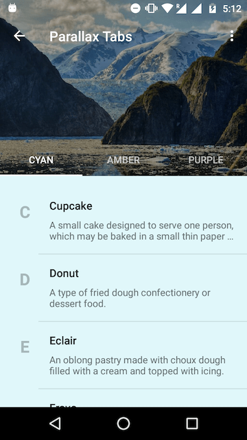
Parallax scrolling Tabs with Header
Parallax Scrolling Tabs in Android
Have you read the android tutorial for creating the Flexible Space with Image Pattern? If you have, then you would immediately recognise that all this needs is a TabLayout. For those who haven’t read it, don’t worry. I’ll walk you through everything in this article.
But wait, hold your horses! I just threw in the TabLayout and this is what I got.
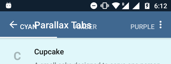
Toolbar and Tabs overlap on collapse
Unlike the typical Material Design Tabs attached to the Toolbar, Tabs here are transparent. Here is the layout. So clearly, the plug and play doesn’t work. It looks like some tweaks are required.
So before I straight away paste the entire code here, let’s look at the layout skeleton.
<android.support.design.widget.CoordinatorLayout>
   <android.support.design.widget.AppBarLayout>

      <android.support.design.widget.CollapsingToolbarLayout>
         <ImageView />
         <android.support.v7.widget.Toolbar />
         <android.support.design.widget.TabLayout />
      </android.support.design.widget.CollapsingToolbarLayout>

   </android.support.design.widget.AppBarLayout>
</android.support.design.widget.CoordinatorLayout>
The CollapsingToolbarLayout is like a super FrameLayout. So take note of the ordering of elements inside. Whatever element you place last, is what appears on the top. This positioning is important to get the parallax scrolling to work.
So now that you have an idea of the layout structure, behold the full XML layout code!
Layout Breakdown
Some of the attributes here make the parallax scroll work. So let me walk you through them.
21. The total height that we want our collapsible header View to have.
25. This is not the Flexible Space with Image pattern. We don’t want the Toolbar title to collapse. We want it fixed. So disable the title.
34. The flag that triggers the parallax effect upon scrolling.
36 – 41 Scrim that makes Tab text more readable against the busy header background.
47. Remember that CollapsingToolbarLayout is an extension of FrameLayout. So this attribute ensures the Toolbar stays on top.
48. TabLayout by default has a height of 48dp. Telling our Toolbar to have a bottom margin of the same, avoids the overlap issue I showed you above.
49. Makes sure the Toolbar consistently is pinned to the top. Otherwise when you start scrolling, the Toolbar scrolls off screen.
56. Ensures the TabLayout sticks to the bottom of the header.
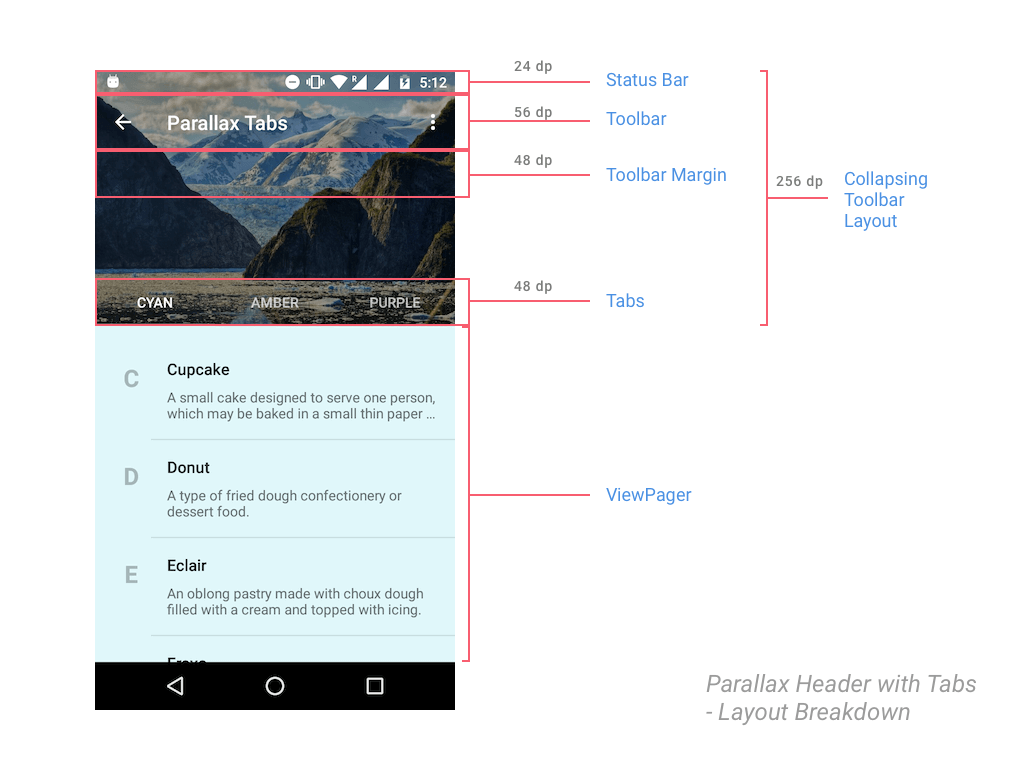
Breakdown of layout metrics
Setting up ViewPager in Activity.java
In case you forgot, the Tabs need a ViewPager to work with, so let’s take care of that in our Activity.java.
Let’s start by creating a dummy Fragment. For the sake of displaying some content, the Fragment will display a RecyclerView. Additionally, it’s background color will change depending on it’s position in the ViewPager.
public static class DummyFragment extends Fragment {

      public DummyFragment() {
      }

      @Override
      public View onCreateView(LayoutInflater inflater, ViewGroup container, Bundle savedInstanceState) {
          View view = inflater.inflate(R.layout.dummy_fragment, container, false);
          ...
          RecyclerView recyclerView = (RecyclerView) view.findViewById(R.id.dummyfrag_scrollableview);

          LinearLayoutManager linearLayoutManager = new LinearLayoutManager(getActivity().getBaseContext());
          recyclerView.setLayoutManager(linearLayoutManager);

          SimpleRecyclerAdapter adapter = new SimpleRecyclerAdapter(list);
          recyclerView.setAdapter(adapter);
          ...
          return view;
      }
  }
Note that DummyFragment is just a placeholder which I’m using with a different background color for each of my Tabs. You on the other hand must define a Fragment accordingly for each of your Tabs.
ViewPager Adapter
A minimal Adapter for our ViewPager. (To hold 3 Fragments)
static class ViewPagerAdapter extends FragmentPagerAdapter {
        private final List<Fragment> mmFragmentTitleList FragmentList = new ArrayList<>();
        private final List<String> = new ArrayList<>();

        public ViewPagerAdapter(FragmentManager manager) {
            super(manager);
        }

        @Override
        public Fragment getItem(int position) {
            return mFragmentList.get(position);
        }

        @Override
        public int getCount() {
            return mFragmentList.size();
        }

        public void addFrag(Fragment fragment, String title) {
            mFragmentList.add(fragment);
            mFragmentTitleList.add(title);
        }

        @Override
        public CharSequence getPageTitle(int position) {
            return mFragmentTitleList.get(position);
        }
    }
Hooking up ViewPager with TabLayout
Finally we’ll attach the ViewPager to our TabLayout in the Activity’s onCreate() method.
...
TabLayout tabLayout = (TabLayout) findViewById(R.id.htab_tabs);
        tabLayout.setupWithViewPager(viewPager);

 tabLayout.setOnTabSelectedListener(new TabLayout.OnTabSelectedListener() {
            @Override
            public void onTabSelected(TabLayout.Tab tab) {

                viewPager.setCurrentItem(tab.getPosition());

                switch (tab.getPosition()) {
                    case 0:
                        showToast("One");
                        break;
                    case 1:
                        showToast("Two");
                        ...
                  }
               }

  private void setupViewPager(ViewPager viewPager) {
        ViewPagerAdapter adapter = new ViewPagerAdapter(getSupportFragmentManager());
        adapter.addFrag(new DummyFragment(getResources().getColor(R.color.accent_material_light)), "CAT");
        adapter.addFrag(new DummyFragment(getResources().getColor(R.color.ripple_material_light)), "DOG");
        adapter.addFrag(new DummyFragment(getResources().getColor(R.color.button_material_dark)), "MOUSE");
        viewPager.setAdapter(adapter);
    }
...
The setupViewPager() method simply initializes my Fragment and adds them to the ViewPager.
Nothing out of the ordinary here. The Material Design Tabs post does the same thing, which is why this has minimal explanation. However if you get stuck anywhere, below is a link to the source code (GitHub) which you can refer to 🙂
Dynamic Tab color with Palette API
The color you see the Toolbar + TabLayout take, is picked from the header image. Courtesy of the Palette API.
Using this, we’ll set colors for the Toolbar, TabLayout and Status Bar. This is easily done by the following code snippet:
try {
    Bitmap bitmap = BitmapFactory.decodeResource(getResources(), R.drawable.header);
    Palette.from(bitmap).generate(new Palette.PaletteAsyncListener() {
        @SuppressWarnings("ResourceType")
        @Override
        public void onGenerated(Palette palette) {

            int vibrantColor = palette.getVibrantColor(R.color.primary_500);
            int vibrantDarkColor = palette.getDarkVibrantColor(R.color.primary_700);
            collapsingToolbarLayout.setContentScrimColor(vibrantColor);
            collapsingToolbarLayout.setStatusBarScrimColor(vibrantDarkColor);
        }
    });

} catch (Exception e) {
    // if Bitmap fetch fails, fallback to primary colors
    Log.e(TAG, "onCreate: failed to create bitmap from background", e.fillInStackTrace());
    collapsingToolbarLayout.setContentScrimColor(
            ContextCompat.getColor(this, R.color.primary_500)
    );
    collapsingToolbarLayout.setStatusBarScrimColor(
            ContextCompat.getColor(this, R.color.primary_700)
    );
}
Notice that the actual Palette API calls reside in the try block. But it is good practice to always handle the fail case. Here, the Palette API can fail if we’re unable to get a Bitmap. So as a fallback, we resort to using our app’s primary colors.
Final Output
With everything in place, run your app and scroll down and watch that beautiful parallax scrolling.

Parallax scrolling Tabs output
We have a neat TabLayout that plays nice with our Toolbar. Our header image scrolls nicely and fades into our image’s primary vibrant color.
As you can see this is a neat pattern in use which many of you would have seen. A perfect use case for this would be in apps that have categories (sub divisions) like the Play Store app, and also require a neat header image (Master Detail being the perfect example).
SOURCE CODE:
Find the source code for this project on GitHub.
Alternate Library:
If you’re not satisfied with the parallax scrolling the Design Support Library provides, or desire a greater degree of control and flexibility, you can use MaterialViewPager by florent37 on GitHub.
Do share the post if you liked it!
Cheers.


In your github project, under the TabsHeaderActivity, you have a collapsing toolbar with tabs. If I enable the expanded title and try to collapse it, the title is out of place. I’ve tried a few things to fix it but didn’t succeed. Do you know how to fix this? See attached screenshots
Hi there,
By default, without me trying to manually adjust the title position, the previous versions of the Support Library wouldn’t fit it correctly.
Do remove the positioning attributes and give it a shot, I’ve tested it to be working fine.
Am using 23.1.1 of the support libraries.
compile ‘com.android.support:design:23.1.1’
I got rid of the title positioning attribute app:titleMarginTop=”13dp” but title is still positioned below where it should be. Left the toolbar height at “104dp”
Can you update your github proj with the changes so I can take a look?
Thank you
I just updated to v23.2.0 of the Support library. Haven’t changed anything in my code. Still works like a charm. I’d suggest you go through my GitHub repository and see if you’re doing anything different.
I just pulled directly from your Github and in TabsHeaderActivity.java, line 54, I changed from:
collapsingToolbarLayout.setTitleEnabled(false);
to
collapsingToolbarLayout.setTitleEnabled(true);
When collapsing, the title is still below where it should be. I updated to 23.2.0 of the support library. I also tried it on an Android 4.4.2 (real phone), 5.1 (GenyMotion virtual), and 6.0 (GenyMotion virtual).
But no luck…
Did you cross check with the Activity’s XML Layout as well?
I left the activity’s XML layout the same as your original source – didn’t make any changes to it. Only changed the above mentioned source line.
Personally, I wasn’t able to get the collapsing title to play nice with this animation. So I simply set a title to the Toolbar instead.
Yeah, bizarre. Probably a bug in the support library.
Same here, vanilla checkout of the repo (a38bd433c13e93a77dec436cb9b6e6744cd6958c), just this one change to get a parallax title — text overlaps with tabs when expanded, sits below toolbar when collapsed.
I pulled directly from your GitHub source and only changed 1 line in TabsHeaderActivity.java. From
collapsingToolbarLayout.setTitleEnabled(false);
to
collapsingToolbarLayout.setTitleEnabled(true);
I also updated to v23.2.0 but it didn’t help. I also tested on Android 4.4, 5.1, and 6.0. No luck unfortunately.
Like I said, I’ve got the alignment straight after a lot of trial and error. I can confirm that my source code even works with the latest support libraries. I’ve personally tested this for you. So if you’re going to modify the layout, it would obviously break.
I can’t quite figure it out. I didn’t change any of your layout. Just one source code change shown above to allow the collapsing toolbar to display the title. I would think the Google Support Libraries should be able to handle it. Perhaps someone else can try it and see what happens. Anyway, won’t bother you anymore. Thanks for the tutorials, they are really helpful.
From your GitHub source (TabsHeaderActivity.java), if I enable expanded titles by setting:
collapsingToolbarLayout.setTitleEnabled(true);
When the title collapses, it appears below the toolbar. See screenshots. I tried playing with layout_gravity and gravity but didn’t seem to work. How do I properly collapse the title back into the proper position?
Yep, same here, still today, latest checkout and just that one change. Except in the last screenshot (expanded layout), the title even touches the tab labels.
Setting the Collapsing Toolbar title to false is what enables me to do this animation. You can alternatively set the Toolbar’s title instead.
Hi,
Is it possible to change the header image once the user slides between tabs?
(Each tab has its own header image)
Hi Danil,
Yes, you could do that via your code.
Create a tab listener and change the image depending upon which tab is selected.
“u can use this code”
tabLayout.setOnTabSelectedListener(new TabLayout.OnTabSelectedListener() {
@Override
public void onTabSelected(TabLayout.Tab tab) {
viewPager.setCurrentItem(tab.getPosition());
switch (tab.getPosition()){
case 0:
header.setImageResource(R.drawable.sunriseheader);
break;
case 1:
header.setImageResource(R.drawable.header);
break;
}
}
@Override
public void onTabUnselected(TabLayout.Tab tab) {
}
@Override
public void onTabReselected(TabLayout.Tab tab) {
}
});
is it possibl e to show tabs dynamically based on the selected list item from another view.
how to implement onListclicklistner in the dummy fragment
please help
i followed your code and implemented this but am facing two issues
1)my header image is not fitting/overlapping status bar
2)Tittle problem am not getting tittle on toolbar
please solve
Please refer to my GitHub code sample linked below.
You can set a title simply by using :
getSupportActionBar().setDisplayShowTitleEnabled(true);
getSupportActionBar().setTitle(“title”);
that’s fine but header image is not overlapping my status bar it’s showing default primarkdarkcolor how to overlap that wid header image plz solve’
Did you go through my code sample first? If you did, you shouldn’t be facing this issue.
Thank you problem solved
Thank you for this article. But it’s not working I copied the same XML layout.
BTW I’m using Support Library v23.1.1.
I hope you reply me soon.
Hi Akshay,
I suggest you go through it once again. I’ve updated my libraries to 23.1.1 as well and experience no such issues. Still works like a charm.
Alternatively, you could consider seeing my GitHub sample project.
I followed the same, but in collapse position, (I think) the toolbar overlaps with tab layout. The positioning seems good but when I touch any tab the does not respond. Please let me know where I can go wrong. Here is my code. https://gist.github.com/SaitejaP/20f8104ec7ab113e0f8a
Hi Saiteja,
Thanks for that useful gist for your code. Since you’re using a DrawerLayout, why don’t you inflate your Coordinator layout part from a Fragment? Makes it more clean and easier to isolate the error.
Plus I’m not sure you need the marginTop attribute for your Tabs. Also try addding android:clickable=”true”
My problem was solved. I mistakenly gave 4dp elevation to toolbar, which stays above tablayout when collapsed. So tabs are not clickable. I removed it and it works fine. Thanks for good tutorial. It is very helpful
That’s good to hear Saiteja. Happy to know you were able to resolve the issue. If you really liked the tutorial, do consider sharing so others find this blog too.
Great tuto, thanks a lot!
You’re welcome Mathieu.
Hi, great tutorial. I am facing a problem, i want to set the title of my toolbar pinned on top, but when i write collapsingToolbarLayout.setTitledEnabled(false), it throws an error saying that “cannot resolve setTitleEnabled” ?? I am using the com.android.support:design:22.2.1′
Please update to the latest support libraries versions first.
Hi,
I have updated my support libraries, “com.android.support:support-v4:22.+’. Still the problem exists. 🙁
Hey, issue is fixed…. Thanks 🙂