In Google I/O 2015, a lot of new stuff was revealed. One particular thing that caught my eye was the release of Android’s Design Support Library, which I found out thanks to Chris Banes’ tweet.
Pssst, we've released a new Android Design support library. http://t.co/RoAwDqfVCc
— Chris Banes (@chrisbanes) May 28, 2015
I’ll show you how to create a Material Design Navigation Drawer almost effortlessly, how to handle Drawer click events and orientation changes too!
What is the new Design Support Library in Android?
Before we get to that, I feel its best if we get comfortable with what the Design support library actually is.
With a little help from the new Android Design Support Library, we’re bringing a number of important material design components to all developers and to all Android 2.1 or higher devices- android-developers.blogspot.in
It includes components such as a NavigationView for Drawer, Floating Action Buttons, Snackbar, Tabs and a motion and scroll framework as well.
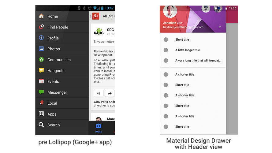
Navigation Drawer- then and now
Earlier making a Navigation Drawer in Android, took considerable effort and with the arrival of Material Design, including a header view and stuff, things got even harder.
Design Support Library, Our Savior
To make lives easier we needed to rely on external libraries to create a Material Design Navigation Drawer in Android (unless you were brave enough to attempt it yourself). But thanks to Design Support library, this is now very simple to do.
Let’s get started making an awesome Material Design Navigation Drawer for our Android app.
Using the Design support library
We’ll start off by adding its dependency in Gradle.
compile 'com.android.support:design:22.2.0'
Since the library depends on the AppCompat and support-v4 libraries, we can replace those two dependencies with JUST this.
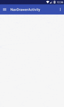
Navigation Drawer Layout
Go to your activity XML layout and structure your DrawerLayout like this:
<android.support.v4.widget.DrawerLayout xmlns:android="http://schemas.android.com/apk/res/android"
    xmlns:app="http://schemas.android.com/apk/res-auto"
    android:layout_width="match_parent"
    android:layout_height="match_parent"
    android:fitsSystemWindows="true">

    <!-- your content layout -->

    <android.support.design.widget.NavigationView
        android:layout_width="wrap_content"
        android:layout_height="match_parent"
        android:layout_gravity="start"
        android:fitsSystemWindows="true"
        app:headerLayout="@layout/drawer_header"
        app:menu="@menu/drawer" />

</android.support.v4.widget.DrawerLayout>
With this as the base, let’s add in our Toolbar layout with: <include layout="@layout/toolbar" />. Remember we can open the Drawer by tapping the burger icon as well, and for that we need a Toolbar.
Note the new NavigationView. This comes from the Design support library. You can define its headerLayout and must assign a menu resource for it.
The fitsSystemWindows attribute tells Android to draw this view behind the Status Bar. So when you open the Navigation Drawer, it appears behind a transparent Status Bar.
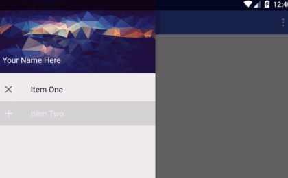
Drawer Menu
This is like your regular menu resource you use for your Toolbar ActionBar, but with a slight change. All menu items must be in a group. (Unless you want to categorize your menu items in groups). It’s checkableBehaviour MUST be single.
<menu xmlns:android="http://schemas.android.com/apk/res/android">
    <group android:checkableBehavior="single">
        <item
            android:id="@+id/navigation_item_1"
            android:checked="true"
            android:icon="@drawable/ic_action_clear"
            android:title="Item One" />
        <item
            android:id="@+id/navigation_item_2"
            android:icon="@drawable/ic_action_add"
            android:title="Item Two" />
    </group>

</menu>
Navigation Drawer Divider
If you wish to add a divider between your menu items, then simply add items in another group with a different ID. So all items residing in the second group will be separated from the first by a divider.
Header Layout
For the Drawer’s Header layout, we create another XML layout that contains a simple ImageView and TextView.
<FrameLayout xmlns:android="http://schemas.android.com/apk/res/android"
    android:layout_width="match_parent"
    android:layout_height="150dp"
    android:orientation="vertical">

    <ImageView
        android:layout_width="match_parent"
        android:layout_height="match_parent"
        android:background="@drawable/nav_header_bg"
        android:scaleType="centerCrop" />

    <TextView
        style="@style/TextAppearance.AppCompat.Subhead"
        android:layout_width="match_parent"
        android:layout_height="wrap_content"
        android:layout_gravity="bottom"
        android:layout_margin="16dp"
        android:text="Your Name Here"
        android:textColor="@android:color/white" />

</FrameLayout>
You could add whatever you need, but I’m going to keep it simple with this.

That is all the XML we’ll be seeing for this post. Let’s dig into some Java now.
Setting up the Activity
Open up your Activity.java. Here we need to:
- Initialize the Toolbar
- Handle Drawer click events
- Handle orientation changes
- Introduce the Drawer to 1st time users (via Preference)
1. Initialize the Toolbar
Frankly, I like to keep my onCreate() method free of clutter. So we’ll create a method for this and call it in.
private void setUpToolbar() {
       mToolbar = (Toolbar) findViewById(R.id.toolbar);
       if (mToolbar != null) {
           setSupportActionBar(mToolbar);
       }
   }
2. Set up Navigation Drawer
private void setUpNavDrawer() {
       if (mToolbar != null) {
           getSupportActionBar().setDisplayHomeAsUpEnabled(true);
           mToolbar.setNavigationIcon(R.drawable.ic_drawer);
           mToolbar.setNavigationOnClickListener(new View.OnClickListener() {
               @Override
               public void onClick(View v) {
                   mDrawerLayout.openDrawer(GravityCompat.START);
               }
           });
       }

   }
Here we’re allowing the Toolbar (ActionBar) to display a home as up button, and supplying the icon for it. Then define its click listener where we open the Navigation Drawer upon click. Remember to call this method in onCreate() as well.
3. Handle Drawer click events
While the Drawer opens/ closes using the DrawerLayout as a reference, the click events for the list items (menu) is handled by the NavigationView via its setNavigationItemSelectedListener() method.
mNavigationView.setNavigationItemSelectedListener(new NavigationView.OnNavigationItemSelectedListener() {
           @Override
           public boolean onNavigationItemSelected(MenuItem menuItem) {

               menuItem.setChecked(true);

               switch (menuItem.getItemId()) {
                   case R.id.navigation_item_1:
                       Snackbar.make(mContentFrame, "Item One",
                           Snackbar.LENGTH_SHORT).show();
                       mCurrentSelectedPosition = 0;
                       return true;
                   case R.id.navigation_item_2:
                       Snackbar.make(mContentFrame, "Item Two",
                           Snackbar.LENGTH_SHORT).show();
                       mCurrentSelectedPosition = 1;
                       return true;
                   default:
                       return true;
               }
           }
       });
Within the switch case is where we’ll actually be handling our Drawer’s item clicks. I will explain a bit later on why we need to track mCurrentSelectedPosition.
If you wish to handle Fragment transactions with your Navigation Drawer, just remember that it stays the same as before. Just below your Toolbar add a FrameLayout like this:
<FrameLayout
        android:id="@+id/nav_contentframe"
        android:layout_width="match_parent"
        android:layout_height="match_parent"
        android:layout_marginTop="?attr/actionBarSize" />
You can handle the fragment transactions under the switch case.
This is all we need to get our Material Style Navigation Drawer with Design support library up and running. But honestly, if you plan on implementing something: Do it good, or don’t bother doing it.
With that being said, that last 2 parts is handling the drawer upon orientation changes (so your app doesn’t crash when you flip the phone) and showing the Drawer for the first time to users (part of the guidelines).
4. Handling Orientation Changes
If the phone orientation changes, the app will redraw or reload the activity to adapt to the new orientation. So when this happens, data existing during the previous load must be held. Loss of this data during the redraw results in a crash.
Remember we used mCurrentSelectedPosition a bit earlier when handling our Drawer clicks? Well, we’re going to use that now. This is used to track which item on the Drawer was clicked, by storing its position.
If you don’t follow what I’m saying, with what we’ve done until now, go ahead and run your app. Tap any item on the Drawer apart from the default and flip your phone in landscape. You’ll note that what you selected is reset. We’re going to prevent that.
To handle the state before and after the orientation change, we need to implement two methods:
public void onSaveInstanceState(Bundle outState) {
        super.onSaveInstanceState(outState);
        outState.putInt(STATE_SELECTED_POSITION, mCurrentSelectedPosition);
}
Note that STATE_SELECTED_POSITION is our key. We’ll transfer mCurrentSelectedPosition‘s value to a Bundle and save it. Upon restoring, we recover that value from the bundle using the key.
Before we change the orientation, we want to save the last position we clicked. Once that’s done, we need to restore the data on reload.
protected void onRestoreInstanceState(Bundle savedInstanceState) {
        super.onRestoreInstanceState(savedInstanceState);
        mCurrentSelectedPosition = savedInstanceState.getInt(STATE_SELECTED_POSITION, 0);
        Menu menu = mNavigationView.getMenu();
        menu.getItem(mCurrentSelectedPosition).setChecked(true);
    }
We retrieve our stored position data via a Bundle and then make that menu item checked.
In your Activity’s onCreate() method, immediately after initializing your views and before calling your setup methods, add this.
if (savedInstanceState != null) {
           mCurrentSelectedPosition =
             savedInstanceState.getInt(STATE_SELECTED_POSITION);
           mFromSavedInstanceState = true;
}
With this our Navigation Drawer will now handle orientation changes properly without crashes.
If you have no idea about what these methods mean, then this should give you a better idea.
4. Introduce Drawer First Time
When a user launches an app for the first time, we must open the drawer and show it to them. We’ll do this using Preference.
First off, add these two methods in your Activity.
public static void saveSharedSetting(Context ctx, String settingName, String settingValue) {
       SharedPreferences sharedPref = ctx.getSharedPreferences(PREFERENCES_FILE, Context.MODE_PRIVATE);
       SharedPreferences.Editor editor = sharedPref.edit();
       editor.putString(settingName, settingValue);
       editor.apply();
   }

   public static String readSharedSetting(Context ctx, String settingName, String defaultValue) {
       SharedPreferences sharedPref = ctx.getSharedPreferences(PREFERENCES_FILE, Context.MODE_PRIVATE);
       return sharedPref.getString(settingName, defaultValue);
   }
Preference file is private static final String PREFERENCES_FILE = "yourappname_settings";
We’ll store a simple true/ false value in our Preference settings file and use that to know whether the app is launched for the first time or not.
Initially read your preference with this:
mUserLearnedDrawer = Boolean.valueOf(readSharedSetting(this, PREF_USER_LEARNED_DRAWER, "false"));
PREF_USER_LEARNED_DRAWER is my key (String type) which I use to fetch my Preference value.
Now, go to where you initialize your DrawerLayout (setUpNavDrawer() method) and add these lines:
if (!mUserLearnedDrawer) {
           mDrawerLayout.openDrawer(GravityCompat.START);
           mUserLearnedDrawer = true;
           saveSharedSetting(this, PREF_USER_LEARNED_DRAWER, "true");
       }
If the user hasn’t learned about the Drawer (not seen it yet), then open the Drawer and set the learned preference to true.
We now have a complete working Navigation Drawer:
Note the deliberate slow down while closing the Drawer. The Status Bar overlaps the Navigation Drawer. This is quite easy to achieve. You just need to add this to your theme in v-21 styles.xml.
<item name="android:windowTranslucentStatus">true</item>
Check out the working sample over at my GitHub.
That’s it. I know the post was pretty long, but let’s just see what we’ve achieved:
We’ve managed to create a fully working Material Design Navigation Drawer with Design Support library in Android, which handles orientation changes perfectly and also greets users for the first time on app launch!
While that was a mouthful, I’m sure you realize that this is actually a walk in the park considering how hard a Material Design Navigation Drawer was to create in the past! 🙂
Do subscribe (below) or Follow @Suleiman_194 for instant updates as I continue to bring you more awesome content!