
Designing your own UX portfolio can give you an edge to stand out from the crowd. By choosing to design it yourself, it is an opportunity to showcase your brand and who you are.
By being original and unique, your portfolio will be memorable. So don’t copy a theme or someone else’s design. You don’t want your UX portfolio to come off as a common template or worse, a rip-off.
Welcome to Part 2 of the ‘Build your UX Portfolio from Scratch’ series!
In this part, we’ll look at how to approach the design phase. From brainstorming ideas on how might we design our portfolio to building high-fidelity screens and then preparing to handoff for development.
Previously in Part 1, I gave you an overview on what this series is going to be about. It covers a lot of things right from a website name to all the various tools we’ll use from design to development. If you haven’t read it yet, I highly encourage you to start with Part 1 first!
Design Process
It always helps to start with a plan or a road-map. To begin with, think of your portfolio as a design problem - Just as you’d tackle as any other design challenge.
But before we even decide on a design plan and anything else, ask yourself this.
Why do you need a Portfolio? Who are its Users?
TIP
You are not the user.
Do you need a portfolio to attract new clients? Or is it to help you land a new role? Think about it’s use-case and who the target users are. For instance, if you need a portfolio to help you get a job, then the users might be recruiters and hiring managers.
Looking at it this way will help decide what want to show on your portfolio and how to present it.
Treat your UX Portfolio as a design problem
Yes, I’m asking you to UX your portfolio!
Asking yourself these questions early on will give you perspective. It will allow you to design with your target audience in mind.
READ
Considering the user of your UX portfolio – Sarah Doody, Inside Design by InVision
Here’s the design process we’re going to follow, right from hand-sketching and all the way to publishing our finished website.
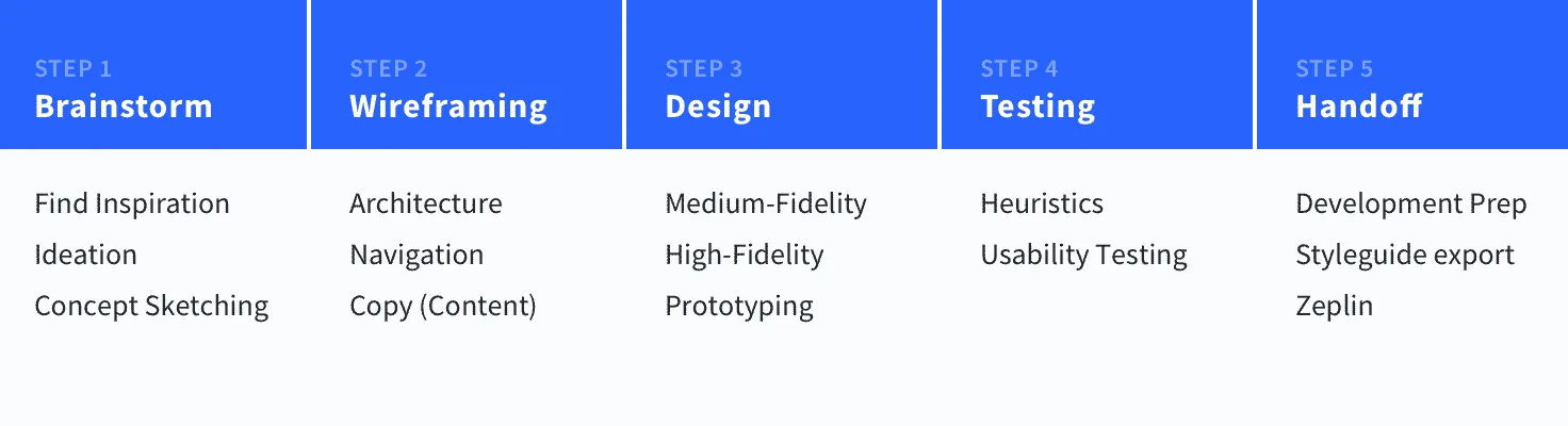
This image could potentially be misleading since it appears to be linear. But design is never linear. Rather, it is iterative. So while you design your portfolio, you can iterate across these steps multiple times until you reach a design that is satisfactory (within reasonable time of course).
Quick Navigation
- Brainstorm
- Wireframing
- Medium-fidelity
- High-fidelity
- Test for Feedback (Optional)
- Development Handoff
- Takeaways
Brainstorm - by finding inspiration
Whether this is the first time you’re making your portfolio or not, you can always learn by learning from what other’s have made.
Bestfolios has a great collection of UX portfolio examples. They are portfolios of designers in companies like Google, Facebook, Spotify and more!
If you’re not sure on what to include in your portfolio yet, this can be a powerful starting point. Looking at how the industry approaches it can give you an idea on WHAT to include and HOW.
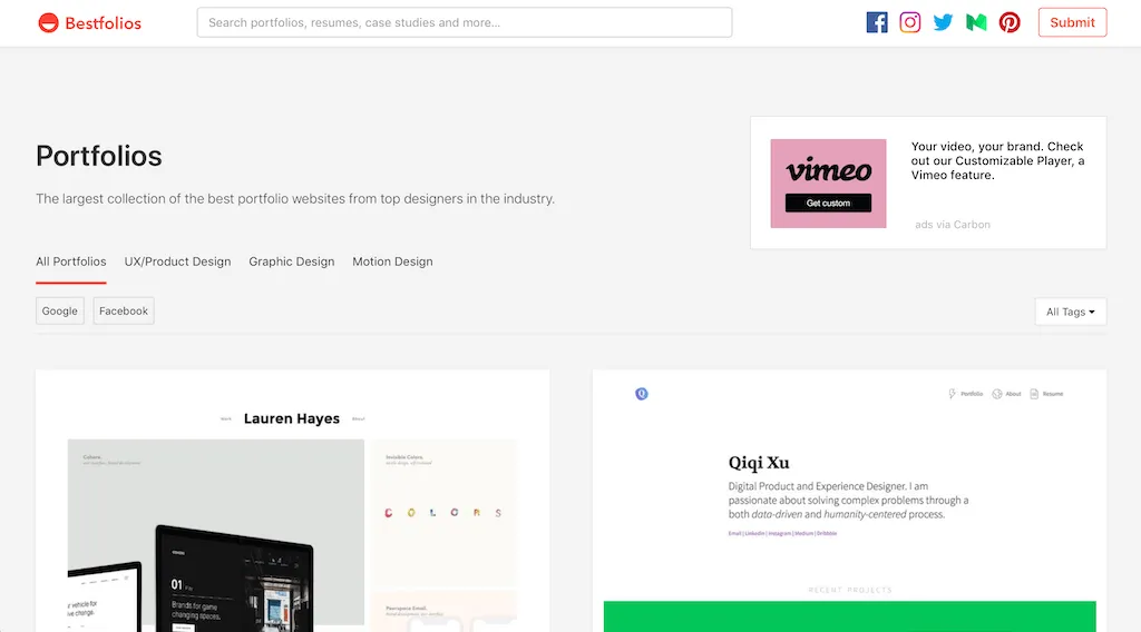
Inspiring collection of UX/UI portfolios - bestfolios.com
INSPIRATION
10 Student Portfolios Done Right – Bestfolios
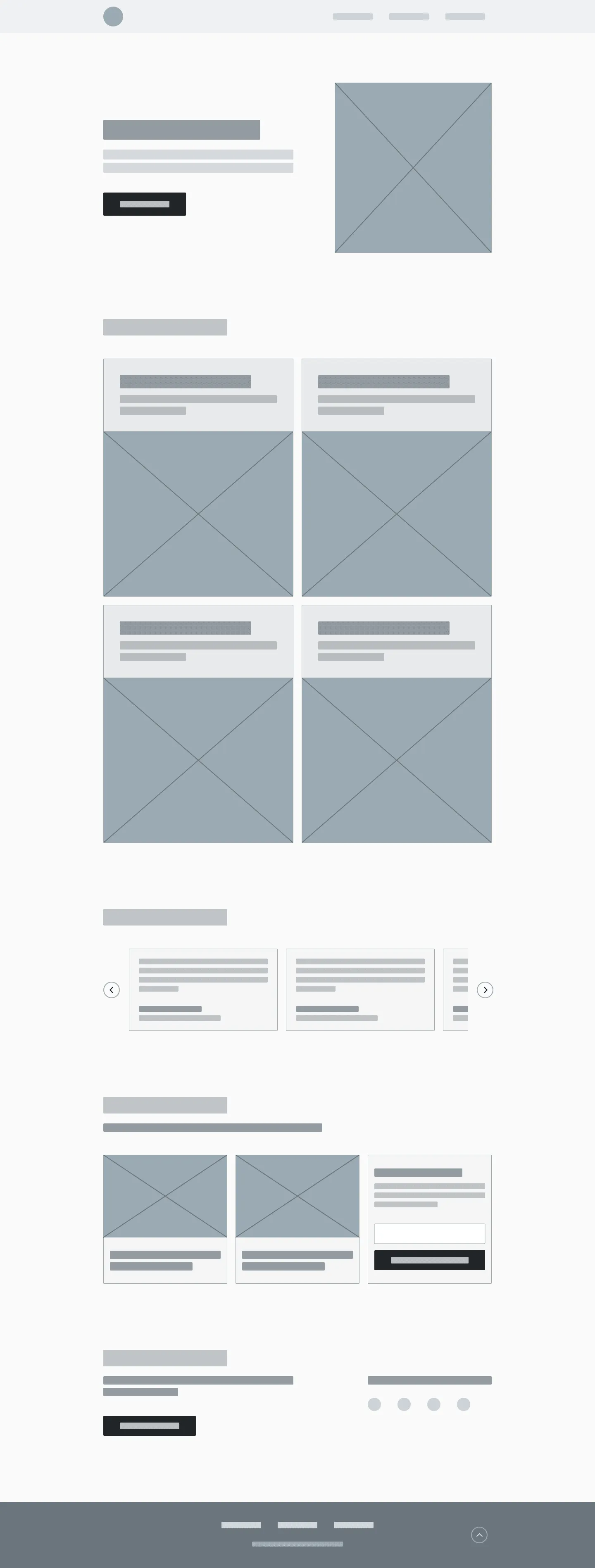
Make note of patterns
Once, you’ve browsed through many portfolios, you’ll start to notice a common pattern - A compelling hero section, focus on projects, and an about me page at the least.
While visually, there might be variations, here’s what a common portfolio structure looks like.

Common Layout/Components in a UX Portfolio Website
Remember, this is YOUR portfolio. So while you look for inspiration, use it to nail the essentials down. But infuse it with your personality to make it unique to you!
Paper Sketching
Now that you’ve seen a couple of portfolio, you should have a pretty good idea on how you might want yours to look like. While that thought is fresh on your mind, put it down on paper.
Doesn’t matter how it looks. Don’t worry about fonts, colors and other visual specifics. Just dump everything that’s on your mind onto a paper. Believe me, in this way, you’ll be able to brainstorm over ideas MUCH faster.
NOTE
There can be a strong tendency to directly jump into code. Resisting that temptation allows you to be more open and flexible to ideas for your portfolio.
Paper sketching allows you to ideate at the speed of thought.
Here are some rough sketches I came up with on the things I wanted to do for my portfolio. Be sure to keep this handy. It works as a great reference point from designing to development!
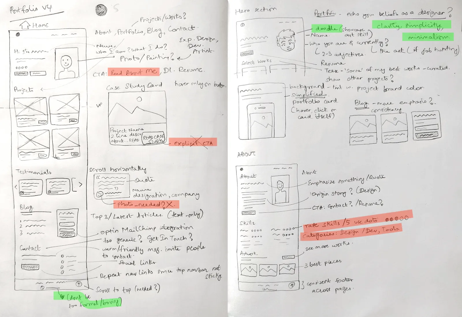
Initial paper sketching to brainstorm ideas for my UX Portfolio.
Notice that I’ve also scribbled a lot of notes around my screens. They’ll be a useful guide for the next design phase.
The focus here was on two key screens - the Home and About page. You might wonder, “What about the case studies?”. While that is by far the most important, in this scenario, content and presentation overthrow the design of the page itself.
NOTE
For my case studies, I chose to write them on Medium as I was more concerned with content rather than the visual design of the page.
However, if you wish to keep your case studies in-house, I strongly encourage you to attempt brainstorming them too
If you’re doing a redesign, make sure you only change those aspects of your portfolio that needs improvement. This could be something you’ve been wanting to improvise, or you’ve received feedback from users.
If you’re unsure, look at your analytics data or previous user tests if any. I know this might be a little overkill. But testing is key to thoughtful design. I’ll cover more on testing further in this article.
The paper sketches are a crucial starting point for your UX portfolio. Think of it as a visual map that will guide us in building our wireframes and high-fidelity. Next, we’ll use this to build our wireframes.
Wireframing
A wireframe is a blueprint. A visual guide that represents the skeleton framework of a website
Wikipedia
By this point, you’d know the elements to include in your portfolio. Your rough paper sketches are a handy guide to what those are.
In wireframing, think about the skeleton or structure of your portfolio. All those elements you wish to include, think about how you want to place them and where.
Here are my wireframes. At this point, you could jump into a design software of your choice to design wireframes. For this entire tutorial series, I will be using Sketch (Mac-only). For Windows, the alternatives are Figma and Adobe XD. I’ve gone over this in Part 1.
Home
About
TIP
This is a good time to think about the portfolio copy such as the headline, subtitle, your about me page, etc. It doesn’t have to be set in stone at this point, but at least, form a rough idea of what you want to say.
Continue to be flexible with ideation at this point. It allows your mind to be open to new ideas. You’ll notice there are a few changes I’ve made to the design in the wireframes compared to the paper sketches.
Medium-Fidelity
Medium-Fidelity designs include the interactions & navigation possibilities of an application.
Definition from d-labs.com
Alright, I tried my best to get you a definition that makes sense. But turns out, I didn’t understand the technical verbage here either. So let me try to explain what medium-fidelity means, in simple terms.
Medium-fidelity includes what your final UX portfolio contains such as layout elements, its navigation and text.
In other words, your navigation links, what your button is supposed to say, your headlines, subtitles, about me. All content needs to be finalized at this phase.
CAUTION
At this phase, do not, I repeat, DO NOT focus on colors, font styles or any other aspect of visual design
Medium-fidelity does NOT mean visual design. Focus on the structure of your UX portfolio. How does your design hold up with the final copy in place?
Keep your medium-fidelity monotone (grayscale). Doing so will keep your focus on structuring your portfolio rather than visual details such as colors and typography.
To design in medium-fidelity, you can use your existing wireframes to build upon. Leverage Symbols to upgrade the fidelity of your existing components.
The fact that you aren’t worrying about visuals will allow you focus on the bigger picture. You won’t be bothered with petty things such as “Should the button be rounded by 2 or 3px?” or “Should the spacing be 40 or 48px”.
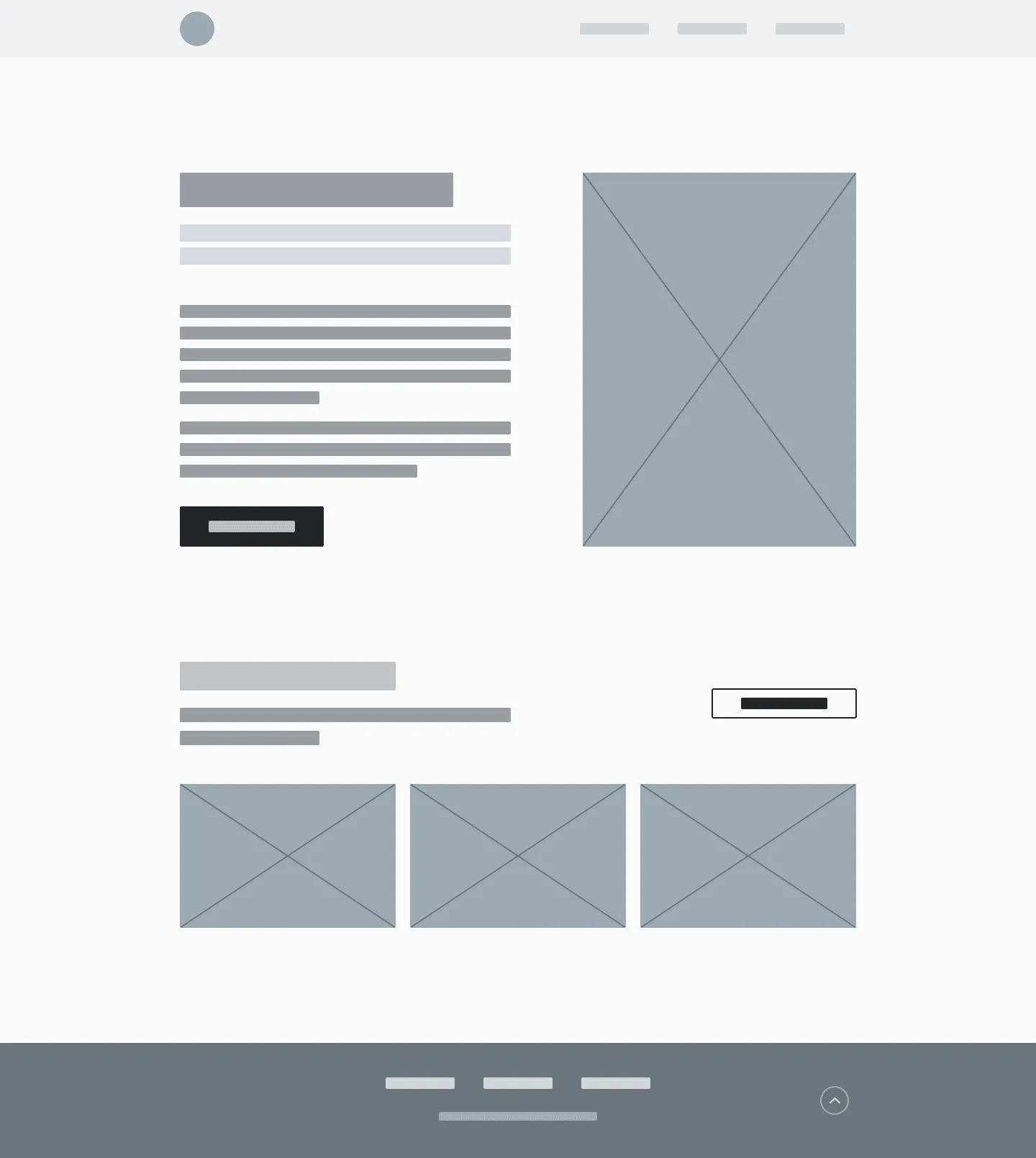
Here’s how my medium fidelity designs look like.
Home
About
I know that some things could be improved here, such as spacing. But as I’ve previously said, the focus should be on layout structure, final copy and how that plays well with your design.
With that said, we now move on to the most fun and visual part of building your UX portfolio.
Design for High-Fidelity
High-fidelity designs appear and function as similar as possible to the actual product that will ship.
Nick Babich, Adobe Blog
This is the phase where you’re going to be spending a bulk of your time. After all, it is designing how your UX portfolio will actually look like on the browser! Define the visual style - colors, typography, spacing, etc.
Before you let loose your creativity, keeping these tips in mind can make things easier.
3 Key things to remember
1. Create a styleguide to build faster
A simple styleguide for colors, typography and basic elements can help you design faster.
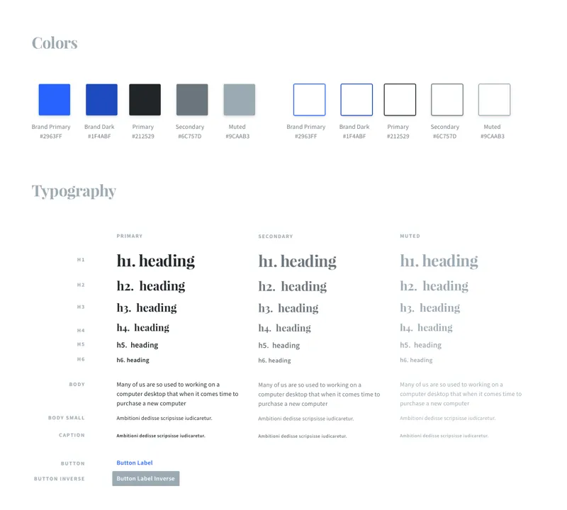
TIP
If you have a front-end framework you wish to use, they might have a Sketch styleguide for you to download. If they do, I highly encourage you to use that to jumpstart your design.
For my portfolio, I decided to use Bootstrap 4 (a very popular front-end web framework). Luckily they had a design system for Sketch. I quickly adapted that to my branding and jumpstarted my design. I’ll cover more about front-end frameworks when we get into development.
Bootstrap 4 Design System
If you plan on using Bootstrap 4, you can grab the design kit Sketch file for free from sketchappresources.com.
2. Consistency is key
Your portfolio is your brand. Make sure it has one voice that echoes in unison across your whole site. Be it colors, type or even the content - keep it consistent.
3. Showcase who you are as a designer
While your portfolio is largely about your work (case studies), it also about demonstrating who you are as a designer and your beliefs.
So ensure your portfolio echoes your thoughts and beliefs in unison. For example, as a designer, I believe in clear, simple experiences that are minimally designed. Hence, my portfolio too is designed to reflect the same.
However, if I said that and then had a portfolio designed over the top with flash of colors and animation, that would be confusing right?
NOTE – **Don’t aim for perfection
**Aiming for ‘that perfect design’ will waste a LOT of your time. graudally improve upon it. Don’t get stuck trying to make it perfect (because there is no such thing).
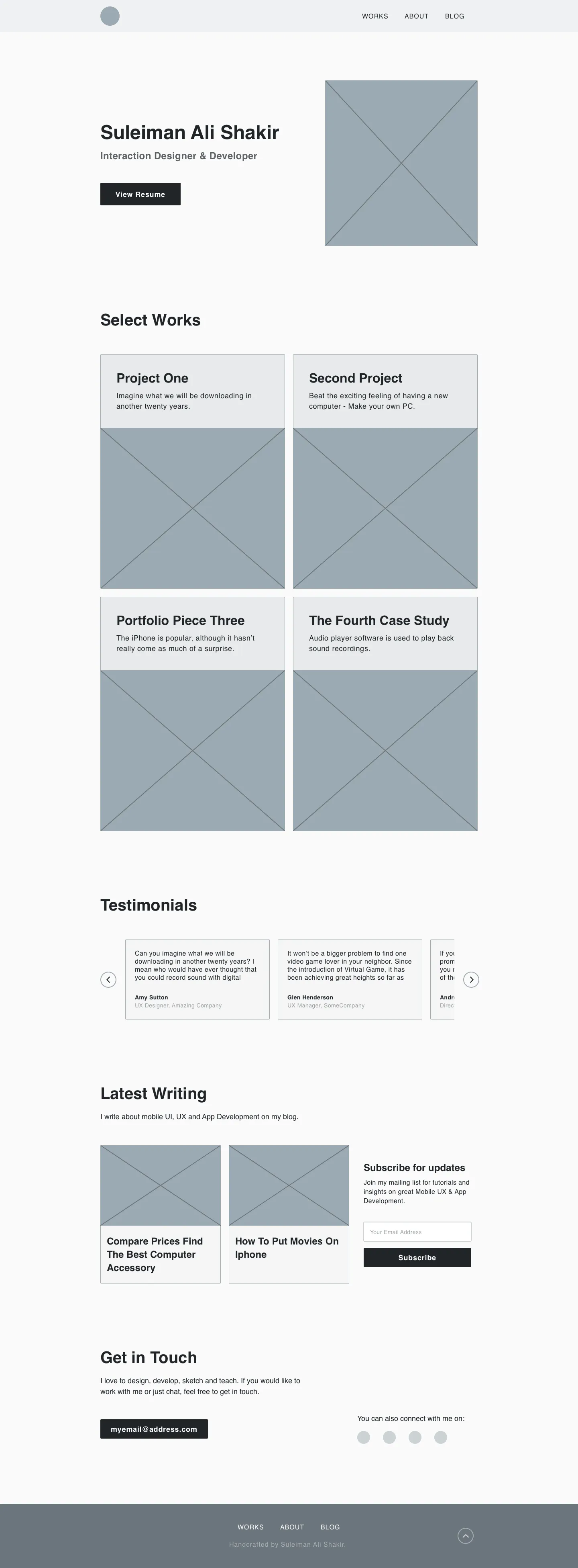
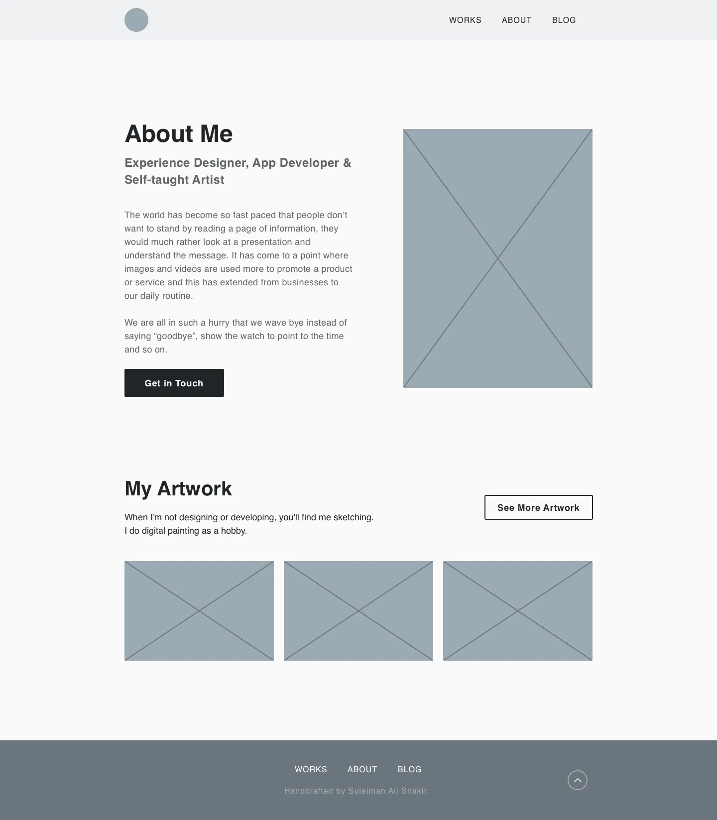
Final Designs
Here’s the final designs for my portfolio.
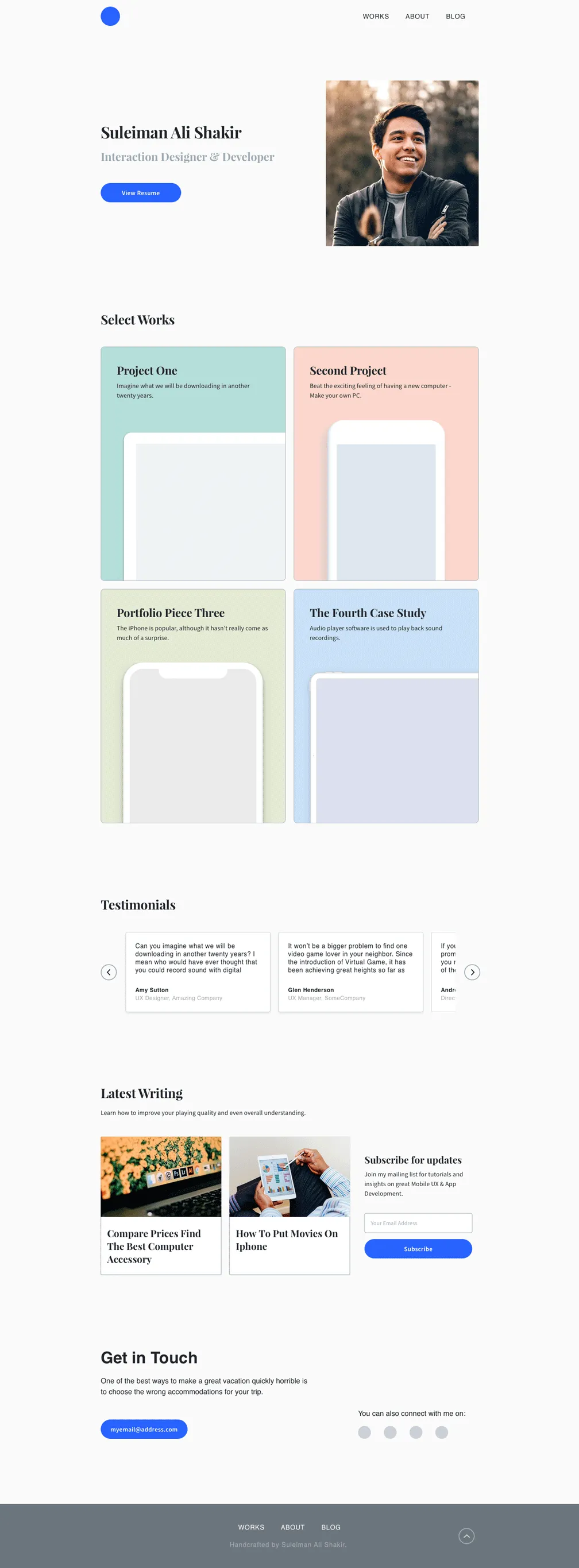
Home
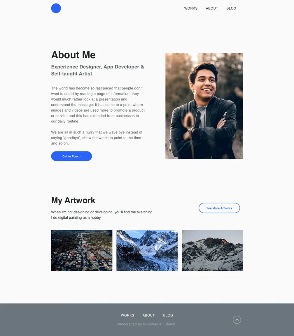
About Me
If you’re interested in getting the high-fidelity designs, you can download the Sketch file from below. It includes a simple styleguide with typography, colors and symbols defined.
Test for Feedback
Now that we’re done designing our portfolio, we need to test to see if our design is actually usable by others.
I’d like to say that you could skip this section if you want. That’s why I’ve called it optional. But then, I strongly urge you to do a bare minimum usability testing at the least.
TIP
Use Nielsen’s 10 Heuristic principles to troubleshoot your UX portfolio design. Fix anything you can find.
I agree that robust user testing at this phase can be overkill. So from here, you could do two things, each with its own pros and cons.
Method
Pros
Cons
Perform User Testing Now
Easier to do now with a prototype
Can uncover usability issues early on
Can take time away from launching your portfolio
Get Feedback after launch
Issues uncovered can be more accurate
Implementing design changes in development can be hard/time consuming
TIP
Here’s how you can conduct quick guerrilla user tests on your own.
If you’re designing in Sketch, Adobe XD or Figma, either software lets you quickly transform your design into a prototype.
You can then share the prototype link which your users can access via any browser to test. Use this via link to test with people. Useful to gauge initial reactions from people. Even better if you’ve designed how your case studies will appear in your portfolio.
READ
Best UX Design Tools for Testing - Paul Boag
If you have the opportunity, test them with hiring managers and other designers you know. Gauge their reactions when they use your website (portfolio). Their feedback is rich information that you can use to further improve your portfolio.
If you have the luxury to do this, then I highly encourage you to do so. The portfolio designs of mine that I shared with you is the 5th iteration based on user feedback. Many of my design decisions are based off this.
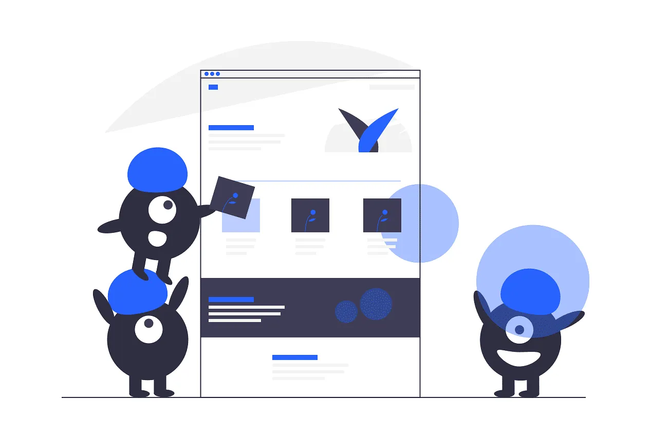
Get Ready for Development Handoff
That was one long article but we’re finally at the last step!
Once your portfolio design is complete (based on how many iterations it took you), the last and final step is handoff.
Remember what I said about perfection? There is no such thing! So don’t spend time trying to get that ‘perfect’ design. You’ll constantly keep getting new ideas so put it hard stop to it after a point.
What I’m trying to say is, the last step is preparing for development. So your design needs to be ready to go for this with no further design changes.
Since this is typically an individual project, you’ll basically be handing it off to yourself (who is also the developer in this case).
Use Zeplin for your Design spec
Use a tool like Zeplin to import your portfolio designs. This is a much better way to reference your design specs rather than constantly looking at your Sketch file.
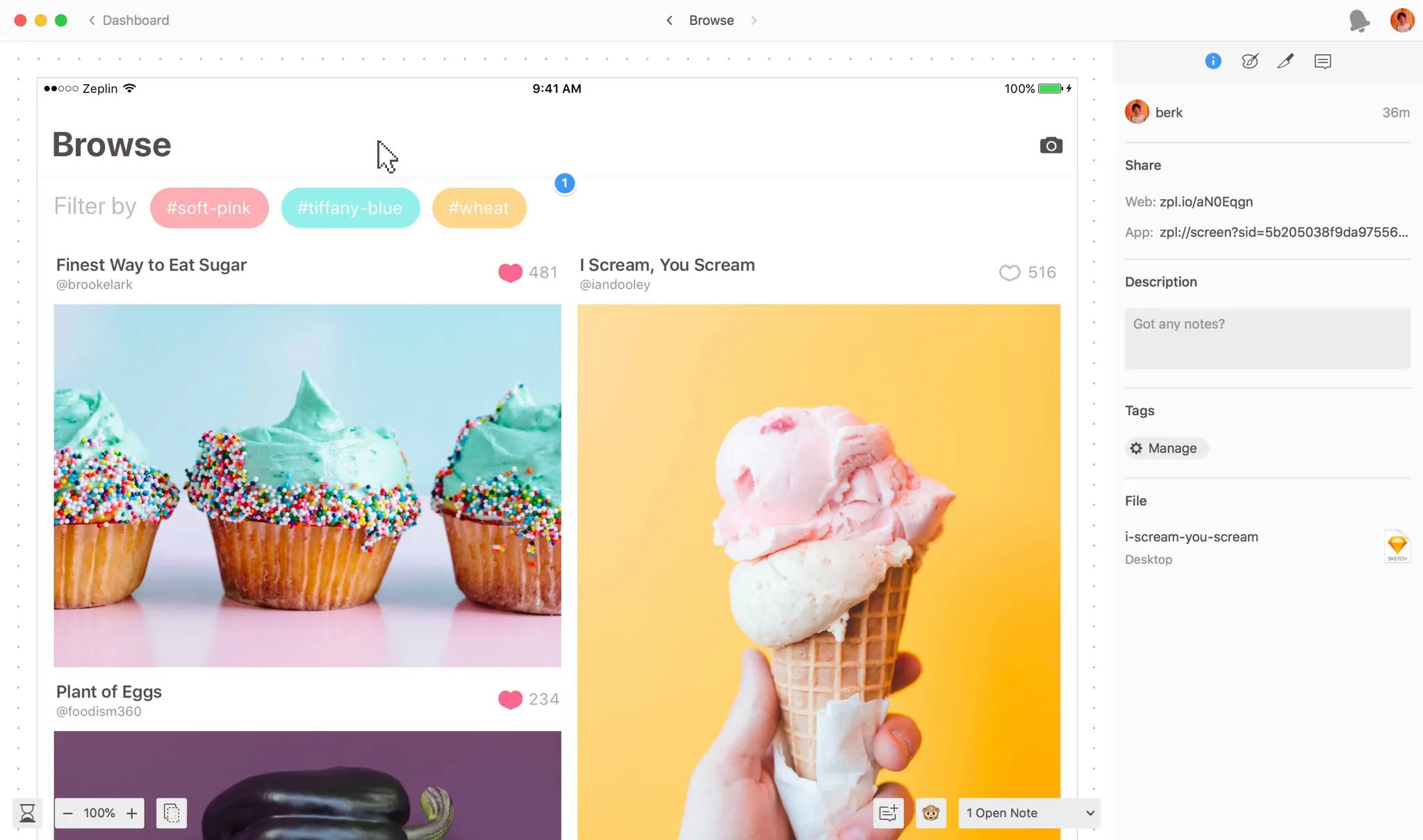
Zeplin is free upto one project. So go ahead and export your Sketch artboards to Zeplin. Sketch has a handy plugin that can do this for you.
READ
Learn from Zeplin on how to export from Sketch.
Thankfully, Zeplin isn’t that complicated to use. By simply hovering over your designs, Zeplin gives you the specs on the right panel along with code!
With that, you’re now ready to jump into development!
Recap
If you’ve made it this far, then please give yourself a pat on the back. That was definitely not easy for an article this long! Great job!
Let’s quickly summarize what we did in this design phase.
- First, we looked into what could be the design process for our UX portfolio.
- We started brainstorming ideas for our portfolio by looking at some great portfolio examples from the industry.
- Then, we identified patterns and sketched early ideas on what our portfolio might look like.
- Next, we took our rough sketches and notes to build wireframes, focusing on layout and structure.
- We then evolved our wireframes to medium-fidelity, fleshing out the website content and navigation.
- Finally, we transformed our medium-fidelity to high-fidelity mockups by focusing on visual design
- After completing our design, we looked into how might improve our portfolio design via heuristics or quick guerrilla usability testing.
- Lastly, with our designs now complete, we exported them to Zeplin for development handoff.
Takeaways
Design is never finished. While that is true, this is our portfolio and there can be a tendency to endlessly iterate, trying to find that perfect design. It is important to be realistic and acknowledge that fact.
With that said, here are some last few pointers to keep in mind when you’re in the design phase of your portfolio.
- Design keeping your users in mind?
- What do you want your users to takeaway from your portfolio?
- Keep consistency with you as a brand and beliefs as a designer
- Case studies are important – prioritize content over presentation
- When possible - test and get feedback from your target audience
Next Steps
With all that said, we’re now done with the design phase of building your UX portfolio. Cheers!
We’ve successfully exported our designs to Zeplin, ready to begin development. However, web development has an ocean of choices which can be overwhelming. But not to worry because that’s exactly what I’ll be covering in the next part.
In Part 3 of Build your UX Portfolio, I’ll talk to you about the frameworks, languages and tools we’ll be using (with choices) to develop your portfolio.
Be sure to subscribe below so you’ll know when Part 3 is out!
Part 3: Choosing Web Technologies (Coming Soon…)