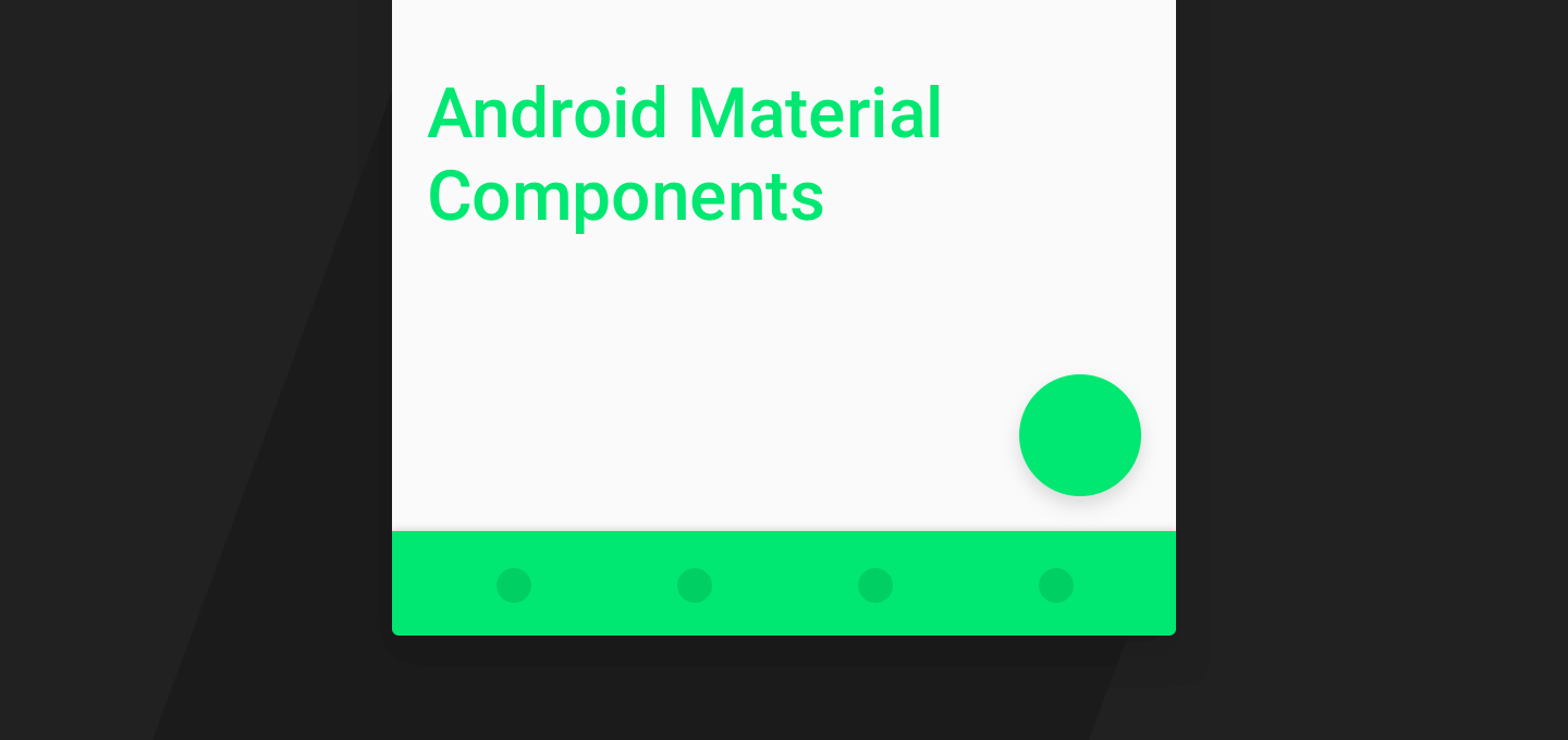
Material Components are a set of UI components that helps you build Android apps with Material Design.
In this post, I’ll cover every Material Design component available to us. In addition to components, popular design patterns can be recreated as well. That too, quite easily. For example, the ‘Collapsing App Bar on scroll’ (Read as Flexible Space with Image Pattern).
Moreover, I’ll tell you how to use each Material Component with links to detailed Android tutorials.
This article has been updated for AndroidX!
A Brief History
Material Design was introduced in 2014. At that time, there was little to no official support from Google for us Android Developers.
On one hand, we had Material Design in all its vibrancy, robust principles and eye-catching animations. On the other hand, we didn’t receive any official support on how to implement all of that.
But all that changed gradually over a year.
Support libraries steadily improved. AppCompat supported basic color theming. Even common widgets were ‘Materialized’. They were also made backward-compatible.
But Material Design wasn’t just about a UI overhaul and vibrancy, was it?
Motion provides meaning. It respects and reinforces the user as the prime mover. Motion is meaningful and appropriate, serving to focus attention and maintain continuity…
Material Components
Now, Android has modularized and put all their Material Design related offerings into a single resource. They call it Material Components. Here’s their website.
For those who don’t know, Material Components isn’t another fancy new library. In fact, it’s the same library which we’re already familiar with, packaged in a different offering. Very smart on Google’s part.
You might have already guessed what it is. For Android, it’s nothing but the Design Support Library.
The Real Hero - Design Support Library
This gem beat every other library before it. Popular design patterns that took days and hundreds of lines of code were accomplished in a matter of minutes.
With a little help from the new Android Design Support Library, we’re bringing a number of important material design components to all developers and to all Android 2.1 or higher devices - android-developers.googleblog.com
Popular Material Design Components such as Snackbar, FAB, Navigation Drawer and more could be easily used. Moreover, patterns like Quick Return, Collapsing Headers were made possible, all through XML. All it takes is one line to enable the animation. That’s brilliance, at its finest!
You can start using Material Components by adding AndroidX and the Material Components library to your app/build.gradle file.
dependencies {
    …
    implementation 'androidx.appcompat:appcompat:1.1.0'
    implementation 'com.google.android.material:material:1.0.0'
}
Benefits:
1. Ease of use
All Material Components can be easily used just like any normal UI widget in Android. Moreover, as I mentioned above, performing on-scroll animations takes only one line of XML. You don’t even have to touch Java.
I’ll show you how to do all of this, later in this article.
2. Backward Compatibility
Remember how we all struggled with maintaining consistency using Material Design? I remember it, crystal clear. Doing anything Material, pre-Lollipop was a nightmare!
But the Design Support Library offers is compatible back to Android 2.1. Sweet!
Honestly, the only difference I see is the lack of elevation (depth) on pre-Lollipop. But there’s a simple fix for that too. There’s a way to show elevation shadows on pre-Lollipop.
3. Respects Material Design Guidelines
The library is officially by Google’s Android team. All components strictly follow and respect Material Design guidelines. Each Material Component looks and behaves the way it’s supposed to. So you don’t have to worry about anything that may be amiss.
Also, you can easily tint your Material Component to match your brand color.
Material Components - Index
The Design Support Library gives us a many to use components. We can even style them to match our brand theme. Here’s a list of all the Material components it offers for us Android developers to use.
You can treat this list as an index to navigate this entire article.
Important Classes
Android Material UI Components
- Bottom Bar Navigation
- Bottom Sheet
- Floating Action Button (FAB)
- Floating labels (for EditText)
- Material Design Tabs
- Navigation Drawer
- Snackbar
Animations
This post is a one stop destination for you to know about everything this library can do for you. Additionally, I’ll even tell you how to implement each feature.
Now that you have a glimpse of what we’re going to cover, let’s dive in.
Important Classes
Before we get to the Material Components, there are 2 fundamental classes you need to know. Without understanding these, it’s difficult to learn how to use almost any Material Component.
1. CoordinatorLayout
CoordinatorLayoutis a super-poweredFrameLayout.
The CoordinatorLayout acts as a top-level parent layout. It helps ‘coordinate’ the behaviors of its child Views. One child Views can listen and react to changes based on another child View. The on-scroll animations that the library helps you perform, is because of the CoordinatorLayout.
To be specific, the CoordinatorLayout does this by using Behaviors. This brings us to our next point.
2. Behavior
Behaviorenables interactions for child Views ofCoordinatorLayout.
In other words, Behaviors allow you to intercept different events of a child View.
Want your FAB to shrink and grow? Want your Toolbar to scroll on and off-screen? All that is possible with Behaviors. Most of the interactions that you see in the Design Support, is made with Behaviors.
Android provides a few default Behaviors off the bat. You’ll become familiar with them as you read this article. However, you can even write our own custom Behavior if you wish.
TIP
Ian Lake has a brilliant Medium write-up about Behaviors.
Or, if you want to create some amazing animation like the one above, Saúl Molinero has a great tutorial on Custom Behaviors.
Android Material UI Components
The Design Support library offers many UI components out of the box. While the Toolbar was introduced with the AppCompat Support Library, Design Support offers a wealth of Material Design components.
1. Bottom Bar Navigation
The newest addition to the Material Design guidelines is Bottom Navigation. Quite recently, it was added to the Design Support Library.
iOS devs would come to know this as the TabBar.
Bottom navigation bars make it easy to explore and switch between top-level views in a single tap.
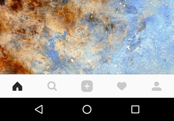
Bottom Bar Navigation as seen on Instagram
To use Bottom Navigation, you use the BottomNavigationView class. Here’s a quick code snippet you can drop into your layout.
<com.google.android.material.bottomnavigation.BottomNavigationView
        android:layout_width="match_parent"
        android:layout_height="wrap_content"
        android:layout_gravity="bottom"
        app:itemBackground="?attr/colorPrimary"
        app:itemIconTint="@drawable/selector_bottombar"
        app:itemTextColor="@drawable/selector_bottombar"
        app:menu="@menu/bottombar_menu"/>
On the surface, it looks very simple and limited in customization. For example, you can selectively display item text labels if you wish, change tint color and more. To give you a hint, all this is possible using ‘State Selectors’.
READ
The Bottom Navigation tutorial for in-depth customization and more.
2. Bottom Sheet
Bottom Sheets slide up from the bottom of the screen to reveal more content.
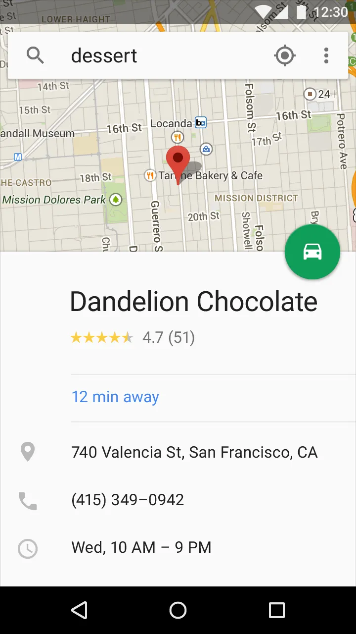
Bottom Sheet as seen on Google Maps Android app
BottomSheet was added to Design Support Library in v23.2.0. It also included a whole new BottomSheetBehavior.
Simply add your Bottom Sheet directly within CoordinatorLayout.
<androidx.coordinatorlayout.widget.CoordinatorLayout>
 ...
  <androidx.core.widget.NestedScrollView
  app:behavior_peekHeight="312dp"
  app:layout_behavior="com.google.android.material.bottomsheet.BottomSheetBehavior" />
 ...
</androidx.coordinatorlayout.widget.CoordinatorLayout>
Additionally, you can make your Bottom Sheet react to on-scroll events. You can see such an example in the GIF above. The FAB contracts on expand, and grows (appears) on collapsing the bottom bar.
READ
The Android Bottom Sheet tutorial teaches you how to do all of this and more.
3. Floating Action Button (FAB)
A floating action button represents the primary action in an application.
The most important action that users will perform on a screen, must reside in a Floating Action Button (FAB). It represents a promoted action on-screen.
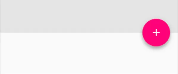
Material Design Floating Action Button. Image Credit: Android Developers Blog
Just like any other UI widget, you’d simply include it in your XML layout. Use the class FloatingActionButton.
<com.google.android.material.floatingactionbutton.FloatingActionButton
   android:src="@drawable/your_icon"
   app:rippleColor="@color/rippleColor"
   app:fabSize="normal" />
Again, Materialdoc.com does a fine job of covering the FAB in detail. Paresh Mayani brilliantly explains how to use, style and customize it.
READ: Floating Action Button on materialdoc.com
If you’re using a FAB in your apps, keep the following in mind and use it carefully.
- Chose your promoted action wisely
- You may risk de-prioritising other onscreen actions
- It may block your screen, as it is an overlay
4. Floating labels (for EditText)
When the user engages with the text input field, the floating inline labels move to float above the field.
Image Credit: materialdoc.com
Again, implementing this is simple. Just wrap your existing EditText with TextInputLayout.
<com.google.android.material.textfield.TextInputLayout android:layout_width=“match_parent” android:layout_height=“wrap_content”>
</com.google.android.material.textfield.TextInputLayout>
To further style your Floating Labels, you can read Floating Labels on materialdoc.com.
5. Material Design Tabs
Tabs make it easy to explore and switch between different views.
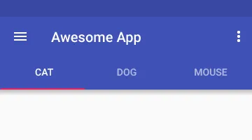
Material Design Tabs
We’re all very familiar with Tabs. But the Design Support Library introduced a new TabLayout class which by default, styles your Tab in Material Design flavor.
<androidx.coordinatorlayout.widget.CoordinatorLayout>
    <com.google.android.material.appbar.AppBarLayout>

        <com.google.android.material.tabs.TabLayout
            android:layout_width="match_parent"
            android:layout_height="wrap_content" />

    </com.google.android.material.appbar.AppBarLayout>

    <android.support.v4.view.ViewPager
        android:layout_width="match_parent"
        android:layout_height="match_parent"
        app:layout_behavior="@string/appbar_scrolling_view_behavior" />
</androidx.coordinatorlayout.widget.CoordinatorLayout>
READ
How to create Material Design Tabs with Android Design Support Library.
6. Navigation Drawer
The navigation drawer slides in from the left and contains the navigation destinations for your app.
In the early days, making a Navigation Drawer in Android took considerable effort. With Material Design things got even harder.
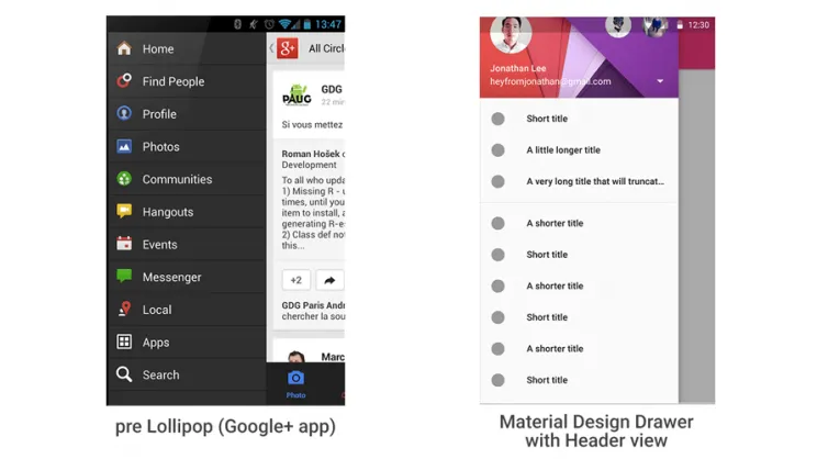
However, adding a Navigation Drawer now is a breeze. All your drawer items are loaded from a menu resource. The drawer header is a separate layout.xml. Honestly, it can’t get any easier than this.
<androidx.drawerlayout.widget.DrawerLayout
    xmlns:android="http://schemas.android.com/apk/res/android"
    xmlns:app="http://schemas.android.com/apk/res-auto"
    android:layout_width="match_parent"
    android:layout_height="match_parent"
    android:fitsSystemWindows="true">

    <!-- your content layout -->

    <com.google.android.material.navigation.NavigationView
        android:layout_width="wrap_content"
        android:layout_height="match_parent"
        android:layout_gravity="start"
        android:fitsSystemWindows="true"
        app:headerLayout="@layout/drawer_header"
        app:menu="@menu/drawer" />

</androidx.drawerlayout.widget.DrawerLayout>
READ
Navigation Drawer with Design Support Library - Android Tutorial
7. Snackbar
A lightweight component that gives feedback to users. It optionally provides an action to users.
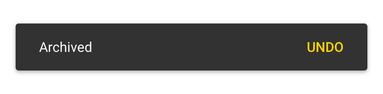
Here’s a simple Snackbar.
Snackbar
.make(view, “Your message here”,
Snackbar.LENGTH_SHORT)
.show();
Note that “view” can be any View from your layout.
I know, you might say that if you remove the action, it’s a Toast. I agree with you. But in one line, here’s the difference.
Toasts are usually for important system related messages.
READ
How and when to use a Snackbar correctly.
Animations
1. Quick Return
The Toolbar scrolls off-screen with the rest of the scrollable content, but upon scrolling slightly up at any point, it scrolls back into view.
– Quick Return Animation Pattern
Quick Return is a useful pattern that provides more vertical space for your content.
They key to enabling this animation is as simple as adding this flag to your Toolbar.
app:layout_scrollFlags="scroll|enterAlways"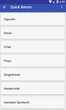
It is also possible to combine Quick Return with the Flexible Space pattern. Simply add this flag to get it working!
READ
Learn via a more detailed demonstration in the Android Quick Return tutorial.
2. Flexible Space with Image
A scrolling technique that supports an image header with a scrollable view below it. Upon scrolling, the ‘Flexible Space’ (image header) fades into a color. At the same time, it collapses into a Toolbar.
Now it’s obviously clear when you would want to use this pattern. It works best when you have a header image. You’ll understand the Flexible Space pattern better via a GIF.
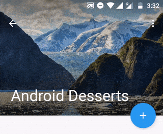
Note that in this GIF, the Toolbar doesn’t always have to tint with the primary brand color. It also can take on the image’s dominant color. You can fetch an image’s dominant color, including a variety of other colors using the Palette API.
READ
How to create a collapsing toolbar animation, including Palette API.
3. Parallax Scrolling (header)
Parallax scrolling is where one element scrolls at a different speed compared to other elements.
In our case, we’ll apply parallax scrolling to ImageView. So our ImageView will scroll at a different rate compared to CollapsingToolbar.
For a bit, head back to our Flexible Space pattern animation. Remember that I said it predominantly uses an ImageView for its header?
You just need one attribute to enable parallax scrolling on the ImageView.
app:layout_collapseMode="parallax"If you want the parallax effect to be more profound, add a multiplier.
app:layout_collapseParallaxMultiplier="0.5"ProGuard rules for Design Support Library
Lastly, don’t forget to add ProGuard rules. I’m sure the apps you build will go on to be production-ready. You’ll even upload it on the Play Store.
So when you’re generating your release build. Add these lines to your app/proguard-rules.pro file.
-dontwarn android.support.design.** -keep class android.support.design.** { *; } -keep interface android.support.design.** { *; } -keep public class android.support.design.R$* { *; }
TIP
If you’re using a lot of libraries, adding ProGuard rules can be hard. So here’s a useful collection of ProGuard snippets that will help you.
Key Takeaways
Being a user of Design Support library since its advent, I say this from experience. If you plan on building a Material Design Android app, this library is a must-have.
I hope this list was exhaustive and convincing enough for you. It’s about time you made the jump to the Design Support Library.
Stop using external libraries that do the same thing. I’m not saying that they’re bad in any way. But I’d prefer using official implementation and reduce third-party dependency when possible.
How will you use Material Components in your Android app? Let me know in the comments below.