This is my third post where I continue to bring you more from the Design Support Library. Let’s look at adding a Material Design Tab strip for our apps with on scroll animations.
Tabs make it easy to explore and switch between different views. Provides a way for displaying grouped content.
This article has been updated for AndroidX!
Material Design Tabs made easy
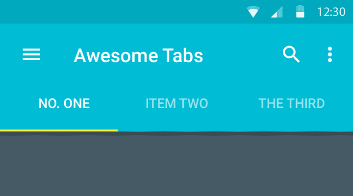
You can see Material Design tabs popularly on the Play Store app, and more recently on WhatsApp as well (after their Material Design update).

Material Design Tabs in Play Store

Tabs in WhatsApp
To implement Tabs earlier, we had to rely on external libraries. Also, let’s not forget the hide on scroll animations which we had to make ourselves!
When you’re done reading this post, you’ll be able to create amazing Material Design tabs for your apps. Like the ones above.
So let’s get to it!
Also read:
- Parallax Scrolling Tabs with Design Support Library
- Flexible space with header image pattern
- Quick Material Design Navigation Drawer with Design Support
Layout
Have you closely observed how Tabs actually behave?
When you click a Tab, it becomes active and slides in a new screen. Rather a new sub-screen called Fragment. We either tap a Tab, or swipe left or right to access adjacent Tabs.
Tabs are typically found anchored to the bottom of the Toolbar.
In essence, the entirety of those Tab screens are Fragments, which will be handled by a ViewPager. Think of it like a gallery slideshow.
But before we dive into all of that, let’s setup our main layout.
Here’s a skeleton of the layout.
<androidx.coordinatorlayout.widget.CoordinatorLayout>
   <com.google.android.material.appbar.AppBarLayout>
      <androidx.appcompat.widget.Toolbar />
      <!-- The Tab rests directly below the Toolbar, attached below it -->
      <com.google.android.material.tabs.TabLayout />
   </com.google.android.material.appbar.AppBarLayout>
   <!-- Helps handing the Fragments to load for each Tab -->
   <android.support.v4.view.ViewPager />
</androidx.coordinatorlayout.widget.CoordinatorLayout>
For creating Tabs, we use the TabLayout widget class. This is a new widget, part of the Design Support Library.
Additionally, you might notice other new widgets as well. If you’re not familiar with them, I strongly suggest you go through this post first.
That’s the skeleton of our Activity layout. Let’s start defining it now. Open your Activity’s layout.xml
<androidx.coordinatorlayout.widget.CoordinatorLayout xmlns:android="http://schemas.android.com/apk/res/android"
    xmlns:app="http://schemas.android.com/apk/res-auto"
    android:layout_width="match_parent"
    android:layout_height="match_parent">

    <com.google.android.material.appbar.AppBarLayout
        android:layout_width="match_parent"
        android:layout_height="wrap_content"
        android:theme="@style/ThemeOverlay.AppCompat.Dark.ActionBar">

        <androidx.appcompat.widget.Toolbar
            android:layout_width="match_parent"
            android:layout_height="?attr/actionBarSize"
            android:background="?attr/colorPrimary"
            app:layout_scrollFlags="scroll|enterAlways"
            app:popupTheme="@style/ThemeOverlay.AppCompat.Light" />

        <com.google.android.material.tabs.TabLayout
            android:layout_width="match_parent"
            android:layout_height="wrap_content" />
    </com.google.android.material.appbar.AppBarLayout>

    <android.support.v4.view.ViewPager
        android:layout_width="match_parent"
        android:layout_height="match_parent"
        app:layout_behavior="@string/appbar_scrolling_view_behavior" />

</androidx.coordinatorlayout.widget.CoordinatorLayout>
The scroll flags for the Toolbar specify how it must behave upon scroll (i.e. its animation).
scroll|enterAlways says make my Toolbar react to scroll events. Hide it when scrolling down, and reveal it when scrolling back up.
This behavior will be indicated by our ViewPager which will be hold our Fragments. The Fragments hold our scrollable view. So when we scroll down a list, the Toolbar knows when to react.
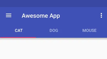
TabLayout and Toolbar in XML preview
Setting up TabLayout
That’s our main layout. Now open up YourActivity.java.
final Toolbar toolbar = findViewById(R.id.tabanim_toolbar);
setSupportActionBar(toolbar);

final ViewPager viewPager = findViewById(R.id.tabanim_viewpager);
setupViewPager(viewPager);

TabLayout tabLayout = findViewById(R.id.tabanim_tabs);
tabLayout.setupWithViewPager(viewPager);
First, start off by setting up your Toolbar. Then define the ViewPager. We’ll attach an Adapter to in the setupViewPager() method. Finally define the TabLayout, and attach the ViewPager to it.
Remember that we must attach an adapter to the ViewPager first. Then attach the ViewPager to TabLayout.
setupViewPager() method
Here I will simply initialize a ViewPagerAdapter (our custom adapter class which I will explain in a moment) and add 3 fragments to it.
For simplicity’s sake, I will be attached the same Fragment thrice which different backgrounds. However in a real app scenario, you would be attaching different once.
Let’s assume you have 3 tabs. Games, Movies, Books. Then you should be loading their respective fragments here in ORDER of the tabs.
private void setupViewPager(ViewPager viewPager) {
 ViewPagerAdapter adapter = new ViewPagerAdapter(getSupportFragmentManager(), FragmentPagerAdapter.BEHAVIOR_RESUME_ONLY_CURRENT_FRAGMENT);
 adapter.addFrag(new DummyFragment(
  ContextCompat.getColor(this, R.color.blue_grey)), "CAT");
 adapter.addFrag(new DummyFragment(
  ContextCompat.getColor(this, R.color.amber)), "DOG");
 adapter.addFrag(new DummyFragment(
  ContextCompat.getColor(this, R.color.cyan)), "MOUSE");
 viewPager.setAdapter(adapter);
}
So let’s define our Tabs and give each one a name. Cat, Dog and Mouse (for the lack of better names) will be my 3 Tabs.
Defining our Adapter
Remember that ViewPagerAdapter I told you about? Let’s create a class for it now, extend FragmentPagerAdapter and implement the required methods.
We need to store, first our Fragments itself, and then the Tab titles. We’ll do this with a List.
private final List<Fragment> mFragmentList = new ArrayList<>();
private final List<String> mFragmentTitleList = new ArrayList<>();
Our entire Adapter class will look like this:
class ViewPagerAdapter extends FragmentPagerAdapter {
 private final List < Fragment > mFragmentList = new ArrayList < > ();
 private final List < String > mFragmentTitleList = new ArrayList < > ();

 public ViewPagerAdapter(FragmentManager manager) {
  super(manager);
 }

 @Override
 public Fragment getItem(int position) {
  return mFragmentList.get(position);
 }

 @Override
 public int getCount() {
  return mFragmentList.size();
 }

 public void addFrag(Fragment fragment, String title) {
  mFragmentList.add(fragment);
  mFragmentTitleList.add(title);
 }

 @Override
 public CharSequence getPageTitle(int position) {
  return mFragmentTitleList.get(position);
 }
}
Note that addFrag() is my own custom method. I’m using it to add Fragments and its titles to the ViewPager adapter.
Tabs with ViewPager Adapter
Tab Fragment
Now that we’ve done all this, you might be wondering what is ‘DummyFragment’ and why its showing an error?
DummyFragment is to be your Fragment (obvious from the name), which holds the layout content. This is what we see when we swipe to each Tab. Ideally, you should be loading a different Fragment for each tab.
The layout could be anything. But I don’t want to complicate things.
Just be sure for testing, to make a list long enough so that its scrollable. This will allow the Quick Return scroll animation to work.
I encourage you to create your own layouts for the Tab Fragment. You could refer mine, but if you’re like “Hey, I can do this!”, then good job! Scroll down to the next section.
    public static class DummyFragment extends Fragment {
        int color;
        SimpleRecyclerAdapter adapter;

        public DummyFragment() {
        }

        @SuppressLint("ValidFragment")
        public DummyFragment(int color) {
            this.color = color;
        }

        @Override
        public View onCreateView(LayoutInflater inflater, ViewGroup container, Bundle savedInstanceState) {
            View view = inflater.inflate(R.layout.dummy_fragment, container, false);

            final FrameLayout frameLayout = view.findViewById(R.id.dummyfrag_bg);
            frameLayout.setBackgroundColor(color);

            RecyclerView recyclerView = view.findViewById(R.id.dummyfrag_scrollableview);

            LinearLayoutManager linearLayoutManager = new LinearLayoutManager(getActivity().getBaseContext());
            recyclerView.setLayoutManager(linearLayoutManager);
            recyclerView.setHasFixedSize(true);

            List<String> list = Arrays.asList(VersionModel.data);

            adapter = new SimpleRecyclerAdapter(list);
            recyclerView.setAdapter(adapter);

            return view;
        }
    }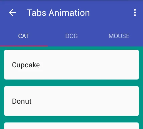
Tabs with Fragments attached
Tab Listener
We can interact with the TabLayout and dictate what must happen when selecting a Tab, unselecting, reselecting and so forth.
While we’re staying on topic, let me show you how we can add such a listener to it.
tabLayout.setOnTabSelectedListener(new TabLayout.OnTabSelectedListener() {
 @Override
 public void onTabSelected(TabLayout.Tab tab) {
  viewPager.setCurrentItem(tab.getPosition());

  switch (tab.getPosition()) {
   case 0:
    showToast("One");
    break;
   case 1:
    showToast("Two");
    break;
   case 2:
    showToast("Three");
    break;
  }
 }

 @Override
 public void onTabUnselected(TabLayout.Tab tab) {}

 @Override
 public void onTabReselected(TabLayout.Tab tab) {}
});
Note viewPager.setCurrentItem(tab.getPosition()) handles changing the Fragment based on Tab click.
Yes, all it takes is to use setOnTabSelectedListener with TabLayout.OnTabSelectedListener().
Just for demonstration, I’ll show a simple Toast when you tap a Tab item. This works not only when tapping, but also when swiping left or right! In essence, a Toast pops each time the Fragment loads into view.
v23.0.0 Tab Listener Fix:
With the release of Android Marshmallow, libraries got updated to 23.0.0 including the Design Support Library. This update somehow broke the tab listener in a viewpager + tab combination. So if click listener for the tabs stops working for you, here is a suggested workaround for it, suggested by Chris Banes himself.
Material Design Tabs in Action
Let’s take a breath and break down what we’ve accomplished so far:
-
Created our main
TabLayout -
Initialized a
ViewPagerand attached an Adapter (ViewPagerAdapter) to it -
Attached the
ViewPagerto our Tabs -
Created the
Fragmentcontent to supply ourViewPagerwith
Finally with all that code behind us, lets run our app and see how it looks like.
That’s it! We’ve got some great looking Material Design Tabs (without a third party library). Created the needed adapter and even got those snazzy on scroll animations for our Toolbar.
Note the Tab underline highlight takes colorAccent by default. Also, did you just notice we got those animations to work just by defining it in XML? No Java. Cheers!
Thats what Android Design Support library allows us to do. Making the easy stuff easier.
How are you using TabLayout in your apps? Have anything else to add? Let me know in the comments.