
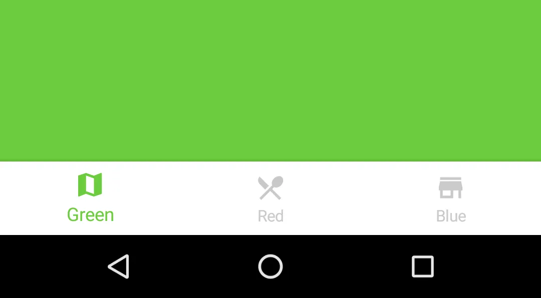
One of the newest additions to the Material Design is the Bottom Navigation Bar. Its like the TabBar you see on iOS, and similar in functionality too.
Android Bottom Navigation

Facebook iOS App
Before getting to the tutorial, let’s get to know what Bottom Navigation is. Also let’s narrow down on the best scenarios to use it.
What is Bottom Navigation?
Bottom navigation bars make it easy to explore and switch between top-level views in a single tap. - Material Design spec
This helps developers opt for Bottom Navigation, instead of a Navigation Drawer.
If you have about four top-level navigation items, its ideal to use Bottom Navigation. Otherwise, go for a Navigation Drawer. We don’t want the Bottom Navigation looking too crowded now, do we?
This was already common for iOS apps. But now, a lot of Android apps have started adapting this. To name a few, the YouTube app recently made the switch.

Bottom Navigation was recently adopted by the Android Youtube app
When to use?
A Bottom Navigation is best used when you have three to five top-level navigation items of similar importance.
Until now, the default, go-to navigation solution is the Navigation Drawer. Would you agree?
Grab all your screens, throw them in the Navigation Drawer and we’re done. I don’t blame you. Once upon a time, I was guilty of the same.
For just 4 navigation screens, would you use an entire Navigation Drawer for it? Besides, that huge side menu is hidden away by a tiny hamburger menu.
Think of the benefits a Bottom Navigation provides:
- always visible - its omnipresent no matter which of the 4 screens you visit
- simpler - lesser the options, easier to remember
So given all that, in such a scenario, a Bottom Navigation will serve you the best.
A simpler way to look at it –
If all that seems too complex, then just keep the number of navigation screens in mind.
- 2 screens - Tabs
- 3 to 5 screens - Bottom Navigation
- 5 and above - Navigation Drawer
Easy enough? Now let’s move on.
Getting Started
I must admit the Bottom Navigation looks pretty cool. I noticed Aurelien Hubert has a fancy Bottom Navigation library. So let’s use that for this tutorial.
NOTE
Android Design Support Library provides a Bottom Navigation Bar too. But compared to this one, what we can do with it is currently limited. Hence, to know what all is possible with the Bottom Bar, we’ll go with Hubert’s library.
However, if you want to use the Design Support Library instead, this tutorial’s got you covered.
But seriously, read this first. This one’s got all the bells and whistles!
First, start by adding the library’s dependency to your **app/**build.gradle file.
dependencies { compile ‘com.aurelhubert:ahbottomnavigation:0.1.3’ }
NOTE
I hope your app supports minSdk >14. If not, make sure you do, because this library supports 14 and above only. Seriously, why are you supporting 0.99% of the (ancient) devices!?
Adding Bottom Navigation to Layout
Make sure your parent layout is a CoordinatorLayout. This ensures the Bottom Navigation behaves correctly with Snackbar and FAB.
<android.support.design.widget.CoordinatorLayout xmlns:android=“http://schemas.android.com/apk/res/android” xmlns:app=“http://schemas.android.com/apk/res-auto” xmlns:tools=“http://schemas.android.com/tools” android:id=”@+id/coordinator” android:layout_width=“match_parent” android:layout_height=“match_parent”>
<android.support.design.widget.AppBarLayout
    android:layout_width="match_parent"
    android:layout_height="wrap_content">

    <android.support.v7.widget.Toolbar
        android:id="@+id/toolbar"
        android:layout_width="match_parent"
        android:layout_height="?attr/actionBarSize"
        android:background="?attr/colorPrimary"/>

</android.support.design.widget.AppBarLayout>

<FrameLayout
    android:id="@+id/frame"
    android:layout_width="match_parent"
    android:layout_height="match_parent"
    app:layout_behavior="@string/appbar_scrolling_view_behavior"
    tools:background="#EFEFEF"/>

<com.aurelhubert.ahbottomnavigation.AHBottomNavigation
    android:id="@+id/bottom_navigation"
    android:layout_width="match_parent"
    android:layout_height="wrap_content"
    android:layout_gravity="bottom"/>
</android.support.design.widget.CoordinatorLayout>
The FrameLayout with ID @+id/frame is the placeholder UI to load our Fragment.
Moving onto Java
Each Bottom Navigation bar item denotes a different color. For demonstration purposes, each item click will change the Fragment’s view color. But ideally, you’ll want to load a different Fragment for each item.
Initializing and using the Bottom Navigation is easy as one two three. I ain’t even kidding. See for yourself!
1. Create your Items
There are different constructors you can use to define your Bottom Navigation items.
At the least, you must provide a title and icon. In other words, a String and Drawable.
Both parameters can be hardcoded Strings. But for the sake of good practice, lets reference both from XML resources.
AHBottomNavigationItem item1 = new AHBottomNavigationItem(R.string.bottomnav_title_0, R.drawable.ic_map_24dp);
2. Add Bottom Navigation items
Once you’ve defined the number of items, its time to add them to the Bottom Navigation.
Use the following method to do so.
bottomNavigation.addItem(item1);
3. Set Listener
Finally, you need to listen to item clicks. So add the following to your Fragment.
bottomNavigation.setOnTabSelectedListener(new AHBottomNavigation.OnTabSelectedListener() { @Override public void onTabSelected(int position, boolean wasSelected) { fragment.updateColor(Color.parseColor(colors[position])); } });
I have a tiny card layout centered in my Fragment layout. Depending on the item click, I change its color.
Also, don’t forget to set your default item. This item depicts the default (home) screen which people will see.
// Setting the very 1st item as home screen.
bottomNavigation.setCurrentItem(0);
Ideally, you’d want to change the Fragment here. The same way when creating a Navigation Drawer in Android.
Styling Bottom Navigation
Off the bat, the library provides considerable styling options. But after recent updates, there has been a lot more.
Some of these additions include notification badges and coordinating behaviors. It also includes on-scroll Quick Return pattern.
Its all that one could ever want with the Bottom Navigation. This library is much more feature-rich than what Android Design Support Library offers. So if you want more customization options and more control, you know what to use.
Before we get to that, here’s a heads-up. We’ll be using and referencing a lot of colors. Normally, we reference colors in Android like this:
ContextCompat.getColor(context, R.id.yourcolor);
Now I’m no fan of writing such a lengthy line for fetching a simple color resource.
So I’ll write a simple method that shortens what I have to type.
private int fetchColor(@ColorRes int color) { return ContextCompat.getColor(this, color); }
Great! From now on I don’t have to write long lines. This simple method call will do to fetch my color resource.
TIP
Hiding the complexities of a system by providing a simpler interface is known as the Facade Design Pattern.
With that out of the way, let’s look at implementing all the possible styling options.
Simple Theming
At the most basic level, the Bottom Navigation requires these attributes:
- Default background color
- Accent color - highlights active items
- Inactive color - (you guessed it!) color for inactive items
bottomNavigation.setDefaultBackgroundColor(Color.WHITE); bottomNavigation.setAccentColor(fetchColor(R.color.yourAccentColor)); bottomNavigation.setInactiveColor(fetchColor(R.color.yourInactiveColor));
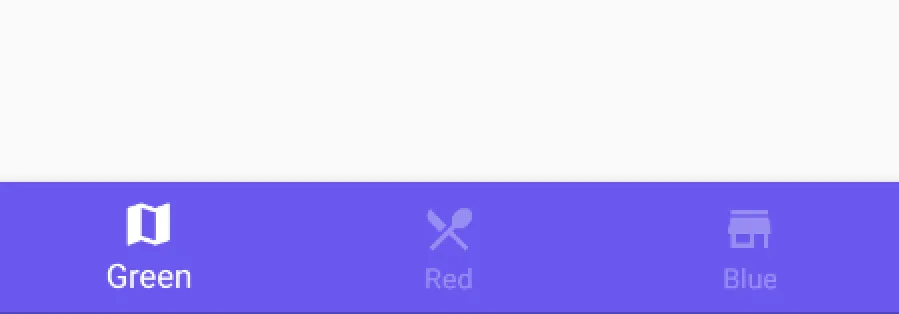
With such basic styling, you can expect your Bottom Navigation to look like this.
Bottom Navigation with basic styling
Color Ripple Effects
You can take styling a step further by using a color ripple.
Yes, I’m talking about this.
Bottom Navigation with Color Ripple
The good news is that its easy to enable a colored ripple.
// Enables color Reveal effect bottomNavigation.setColored(true); // Colors for selected (active) and non-selected items (in color reveal mode). bottomNavigation.setColoredModeColors(Color.WHITE, fetchColor(R.color.bottomtab_item_resting));
setColoredModeColors() defines the colors for items when using color ripple.
Text Labels
Here’s what the Material Design documentation tells us. If Bottom Navigation has:
- 3 items - display icon and text always for all items
- 4-5 items - display text for active icon only and hide for inactive views
Now, you might have a good guess on what I’m going to say next.
“This is what the Material Design guidelines suggest, so let’s do just that”.
But this time I won’t. I disagree, and so should you. I’ll tell you why.
The Material Design guidelines aren’t always right
Whether you have 3 or 5 items in your Bottom Navigation, always show text labels!
By doing so, you’ll avoid the mystery meat navigation problem that plagues Material Design.
Buttons or links that don’t explain to you what they do. Instead, you have to click on them to find out
Mystery Meat Navigation
I’m sure we’ve all been victims of this at some point at least. We click on a button assuming it to do something, only for it to do something else entirely!
So do yourselves, and your users a favor. Always, show text labels for your Bottom Navigation icons.
bottomNavigation.setTitleState(AHBottomNavigation.TitleState.ALWAYS_SHOW);
I did my part to give good UX. What about you?
Translucent Bottom Navigation
Translucent Bottom Navigation
First, you create an app Theme that supports translucent navigation.
…
Next, in your AndroidManifest.xml, apply this Theme to your Bottom Navigation Activity.
…
Finally, the last step is to add one simple line to YourActivity.java.
bottomNavigation.setTranslucentNavigationEnabled(true);
NOTE
Disable Instant Run if you observe weird UI glitches. I’ve disabled mine by default.
Behaviors
The library allows on-scroll animation for the Bottom Navigation Bar. It also supports a Translucent Theme for the same.
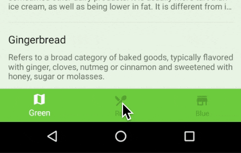
‘Quick Return’ Animation
A View can scroll off-screen with the content and return when the user reverse scrolls.
Quick Return
Hide on scroll - Quick Return
This is a popular Animation pattern that helps maximize screen estate while scrolling. Usually the Quick Return animation pattern is used for Toolbars.
The good new is, this library allows us to enable the same for Bottom Navigation. You just have to add this simple line.
bottomNavigation.setBehaviorTranslationEnabled(true);
Translucent Navigation with Quick Return
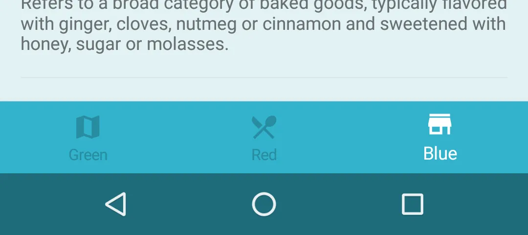
Now you might get ambitious and want to combine both. A translucent Bottom Navigation and Quick Return pattern.
While I applaud your bravery, there’s a small hiccup in making both work together. You already might have set up a Translucent Navigation.
But once you enable Quick Return, you might notice the scroll not behaving as expected. The Toolbar might appear clipped. No amount of fitsSystemWindows will help.
Toolbar clipping with Translucent bar + quick return
That’s the hiccup I’m talking about.
But don’t worry. I’ll tell you how to fix this. Its not perfect, but it gets the job done.
All you have to do is alter your AppBarLayout. Add a View as a child to your AppBarLayout, above the Toolbar View.. This View should have a height equal to the StatusBar, which is 24dp.
<android.support.design.widget.CoordinatorLayout > <android.support.design.widget.AppBarLayout>
  <LinearLayout
  android:orientation="vertical">
     <View
    android:layout_width="match_parent"
       	android:layout_height="@dimen/statusBarSize" />

   	   <android.support.v7.widget.Toolbar
        	android:id="@+id/toolbar"
       	android:layout_width="match_parent"
       	android:layout_height="?attr/actionBarSize"
       	android:background="?attr/colorPrimary"/>
</LinearLayout>

</android.support.design.widget.AppBarLayout>

<FrameLayout
    android:id="@+id/frame"
    app:layout_behavior="@string/appbar_scrolling_view_behavior"/>

<com.aurelhubert.ahbottomnavigation.AHBottomNavigation
    android:id="@+id/bottom_navigation"
    android:layout_width="match_parent"
    android:layout_height="wrap_content"
    android:layout_gravity="bottom"/>
</android.support.design.widget.CoordinatorLayout>
TIP
AppBarLayout is a vertical LinearLayout that determines scrolling behavior of its child Views.
Translucent bar with quick return
Notification Badge
This again is simple. For the sake of demonstration, I’ll show you by creating a dummy notification.
Show notification
Let’s say I want to show a notification count of 1, for the last item. We can use the library’s AHNotification class for this.
private void createFakeNotification() { new Handler().postDelayed(new Runnable() { @Override public void run() { AHNotification notification = new AHNotification.Builder() .setText(“1”) .setBackgroundColor(Color.YELLOW) .setTextColor(Color.BLACK) .build(); // Adding notification to last item.
           bottomNavigation.setNotification(notification, bottomNavigation.getItemsCount() - 1);

           notificationVisible = true;
       }
   }, 1000);
}
The Builder allows us to customize the text, its color and the background. Then, remember to set that notification to the Bottom Navigation item.
Notification Badge
Remove notification
In the above code snippet, I used a boolean notificationVisible. It tells us whether the notification badge is currently visible or not.
A notification must be removed or dismissed once we tap the respective item. We can do this in 2 simple steps:
- detect the item click via
OnTabSelectedListener - check if notification is visible and remove it
bottomNavigation.setOnTabSelectedListener(new AHBottomNavigation.OnTabSelectedListener() { @Override public boolean onTabSelected(int position, boolean wasSelected) {
    //TODO: update Fragment here

         // remove notification badge
   int lastItemPos = bottomNavigation.getItemsCount() - 1;
         if (notificationVisible && position == lastItemPos)
             bottomNavigation.setNotification(new AHNotification(), lastItemPos);

         return true;
     }
 });
To remove a notification, we set an EMPTY notification for that item. That is all there is to it.
Dismissing notification badge
Managing Bottom Navigation with Fragments
It’s pretty obvious by now that each Bottom Bar’s item manages a Fragment.
To put it in other words, you could say it’s similar to Material Tabs with a ViewPager. Except you can’t swipe.
Maintaining Fragments with ViewPager
Now that we’ve decided on using a ViewPager to handle our Fragments, we need to write an Adapter.
For that, we have two choices:
Now, depending on your use case, choosing between the two can make all the difference. But I’ll spare you all the rambling and state it simply.
Using a
**FragmentStatePagerAdapter**is more useful when there are a large number of pages. It holds on to much less memory associated with each visited page.
Okay, our Bottom Navigation has three items, but it can go up to five. So considering the extreme scenario, we can have five resource-heavy Fragments. So you can do your app a favour and use a **FragmentStatePagerAdapter**.
But if you’re interested in knowing in depth, this SO post has all the answers.
Creating the ViewPager Adapter
There’s a ‘smart’ implementation of FragmentStatePagerAdapter that allows us to access already existing Fragments from the Adapter. So go ahead and grab it from this GitHub gist.
Next, to actually use this, we need to create our Adapter that extends SmartFragmentStatePagerAdapter. So let’s call it BottomBarAdapter.
public class BottomBarAdapter extends SmartFragmentStatePagerAdapter {
private final List
public BottomBarAdapter(FragmentManager fragmentManager) {
    super(fragmentManager);
}
// Our custom method that populates this Adapter with Fragments public void addFragments(Fragment fragment) { fragments.add(fragment); } @Override public Fragment getItem(int position) { return fragments.get(position); }
@Override
public int getCount() {
    return fragments.size();
}
}
Nothing fancy here. Just note the List<Fragment> that our Adapter uses here.
NOTE
In future if you want to fetch a particular Fragment, you can do it using **pagerAdapter.getRegisteredFragment(position)**.
Now that our Adapter is ready, we need to connect it to the ViewPager. But wait. Not so fast!
There is one tiny change we need to do to the ViewPager. Swiping must be disabled.
Disable swiping on ViewPager
The easiest way is to create a custom ViewPager. So let’s create a new class extending ViewPager. I call it NoSwipePager, for the lack of a better name.
public class NoSwipePager extends ViewPager { private boolean enabled;
public NoSwipePager(Context context, AttributeSet attrs) { super(context, attrs); this.enabled = true; }
@Override public boolean onTouchEvent(MotionEvent event) { if (this.enabled) { return super.onTouchEvent(event); } return false; }
@Override public boolean onInterceptTouchEvent(MotionEvent event) { if (this.enabled) { return super.onInterceptTouchEvent(event); } return false; }
public void setPagingEnabled(boolean enabled) { this.enabled = enabled; } }
NOTE
Make sure you reference NoSwipePager in your XML layout instead of a regular ViewPager.
Once, you initialize your ViewPager in Activity, you need to explicitly disable swiping. You can do it with a single line.
viewPager.setPagingEnabled(false);
With the previous step, our Adapter and ViewPager is now ready to roll. The final step is to create our Fragments, then pass them to the Adapter and finally connect the Adapter with ViewPager.
Connecting ViewPager with PagerAdapter
Let’s create a simple Fragment called DummyFragment. It accepts one argument “color”. Using a different color will tell us which Fragmentinstance is shown when we use the Bottom Navigation.
Once your Fragment is ready, let’s get to completing our ViewPager.
1. Set up ViewPager
// init UI viewPager.setPagingEnabled(false);
2. Initialize PagerAdapter
pagerAdapter = new BottomBarAdapter(getSupportFragmentManager());
3. Create Fragments and add them to Adapter
Bundle bundle = new Bundle(); bundle.putInt(“color”, color);
DummyFragment fragment = new DummyFragment(); fragment.setArguments(bundle);
pagerAdapter.addFragments(fragment);
4. Finally, set the **ViewPager** Adapter
viewPager.setAdapter(pagerAdapter);
Handling Click Events
Hang in there, we’re almost done!
Since we disabled ViewPager swiping, the only way to switch Fragments is by clicking the Bottom Navigation Items. So we need to manually handle those click events!
Don’t worry, it’s dead simple. See for yourself!
bottomNavigation.setOnTabSelectedListener(new AHBottomNavigation.OnTabSelectedListener() { @Override public boolean onTabSelected(int position, boolean wasSelected) {
             **if (!wasSelected)**
                 **viewPager.setCurrentItem(position);**
return true; } });
The click listener provides us a useful boolean that tells us if the current click is happening on an already selected item. So we simply need to change the Fragment when this is NOT the case.
That’s all there is to it.
Output
Just to give you a visual on how all that code works, here’s a GIF of everything put together.
 *
*
Where to, from here?
The Bottom Navigation is the newest entry in Material Design. It pushes us to rethink our navigation structures.
At first, it might be confusing. But I hope this post has helped clear the air.
SOURCE CODE:
Available on GitHub.
Other Options
- Bottom Navigation Bar by roughike
Clearly its the more popular one. But this library seems to work just as fine, so there’s no cause for alarm. - Official Bottom Navigation by Design Support Library
However, it is very limited in options in terms of styling and customization.
Wrap Up
So what do you think about Bottom Navigation? It is very common in iOS but I’m excited to see how we’re going to use it in Android.
A lot of Android apps have already adopted it (Instagram, Google+ and Quora to name a few). What about you? Let me know in the comments below.