
One of the new features in Android O is using Custom Font Resources. In this Android Tutorial, let’s see how to use them in our apps. The first Android O Developer Preview just dropped. There’s a lot for us developers to know about. One of the highlights in Android O is the ability to use custom font resources. In this article let’s look at using custom fonts in our apps. Before Android O, how difficult was it to use a custom font in our apps? We had two options:
- Write a custom View
- Use a library
Both options need considerable effort, for just a simple font. Extending your custom View in EVERY layout.xml, instead of TextView is tedious. Moreover, using a third-party library for something basic as text, can be a risky call. How many times have you admired a beautiful font, and wanted to use that in your app? But the sheer thought of integrating it, made you feel it’s not worth it? Well, not anymore! Seeing Android O giving official support to custom fonts brought a big smile to my face. I hope it did to you as well.
Getting Started with Font Resources
Android O supports custom fonts via font resources. The magic lies in the app/res folder.
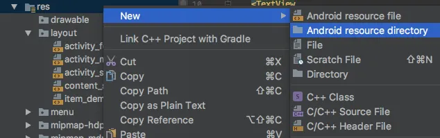
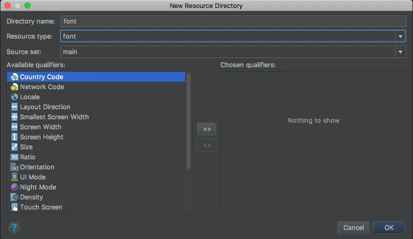
Creating the font folder is easy. It is like every other resource such as menu, values, drawable, etc. So right click the res folder and create a new font folder.
Now you’re ready to drop in your fonts. So go ahead and pick a font of your choice. Font Formats Android O supports both .otf (OpenType) and .ttf (TrueType) font formats. I’m going to create a simple page design. Like a book, where the heading is a large serif font.
Using Custom Font Resources in Android O
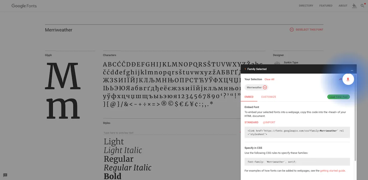
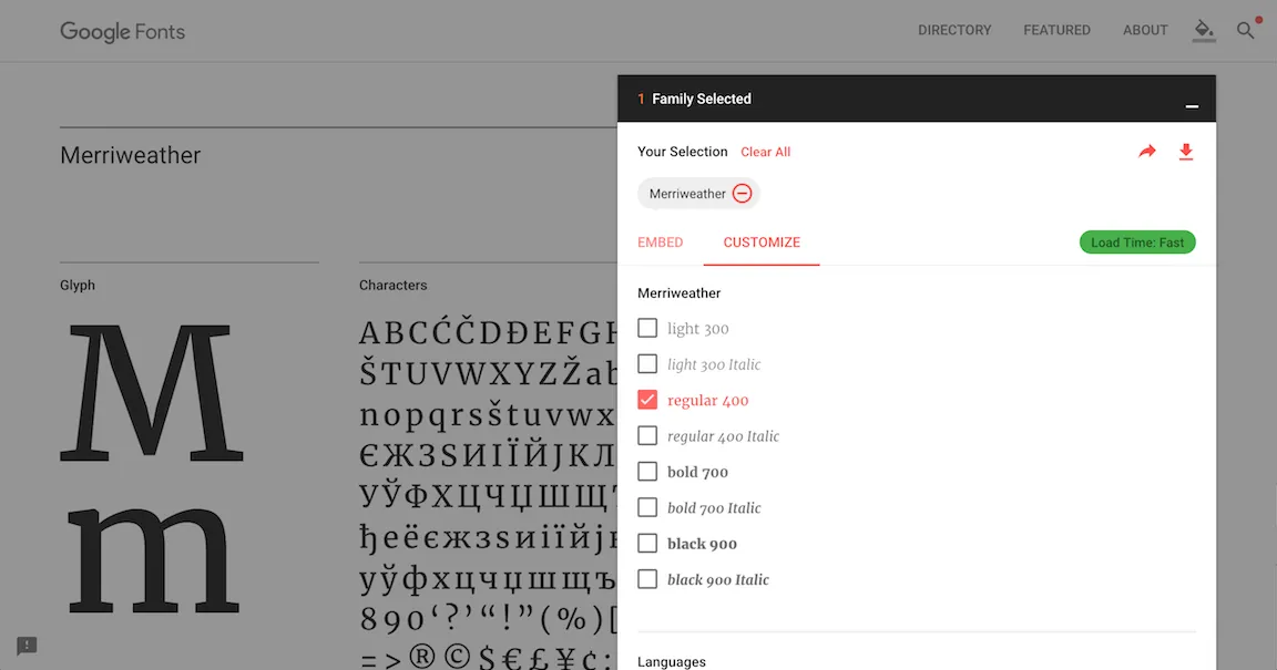
For this Android O tutorial, I’m going to pick my fonts from Google Fonts. They have a great collection, so definitely check that out! My two font choices are:
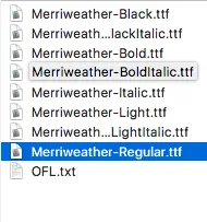
Here are the available font styles for Merriweather. I’m happy with just the regular font so I’ll take that alone.
You can download the .otf or .ttf fonts of your choice and drop them in the res/fonts folder. Note: Keep in mind, that resource files should use lowercase alphabets and underscores. For example, the downloaded font was Merriweather-Regular.ttf. When you copy it to the res/fonts folder, rename it to merriweather_regular.ttf. Once you drop in your custom font files in the fonts folder, you can preview your fonts. Simply double-click on a font, and Android Studio previews the typeface. Neat right?
We’re going to need two fonts. One for the heading, and one for the body text. Look closely at the design above. The headline uses a serif font, while the content body is a sans-serif. In other words, the heading will use Merriweather while the content body will use Lato. Remember, I encourage you to use whatever you like. Feel free to experiment. I’m just using a simple example to show you what’s possible.
Using Custom Fonts via XML
Head over to your XML layout file. Let’s skip the layout design and go straight to using our fonts.
<TextView
    android:layout_width="match_parent"
    android:layout_height="wrap_content"
    android:fontFamily="@font/merriweather_regular"/>
Here’s my simple TextView. All you need to use a font is ONE attribute, and you’re good to go. Its really that easy!
android:fontFamily="@font/merriweather_regular"Custom Fonts via Java
You can assign a font programmatically too. First fetch the font typeface. Then set it to your TextView.
Typeface typefaceLato = getResources().getFont(R.font.lato_regular);
mTextIntro.setTypeface(typefaceLato);
Additionally, you can even specify a basic font style such has bold, italic or a combination of the two.
mTextIntro.setTypeface(typefaceLato, Typeface.BOLD_ITALIC);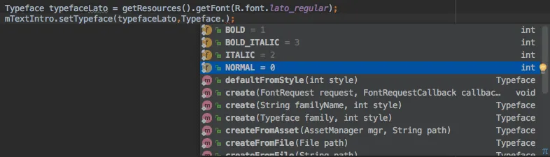
There’s something interesting to note here. If you’re using a font family, you’ll have the same font, with different weight. You know what I’m talking about. If you download a font and extract the .zip file, you’ll get multiple font variations like this.
So for example, assume I’m using Merriweather-Regular. If Iset the typeface style to bold, Android will choose Merriweather-Bold from my font-family and display that. Now that I’ve dropped a hint about font family, you might be wondering what exactly it is. So let’s talk about that next.
Using a font family
As we’ve seen above, what if you want to use the same font in its different styles? Alright, maybe you can get away using the default Typeface style of bold or italic. But what if you want a thinner font? Thin and italic? When you downloaded the .zip file from Google Fonts, did you notice there wasn’t just a single font? There was a multitude of them. All varying in weight or thickness. You can group all these different fonts, and use them together as a font family.
Creating a Font Family
You can do this in 3 easy steps.
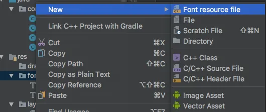
1 Right click the res/fonts folder and create a new ‘Font resource file’.
- Add an element for EVERY font variation you wish to include. Let’s go back to the design we’re trying to do. Font styles that are thin, thick and in italics would be nice. So let’s add three. I only wish to vary fonts for the body content. So let’s add 3 font variations for Lato.
<font-family xmlns:android="http://schemas.android.com/apk/res/android">
    <font
        android:font="@font/lato_light"
        android:fontStyle="normal"
        android:fontWeight="300"/>

    <font
        android:font="@font/lato_regular"
        android:fontStyle="normal"
        android:fontWeight="400"/>

    <font
        android:font="@font/lato_bold"
        android:fontStyle="normal"
        android:fontWeight="700"/>
</font-family>
If you’re unsure about the fontWeight, a quick look at Google Fonts will clear your doubts.
- After that, using a single font from a font family is the same. Just reference them via the font attribute
android:fontFamily="@font/lato_black"Just remember to first add all your font variations to the font folder. Then create a ‘Font resource file’. Then add an element per font variation. Finally, reference your font style just like a regular single font.
Customizing Font Styles for Readability
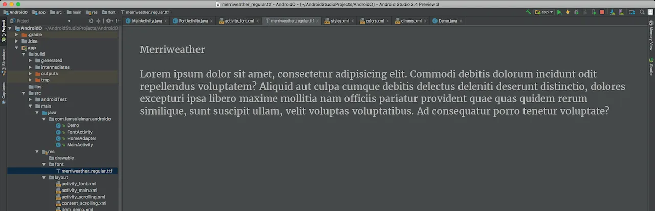
Using the fonts outright on a TextView does not guarantee good readability. Take a look for yourselves.
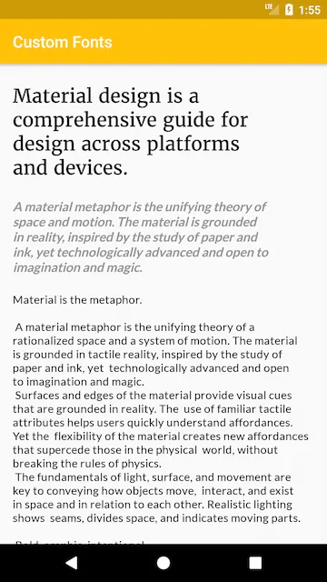
Seriously, that’s bad. It hardly readable. Keep in mind that a smartphone is a small device, compared to a desktop or tablet. This makes it harder to read the text. So if your app’s priority is for users to read content. Then its also your priority to make sure the content is easy to read. The key lies in playing around with two attributes:
letterSpacinglineSpacingExtra
So with that in mind, here are my TextView elements in the layout.
...
<TextView
style="@style/TextAppearance.AppCompat.Headline"
android:layout_width="match_parent"
android:layout_height="wrap_content"
android:fontFamily="@font/merriweather_regular" />
<TextView
style="@style/TextAppearance.AppCompat.Subhead"
android:layout_width="match_parent"
android:layout_height="wrap_content"
android:lineSpacingExtra="4dp"
android:letterSpacing="0.08" />
<TextView
style="@style/TextAppearance.AppCompat.Body1"
android:layout_width="match_parent"
android:letterSpacing="0.04"
android:layout_height="wrap_content"
android:fontFamily="@font/lato_regular"
android:lineSpacingExtra="4dp" />
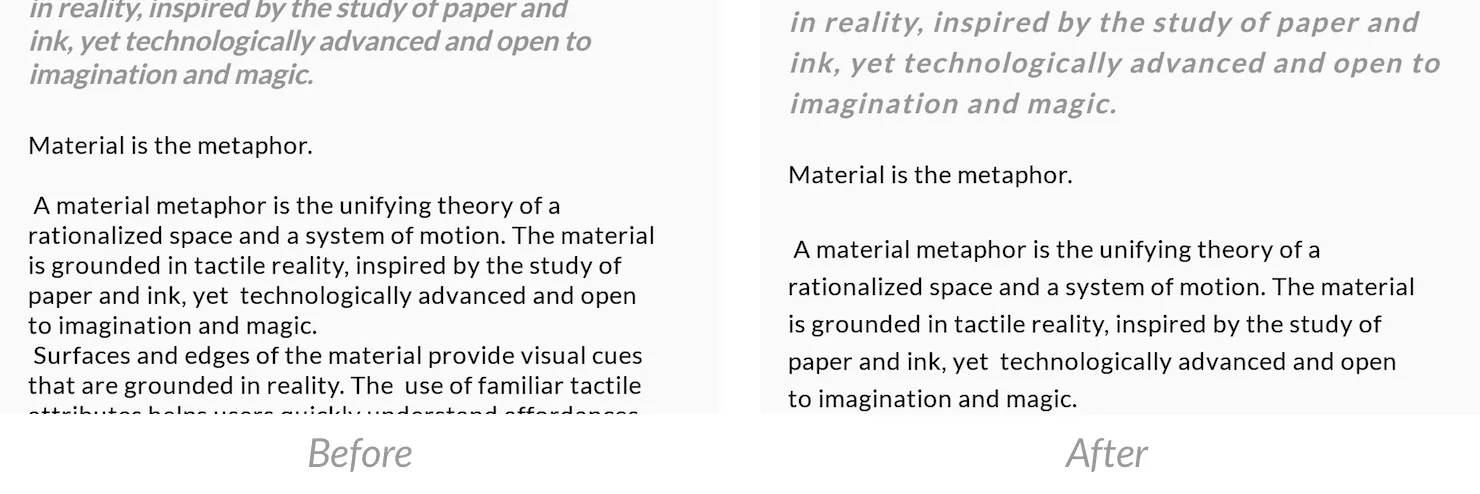
...With these extra attributes, font should now be easy to read. See the difference for yourself. Its better right?
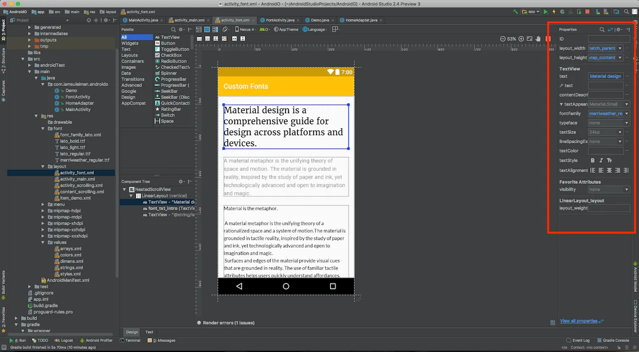
If you have a hard time remembering the different attributes, use the ‘Design’ Pane in the XML Editor. The ‘Properties’ pane on the right, lists all available attributes that you can change.
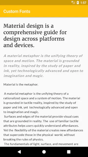
Final Results
Here’s how the app finally looks like.
Now take a breather here and notice how easily this was. We used 3 different custom fonts without breaking a sweat. Using a font of your choice is as simple as drag and drop! Then, all it took was a single attribute to reference the font file. I’ve used merriweather_regular for the large title heading. The following introduction text is like a quote. That uses lato_bold, with Typeface.ITALIC.
Typeface typefaceLato = getResources().getFont(R.font.lato_bold);
mTextIntro.setTypeface(typefaceLato, Typeface.ITALIC);
Yes, such a mix and match is also possible.
SOURCE CODE: Available on GitHub
Where to from here?
Using custom Font resources is just one of the new features in Android O. You can read about the other Android O features here. While using custom fonts is something basic, its good to know its finally added. Also, it’s relative ease of use makes this feature adoptable by many Android Developers. So what’s your take on custom fonts? How are you using it? Let me know in the comments. Also, I’ll be covering other new Android O tutorials in future articles. So don’t forget to subscribe below.