Android Pagination Tutorial – Adding Swipe-to-Refresh
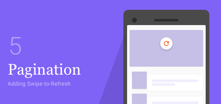
Swipe-to-Refresh is a popular way of refreshing data. In part 5 of the Android pagination tutorial, I will show you how to implement Swipe-to-Refresh.
Thoughts on Design and Mobile App Development
Swipe-to-Refresh is a popular way of refreshing data. In part 5 of the Android pagination tutorial, I will show you how to implement Swipe-to-Refresh.
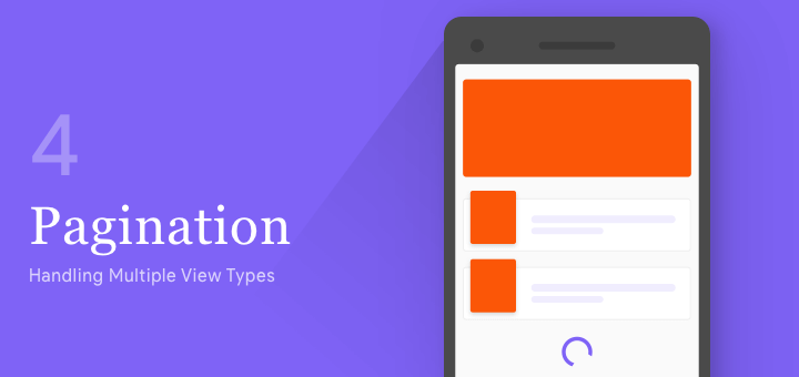
Pagination is also known as endless or infinite scrolling. This is achieved using RecyclerView. In this tutorial, I’ll show you how to paginate when...

You can now style and customize your Google Maps colors and more. In this Android tutorial, let’s see how we can do that in...

Picture in Picture or PIP is a feature famously seen on YouTube and Android TV apps. It minimizes your content (typically video), keeping it...
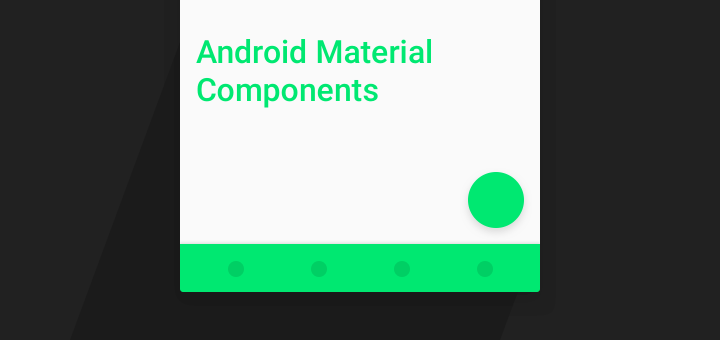
Material Components are a set of UI components that helps you build Android apps with Material Design. In this post, I’ll cover every Material Design...

During the concluded Google I/O 2017, there were some amazing announcements about Android. Say hello to Android Architecture Components. For once, these are announcements...
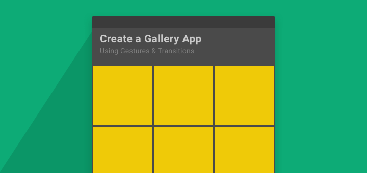
In this post, we’ll look at creating a Material Design style, image Gallery app for Android. It will support image gestures like zoom, as...
One of the new features in Android O is using Custom Font Resources. In this Android Tutorial, let’s see how to use them in...

The Android O SDK (API 26) dropped recently and the internet went nuts! The Developer Preview SDKs brought along many new features. But these...
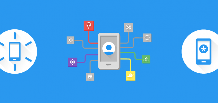
A while ago, Google announced something really interesting called the Awareness API. According to Google Developers – Android Awareness API bridges the physical world...