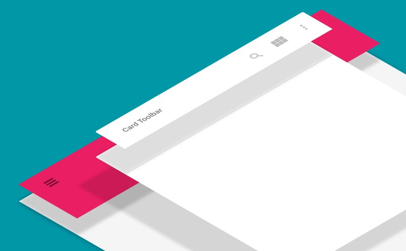
I heard Android updated its Material Design specs, so I revisited the site to check out what’s new. While looking around the Layout Structure section, I came across a particular image “Flexible toolbar and card toolbar”. So being the inquisitive person I am , I went ahead trying to replicate the pattern.
In this post we’ll look at how to make this. A Card Toolbar resting above another extended Toolbar. Also read: Add a Toolbar Elevation on pre Lollipop.
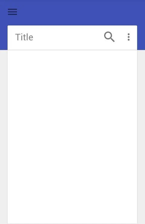
Layout Structure
If you observe closely, the background is a regular Toolbar with an extended height. It doesn’t have a menu, whereas the secondary Toolbar is set within a CardView, inflates a menu and a Title as well. There is a divider (View) that rests below the secondary Toolbar. Let’s look at how our layout structure will look like first.
Extended Toolbar
The extended Toolbar takes double the default Toolbar height (i.e. 56dp x 2 = 112dp) keeping in mind that’s the measurement for a portrait oriented phone. So you might want to add relevant values under your dimens.xml for landscape and tablet sizes as well! However, I will cover the minimum dimen values here.
Toolbar Height
Below are the default Toolbar heights. Remember we need twice the Toolbar’s height for the extended Toolbar. Mobile Landscape: 48dp Mobile Portrait: 56dp Tablet/Desktop: 64dp Under res/values/dimens.xml add this:
112dpThen, under your values-land and values-sw600dp, add the same item with dimensions 96dp and 128dp respectively. If you’re still wondering how I got those values, you might want to check this out. So our extended Toolbar’s XML will simply be this:
...Card Toolbar
You might have noticed the card has some margins. The top margin is the Toolbar’s height. We’ll wrap the Toolbar in a LinearLayout, along with a 1dp tall View which holds the divider. The CardView side margins when used on a phone must be minimal (since it already lacks width). However for landscape and tablet forms, you could add side margins anywhere between Toolbar Height or Toolbar Height x 2.
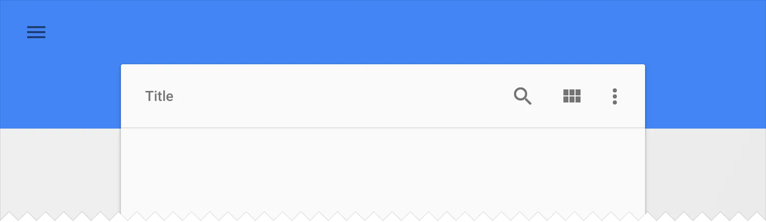
Final Layout
Final Setup
Lastly, we need a bit of Java to wrap things up so open your Activity.java and setup your SECONDARY Toolbar (Card Toolbar) to be the ActionBar. This will use the inflated menu resource as well. Keep in mind the primary Toolbar (extended) on the top will be holding just the Navigation Drawer icon.
// Card Toolbar as ActionBar (to inflate menu)
setSupportActionBar(mToolbar2);
getSupportActionBar().setTitle("Title");
// Extended Toolbar (holds drawer icon)
mToolbar1.setNavigationIcon(R.drawable.ic_action_menu);
mToolbar1.setNavigationOnClickListener(new View.OnClickListener() {
    @Override
    public void onClick(View v) {
         // TODO: Handle Navigation Drawer menu click here
    }
});
With that we’re done! You might have noticed how our layout is turning out to be on the Preview pane in Studio, while creating the XML layout. However do run the app and take a look, just in case ;-)
Divider Height Issue
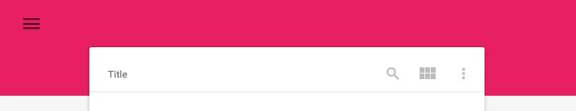
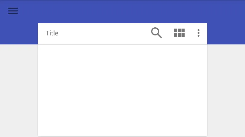
Note that the divider view below the Card Toolbar must align in height exactly with where the extended Toolbar’s height ends. Now while the preview shows it just fine, when we actually run the app, this may not be the case leading to misalignment due to reasons unknown. However this can be resolved with a simple fix. Add a layout_marginTop="-4dp" to your Card Toolbar. Feel free to alter that value as you see fit in order to align the divider and extended Toolbar exactly. Though -4dp works perfect for me! So with all things in place, run your app for the last time. It will be perfectly aligned now! Try it on different screen sizes and orientations to check if it aligns properly. Here are final screenshots from my phone, portrait and landscape orientation.
Click to buy Nexus 9
NOTE: This layout style works best on tablet devices. Nexus 9 is a brilliant tablet device and one of the best to buy.
In this post the fact that the Toolbar can be used flexibly like another other view is reinforced. We’ve added two Toolbars in our layout and attached one inside a CardView. Check out the code sample for this on GitHub. Do subscribe (below) or Follow @Suleiman_194 for instant updates on new posts, tips and tricks in Android design!