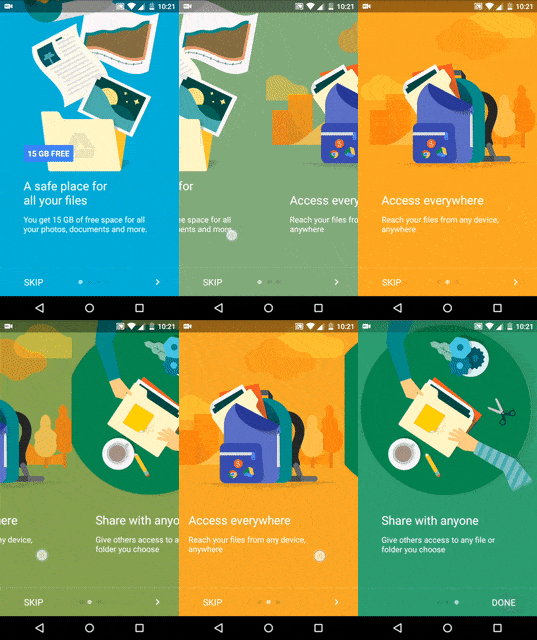
In this tutorial, learn to create an onboarding experience for your apps with Android ViewPager. Similar to the product tour app intro in Google Drive app.
When you launch an app for the first time, you see the onboarding experience. It displays slides, highlighting features about the app with vibrant imagery. Let’s make one for our app, the way Google does for theirs.
The ‘Onboarding Experience’
Its also known as App Intro or Product Tour. Call it what you want, but its what every user sees when opening a new app. Also, every other app includes it. Google too.
This type of Onboarding is known as Top User Benefits model, as noted in the Material Design spec.
Display a brief autoplay carousel (or animatic) highlighting up to three benefits of using the app. – material.google.com
When to use it?
According to specs, use it when your app uses new features or major changes.
DO NOT use it to highlight common features your users expect your app to have. In short, avoid anything that is trivial. Because its is called ‘Top User Benefits’ for a reason 😉
We will replicate the Product Tour seen on the Google Drive Android App.

Upon first look, it may appear the background transitions color when the slide changes. But look closer and you’ll will notice the drag changes color.
In this tutorial we will:
- create an onboarding experience for our app with ViewPager
- control color transition while swiping
- display these slides when launching app for the first time
Getting Started
Add the support libraries to your build.gradle file:
dependencies {
    compile 'com.android.support:appcompat-v7:23.1.1'
    compile 'com.android.support:design:23.1.1'
    ...
}
Here’s what I’m using:
- Android Studio 1.5.1
- Build Tools v23.0.2
- Support Libraries v23.1.1
- Gradle 1.5.0
Let’s use the updated App templates provided by Android Studio, to jumpstart this tutorial. Right click your package > New > Activity > Tabbed Activity. Then, set the Navigation Style to Swipe Views (ViewPager).

READ ALSO:
- Create an Image Gallery App with Android Studio 1.4 and Glide
- Using Vector Assets for Icons in Android Studio 1.4
Tabbed Activity Template
I must say, this template did half the setup work for us. Brilliant!
First, lets see what we have:
- Our Activity (I called it PagerActivity)
- SectionsPagerAdapter (
ViewPagerAdapter. Handles the slides) - PlaceholderFragment (responsible for each slide’s layout)
So with all this in place, let’s tweak it to our needs. Open your Activity layout.xml and do the following:
- Remove the
Toolbar - Add the button bar (which controls the ViewPager)
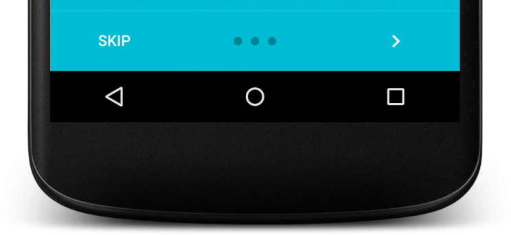
The button bar is what you noticed below the onboarding screen.

Layout:
Button Bar
- Skip Button
- Circle pager indicator (we’re rolling our own here)
- Next/ Finish Button
I wrapped all of this within a FrameLayout and added it to my Activity layout XML.
<android.support.design.widget.CoordinatorLayout
    android:layout_width="match_parent"
    android:layout_height="match_parent">

    <android.support.v4.view.ViewPager
        android:id="@+id/container"
        android:layout_width="match_parent"
        android:layout_height="match_parent"
        android:paddingBottom="?attr/actionBarSize" />

<!-- divider -->
    <View
        android:layout_width="match_parent"
        android:layout_height="1dp"
        android:layout_gravity="bottom"
        android:layout_marginBottom="?attr/actionBarSize"
        android:alpha="0.12"
        android:background="@android:color/white" />

    <FrameLayout
        android:layout_width="match_parent"
        android:layout_height="?attr/actionBarSize"
        android:layout_gravity="bottom"
        android:paddingEnd="@dimen/activity_horizontal_margin"
        android:paddingLeft="@dimen/activity_horizontal_margin"
        android:paddingRight="@dimen/activity_horizontal_margin"
        android:paddingStart="@dimen/activity_horizontal_margin">

        <Button
            android:id="@+id/intro_btn_skip"
            style="@style/Widget.AppCompat.Button.Borderless"
            android:layout_width="wrap_content"
            android:layout_height="wrap_content"
            android:layout_gravity="start|center"
            android:text="Skip"
            android:textColor="@android:color/white" />

        <LinearLayout
            android:layout_width="wrap_content"
            android:layout_height="wrap_content"
            android:layout_gravity="center"
            android:orientation="horizontal">

            <ImageView
                android:id="@+id/intro_indicator_0"
                android:layout_width="8dp"
                android:layout_height="8dp"
                android:layout_marginEnd="@dimen/activity_margin_half"
                android:layout_marginRight="@dimen/activity_margin_half"
                android:background="@drawable/indicator_unselected" />

               <!-- Your other 2 indicators here -->

        </LinearLayout>

<!-- This overlaps the next button in the last slide -->
        <Button
            android:id="@+id/intro_btn_finish"
            style="@style/Widget.AppCompat.Button.Borderless"
            android:layout_width="wrap_content"
            android:layout_height="wrap_content"
            android:layout_gravity="end|center"
            android:text="Finish"
            android:textColor="@android:color/white"
            android:visibility="gone" />

        <ImageButton
            android:id="@+id/intro_btn_next"
            style="@style/Widget.AppCompat.Button.Borderless"
            android:layout_width="wrap_content"
            android:layout_height="wrap_content"
            android:layout_gravity="end|center"
            android:padding="@dimen/activity_horizontal_margin"
            android:src="@drawable/ic_chevron_right_24dp"
            android:tint="@android:color/white" />

    </FrameLayout>

</android.support.design.widget.CoordinatorLayout>
Fragment
Here’s the layout breakdown for the ViewPager Fragment.

With the layout in place, lets get the onboarding to work with the ViewPager.
Controlling color with ViewPager
The pager adapter is already tied to the ViewPager, so thats one less to worry about.
As we swipe through, the color updates itself. In other words, the distance offset by the swipe determines the amount of color to change.
We will have 3 simple slides, with a set color for each.
int color1 = ContextCompat.getColor(this, R.color.cyan);
int color2 = ContextCompat.getColor(this, R.color.orange);
int color3 = ContextCompat.getColor(this, R.color.green);

int[] colorList = new int[]{color1, color2, color3};
We can detect changes to the ViewPager using the OnPageChangeListener; the meat of this tutorial.
mViewPager.addOnPageChangeListener(new ViewPager.OnPageChangeListener() {
     @Override
     public void onPageScrolled(int position, float positionOffset, int positionOffsetPixels) {

         /*
         color update
          */
         int colorUpdate = (Integer) evaluator.evaluate(positionOffset, colorList[position], colorList[position == 2 ? position : position + 1]);
         mViewPager.setBackgroundColor(colorUpdate);
     }

     @Override
     public void onPageSelected(int position) {

         page = position;
         updateIndicators(page);

         switch (position) {
             case 0:
                 mViewPager.setBackgroundColor(color1);
                 break;
             case 1:
                 mViewPager.setBackgroundColor(color2);
                 break;
             case 2:
                 mViewPager.setBackgroundColor(color3);
                 break;
         }

         mNextBtn.setVisibility(position == 2 ? View.GONE : View.VISIBLE);
         mFinishBtn.setVisibility(position == 2 ? View.VISIBLE : View.GONE)
     }

     @Override
     public void onPageScrollStateChanged(int state) {

     }
 });
We’ve created a ArgbEvaluator object to update the color. The transition happens from the previous slide’s color, to the next slide’s color.
The updateIndicators() method as you guessed, updates the pager indicators by toggling two drawables.
void updateIndicators(int position) {
      for (int i = 0; i < indicators.length; i++) {
          indicators[i].setBackgroundResource(
                  i == position ? R.drawable.indicator_selected : R.drawable.indicator_unselected
          );
      }
  }
NOTE:
colorList[position == 2 ? position : position + 1] indicates that if the position is at the last slide, don’t increment. Array size basics (goes from zero to (n-1). Otherwise this gives us an ArrayIndexOutOfBoundsException.
The page variable helps track the ViewPager’s current page position. Remember to increment this in your Next button’s click listener! onPageSelected() method is where we handle setting the background color for each slide.
Finally check if we’re on the last slide and make the finish button visible.
Updating the Indicators
I toggle between two simple drawables for the pager indicators.
indicator_selected.xml
<shape xmlns:android="http://schemas.android.com/apk/res/android"
    android:shape="oval">
    <corners android:radius="100dp" />
    <solid android:color="@android:color/white" />
</shape>
indicator_unselected.xml
<shape xmlns:android="http://schemas.android.com/apk/res/android"
    android:shape="oval">
    <corners android:radius="100dp" />
    <solid android:color="@color/indicator_unselected" />
</shape>
Calling it in
The onboarding screen is best called when the app is launched for the first time. This helps in making the user aware of what this app has to offer. However, from the second launch onwards, the app loads the home screen. We can achieve the same via a simple boolean SharedPreference.
Alternatively, if your app introduces major changes in an update, highlighting them with onboarding screens is a good approach.
Here are 2 handy utility methods for reading and saving a SharedPreference:
public static String readSharedSetting(Context ctx, String settingName, String defaultValue) {
      SharedPreferences sharedPref = ctx.getSharedPreferences(PREFERENCES_FILE, Context.MODE_PRIVATE);
      return sharedPref.getString(settingName, defaultValue);
  }

  public static void saveSharedSetting(Context ctx, String settingName, String settingValue) {
      SharedPreferences sharedPref = ctx.getSharedPreferences(PREFERENCES_FILE, Context.MODE_PRIVATE);
      SharedPreferences.Editor editor = sharedPref.edit();
      editor.putString(settingName, settingValue);
      editor.apply();
  }
Trigger first time launch
Check the SharedPreference before you set your Activity‘s layout. Then launch the onboarding if needed.
isUserFirstTime = Boolean.valueOf(Utils.readSharedSetting(MainActivity.this, PREF_USER_FIRST_TIME, "true"));

       Intent introIntent = new Intent(MainActivity.this, PagerActivity.class);
       introIntent.putExtra(PREF_USER_FIRST_TIME, isUserFirstTime);

       if (isUserFirstTime)
           startActivity(introIntent);
Finally, to make the app know the onboarding is complete, we update this preference to false. Do this in your Finish button’s click listener (The one we make visible on the last slide!).
mFinishBtn.setOnClickListener(new View.OnClickListener() {
        @Override
        public void onClick(View v) {

            finish();
            //  update 1st time pref
            Utils.saveSharedSetting(PagerActivity.this, MainActivity.PREF_USER_FIRST_TIME, "false");

        }
    });
APP INTRO LIBRARY:
If you want a more simpler solution, or don’t want deal with all this yourself, here’s a library alternative by Paolo Rotolo.
KOTLIN ALTERNATIVE:
For all the Kotlin lovers out there, here’s a library by Edgar Fernandes based on this post.
Taking it Further
If you’re not satisfied with such a ‘simplistic’ implementation. Or if you want to take it to the next level. Say with added animations and PageTransformers, there’s a brilliant post on Medium by Michell Bak that will help.
Final Output
Phew! That was quite some work. But hey, the new Activity templates in Android Studio took care of half the work, didn’t it? We just modified the layout to our liking and made the ViewPager do a nice color transition.
Here’s the result:
READ ALSO: How to make the Status Bar transparent
SOURCE CODE:
GitHub.
That’s a wrap for this post. We created a nice onboarding experience for our app’s first time users. Used the ViewPager’s scroll listeners to create a nice color transition on swipe. We even used a little SharedPreferences to display this screen for the first launch.
My ‘images’ don’t quite match with the ones you see on the Drive app. But I’m sure you can come up with something better! Drop ’em in the comments below.
