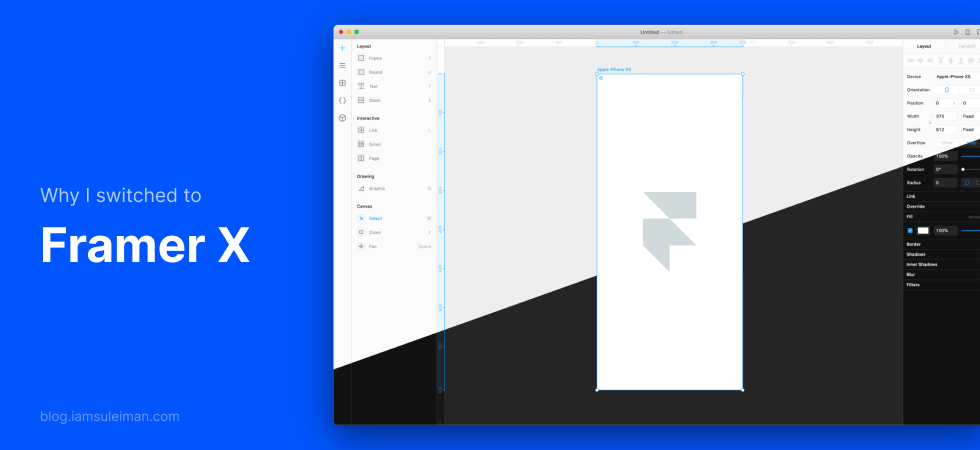
As a developer turned designer, I have always been fascinated with ways to close the gap between design and development. Recently, I stumbled upon Framer X. After using it for quite a while, I’m convinced that it is a powerful new design tool that closes that gap considerably and encourages tighter collaboration.
(more…)Category: Design
-

Build your UX Portfolio from Scratch – Choosing a Web Stack
Choosing to hand-code your UX portfolio can be an ambitious, yet daunting task. Your portfolio website is perhaps the most important avenue to display your experience, skills, and values as a designer.
With that said, you want to put your best foot forward. Having complete control in how you do this is what development (hand-coding) can offer albeit at the cost of time and increased effort.
A majority of that time could go into choosing the right set of tools for web development. Especially, when there’s a multitude of options to choose from that do similar things. It is important to choose tools that are not only easy to understand but speed up our workflow.
Even then, making a choice and then sticking with it can be hard, especially when you discover a blocker later down the road.
That’s what I’m here to help you with.
(more…) -

Build your UX Portfolio From Scratch – Design
Designing your own UX portfolio can give you an edge to stand out from the crowd. By choosing to design it yourself, it is an opportunity to showcase your brand and who you are.
By being original and unique, your portfolio will be memorable. So don’t copy a theme or someone else’s design. You don’t want your UX portfolio to come off as a common template or worse, a rip-off.
(more…) -

Build your UX Portfolio From Scratch – Getting Started
Our UX portfolio is a key piece of displaying our capabilities as a designer. Hence, it becomes essential to make one that can speak for you.
In this tutorial series, I will walk you through how I designed and developed my UX portfolio website. Sure, I could’ve named this article as ‘How I Built My Portfolio’ but I want to show you how YOU can do it too. It’s easy, and you don’t need to be a developer. Let me show you.
(more…) -
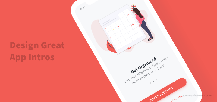
How To Design A Great Mobile App Intro By Learning From The Best
The App Intro or Product Tour is an introductory welcome experience for first-time users to your product. In this article, we will look at how to design great app intros by learning from the best mobile apps.
-

Use Empty States to your Advantage – Better User Retention
Empty States are often neglected and designed last. I don’t blame you though. After all, compared to the main screens, these aren’t important. Right?
Sadly, no. The worst that can happen is that users can uninstall your app after first use. Trust me, you don’t want that to happen.
Users who uninstall your app after first-use are most likely to never return.
Mostly, empty state screens are ignored until the app is done. Then, you realize that a particular screen could be empty at some time. So you just throw in a little error message like this and call it a day.

iOS Pages app — I’m not sure where it’s asking me to tap…
This is NOT okay! Once users reach an empty state screen, they might not know what to do. Or they simply might move on to another screen, or worse, another app.
The gravity of the situation is worse than you think! Here’s a wake-up call.
The average app mostly loses its entire user base within a few months. – Andrew Chen (Growth at Uber, LinkedIn Influencer)
First, let’s clarify what an empty state is. Then, we’ll see why it must be given importance. Next, let’s find out when it can occur and how to tackle them. Finally, we’ll see how to design effective Empty States.
What are Empty States?
I’ll spare you the boring book definition here.
Empty State or zero-data state is what a user sees when there is no data to display on-screen.

Image credit: emptystat.es
Why Bother?
We need to make sure that users learn the purpose of a particular screen. If it’s a news app, and there is no news to display, tell them why.
Well, that might sound ironic. But what if the network call fails?
The reality is that 77% of users will uninstall your app in 3 days. Only the top 10-50 apps are able to break that and keep more users.

You might say these are extreme statistics but think again.
The difficulty of User Retention
Let me put that in perspective for you.
You use apps too right? Say you want to try out a news app. I’m sure you don’t download just one, but at least a couple of them.
Then, you give each app a try. You try to see which one is good. Finally, you keep what you like and you uninstall the rest.
Users try out a lot of apps but decide which ones they want to ‘stop using’ within the first 3-7 days – Ankit Jain, Google.
Get it? That might happen to your app as well. Hence you need to use everything at your disposal to keep your users.
Once they start using your app, do your best to make them stay. Empty States are the perfect opportunity to do so.
Use them to encourage interaction, reinforce your brand and increase user loyalty. I know such terms might sound cheesy. But if you use Empty States correctly, your app adoption rates will be much higher. In other words, that translates to lesser app uninstalls.
The best way to bend the retention curve is to target the first few days of usage, and in particular the first visit – Andrew Chen
When are most of the empty states visible? During the first few days of using the app.
Now you know what needs to be done. Let’s see when Empty States can occur and how to best design them.
Another user retention technique — Using Skeleton Screens make your app appear faster.
When can Empty States occur?
Now that we know about Empty States and its importance, let’s see when it can actually occur.
To put it simply, it occurs whenever there is an absence of data.
Yes, that’s just straight from the definition, but the exact scenarios are as follows:
- for first-time users
- when an error occurs
1. For first-time users
Empty States can serve as an onboarding for first-time users. Yes, you don’t have to do those forced carousel-like product tours!
Let’s take the example of the Google Keep Android app. It handles Empty States for first-time users in a unique way.
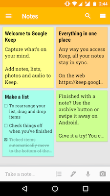
Google Keep — Empty State It displays ‘starter content’ to familiar users with its app. Typically, when you open a note-taking app, it will be empty. You don’t know how a bunch of notes will appear on-screen. You’ll have to create a couple of them to find out.
Instead, Google Keep does that for you. So although you don’t have any notes, Keep creates a few.
With this, first-time users are educated on 2 things:
- how notes work within the app
- learn about the app’s features
That’s pretty smart, right? It works extremely well for them. We’ll talk more about ‘starter content’ later into this article.
For apps like notes, email, bookmark managers and others, there is no content, to begin with! Users will have to start adding content manually to populate them. In such apps, having Empty States for first-time users is a sure shot.
But keep in mind that you have to think about individual screens rather than the entire app.
For example, a news app might show worldwide news by default on the home screen. So no worries there. Say the news app allows a bookmark feature. That screen would be empty unless users bookmark a news article. So that’s an Empty State too. How would you handle that? Think about it!
2. When an error occurs…
Now for some apps, even if you’re a new user, there will be some content to display. Say that the app makes an API call to fetch content, and for some reason, it fails.
When a new user opens your app and goes to the home screen, you don’t want that to happen. It appears very bad. Don’t show a generic error message.
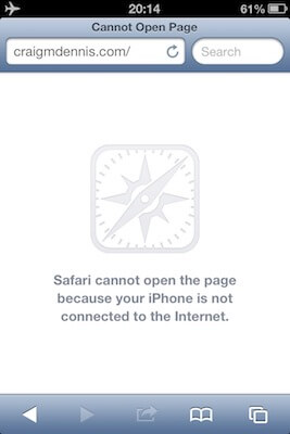
Safari iOS app — No internet state Image credit: tympanus.net That is just one scenario. This could happen to ANY screen. Make sure you handle that as well.
Tell users why it failed
This is perhaps the most important thing to remember. When you’re showing an Empty State in the event of an error, tell users what happened.
Make sure you tell users what the issue is, without going too technical. For example, let’s assume, your app’s servers overloaded and crashed due to traffic surge. If that’s the scenario, don’t get too technical and spam them with crash logs and error codes. That’s for your developers, not users! An appropriate error message could say “Our servers are currently busy”.
The Google Chrome browser balances information and detail very well. It even adds a bit of humor to it. It has a brilliant empty state that not only tells us what’s wrong. But also suggests how to fix the problem.
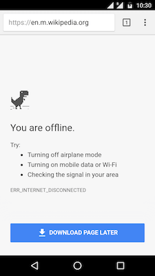
Android Chrome App — Offline State Here’s what Chrome achieves with this design.
- A generic error message that everyone can understand
- Suggests steps to resolve the error
- An error code — for the tech savvy?
- Download Page Later button— automatically download page for viewing when the internet is back on
- T-Rex game— it’s actually a game you can play to kill time until your internet comes back
FUN FACT: Why Google Chrome shows a dinosaur when offline?
Here’s another example.
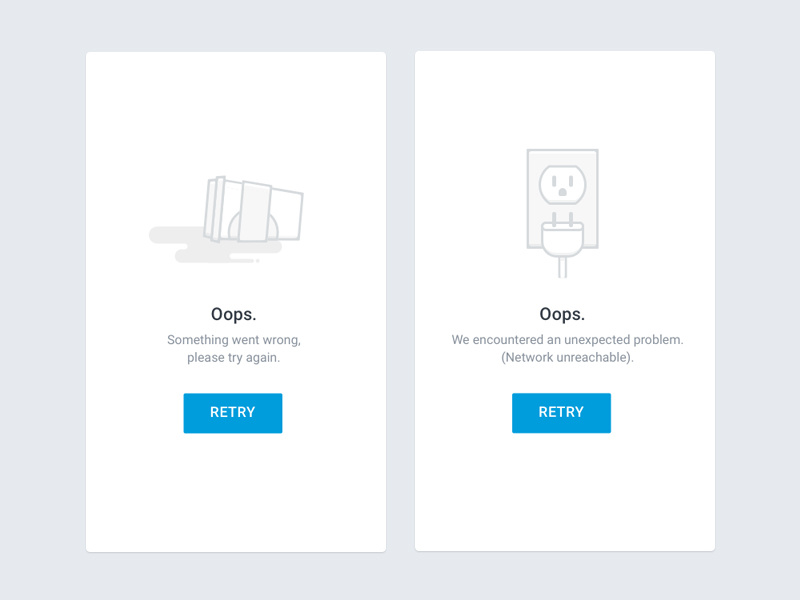
Desk Empty States by YiJing Z — Dribbble Remember that not every scenario is the same. This would have already become evident to you. For example, for a retry page load, it makes sense to have a retry button. But what about an email app with an empty Spam screen?
Now that’s clear, we can see how to actually design it.
How to Design Empty States
To make blank slate useful, consider inserting quick tutorials, videos, help tips, call to action-elements, screenshot of the page when it is in “normal” stage – anything that helps the user and makes him happy with your app. — Patternry
Here is a couple of tips on how to design effective Empty States. Let’s go through them one at a time.
1. Be informative
When an empty state occurs, it is visible to the user. Tell them why they’re seeing this screen.
When a user sees an empty state, 2 things should be conveyed.
- Purpose of the screen (what can I expect to see here?)
- Why am I currently seeing an empty state?
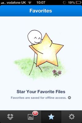
Dropbox favorites Image credit: tympanus.net Copy in design is very powerful. It effectively communicates what users need to know. The lesser the words used, the better.
If you read carefully, the copy answers both those questions above. It tells us:
- What is this screen?
- What’s the use of marking a file as a ‘favorite’?
2. Handle Failure States— Don’t scare your users
If it’s an error, tell them what went wrong. Take it a step further by suggesting how to resolve the error. Remember the Google Chrome example?
Here’s what you can do with Empty States for an error:
- show a non-technical copy for error text
- suggest possible steps to resolve the error (as simple and short as possible)
- Don’t use technical jargon that can confuse users
- Allow them to reload (retry loading a page)

Image credit: emptystat.es
3. Encourage Users to take action
A simple, yet highly-effective way to get users to interact, is to use a CTA (Call-to-Action).
A call-to-action (usually abbreviated as CTA) is an image or line of text that prompts your visitors, leads, and customers to take action. It is, quite literally, a “call” to take an “action.”— blog.hubspot.com
In other words, for our apps, CTAs are buttons. Big bold, attention hogging buttons. When a user sees a screen, the should immediately be able to see that CTA (button). That’s what makes it effective.
Material Design provides us a Floating Action Button. That’s a perfect candidate for a CTA!
Some examples would be a note-taking app. Prompt first-time users to add a new note by using a CTA button. Or a recipe app, where the CTA is to add a new recipe.
Marvel App – Project empty state by Murat Mutlu — Dribbble Yet for some screens, there is simply nothing to do. Example, Gmail Spam screen.
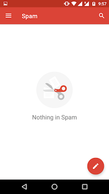
Gmail App — Spam 4. Display Starter Content
Remember the Google Keep app? We spoke about it as an example for Empty States. That’s called Starter Content.

Evernote app — starter content for first-time users With this, 2 goals can be achieved.
- Help familiarize users with how notes work
- Use these ‘starter content’ notes to to flaunt the app’s features
Consider Twitter, where every new user needs to follow few people first to get started. In this way, no first-time user’s home feed is going to be empty. This can also be seen as a way of Twitter reinforcing what it’s all about.
5. Stick to your brand— be consistent
You might have a lot of freedom when designing Empty States. But make sure you stick to your brand.
By that I mean, make sure you stick to your styleguide and color palette. The last thing you want is a screen that feels alien within your entire app.
Alright, this might not be a design tip that’s specific to Empty States. But even so, it is still important. It’s easy to get carried away!
For example, if your brand color is blue. For the sake of emphasis, don’t make your Empty State’s CTA button red! Agreed that you might want to emphasize an alert or danger. But don’t do it at the cost of inconsistency.

Course Dashboard by Shashank — MaterialUp 6. Use Humor
Sometimes, humor can play a big role in damping down the seriousness of an issue.
A great example of using humor in design is Mailchimp. They know how well to design it so that it engages the user.
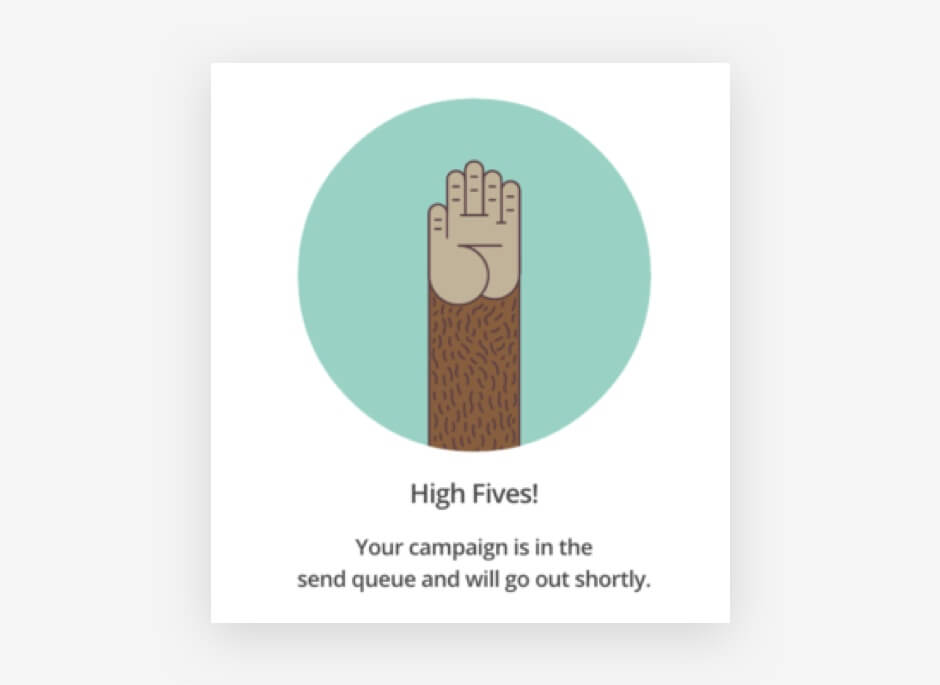
Mailchimp — what users see after sending a campaign. Image credit: smashingmagazine.com So before you use humor, make sure you it’s in the right context. For example, a good place to use it would be content not found screens (empty search results).
On the contrary, a bad place to use it would be in an error state. Say a failed task. It’s worse if the error was on your part.
Using humour is fun and is a welcome relief. But also think of scenarios when a customer comes to your site to complain, or they have a problem with your product or service. They may not be in the best mood and that humorous message could be a tipping point for a customer to leave permanently. — spotless.co.uk

Empty state concepts infused with personality by Tasnadi Otto — MaterialUp 7. Keep it simple
Arriving at the last design tip, this is the most important one to remember.
With all the tips mentioned above, it’s easy to include everything and go overboard! Don’t do that.
Remember that simple designs are always more effective.
Here’s a great empty state interaction. It’s lovely, but it’s also so fancy that if my app is simple and not animation-heavy. I wouldn’t attempt anything like this, just for an Empty State!

Empty State by Jordan Nelson — MaterialUp An Empty State is supposed to be a lightweight screen. If there is an action to be performed, make sure it’s just one. Don’t offer many points of interaction on a single empty state! That’s just confusing.
Takeaway
To summarize everything, Empty States are an excellent opportunity to engage with users. It might seem insignificant in the larger picture. But even the smallest of things matter.
Attention to detail matters because when you show that you care about the small details, people trust you to care about the big ones. — Meg Robichaud (Shopify UX)
User retention with apps are already very hard. So use every chance you have to keep them. Because once they leave, it’s difficult to get them back.
Remember that no screen should be a dead-end for your users.
Wrap up
Keeping these simple design tips in mind will help you create effective Empty States:
- Be informative — tell users why they’re seeing this screen
- Handle failure — tell why the error occurred and suggest a fix
- Use a CTA — encourage users to take action
- Consider Starter Content — great way to familiarize users with your app
- Be consistent — stick to your brand’s design guidelines
- Use Humour — reduce the seriousness of an issue. Use carefully
- Keep it simple — nothing over the top. Remember simple = effective.
I hope this article will help you design better, effective Empty States. Use them to your advantage for better user retention!
Lastly, if you need some design inspiration, these resources have you covered.
Resources for your inspiration —
Thanks for reading!
-
Horizontal Scrolling Lists in Mobile – Best Practices
Many Android and iOS apps have horizontal scrolling lists. Maybe it’s also combined inside a vertical list. But is it necessary? Even assuming it is, are you doing it right?
-

Design Techniques to Display Text over Background Images
It’s become popular to overlay text labels on background images. But the image could be anything. How does your user interface design accommodate that? Can text overlay remain readable always?
The last thing you’d want is your users straining to read such text. This is all the more important on mobile. Smaller screens and smaller text make it slightly harder to read.
But don’t worry. There are a couple of design techniques you can follow to ensure that.
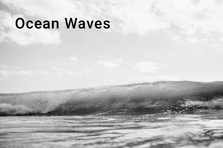
First, let me show you some design mockups that use text overlay.
Photography Portfolio by Winart Foster on Dribbble Here’s another.
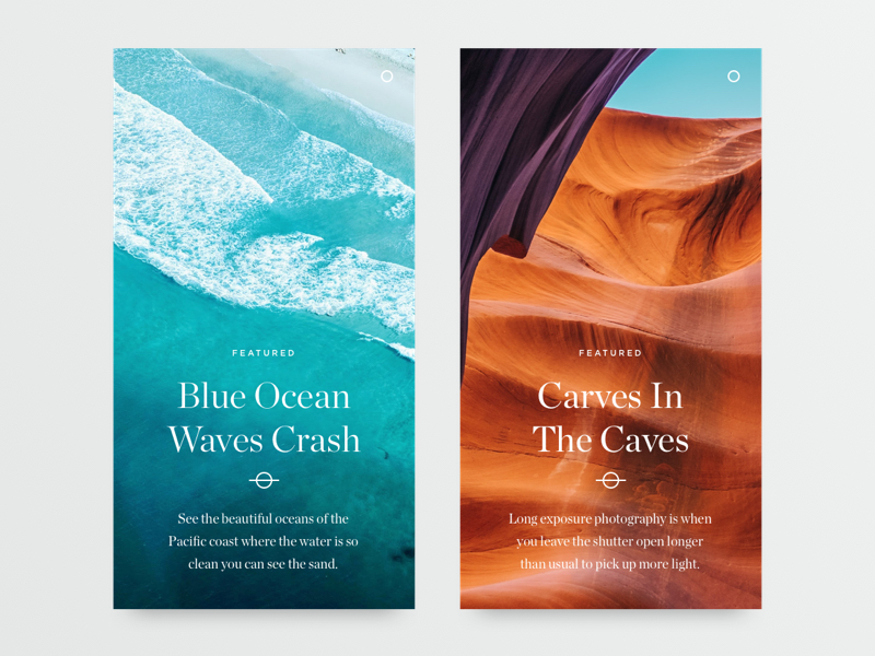
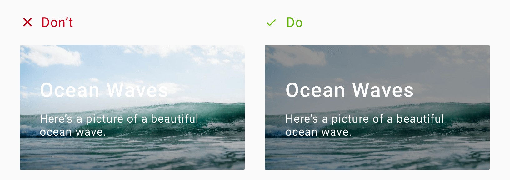
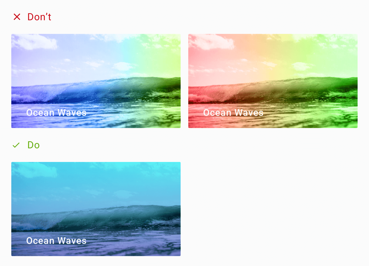
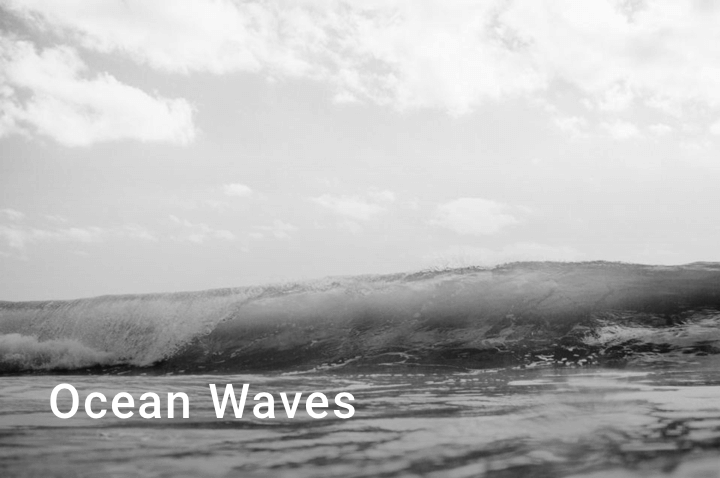
Article Cards Alternate by Oliur on Dribbble A good eye will immediately notice the problem with these two designs. Take the second one with the sea waves. If the wave foam was on the lower half of the image, would that text be readable?
Let me try to recreate that design for you.
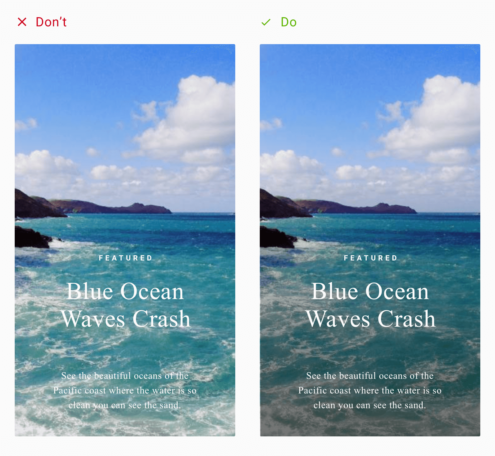
Text with scrim overlay How readable is the text now?
Alright, its not the same picture. But it’s still ocean waves.
The background image is outright disturbing. But the image is not to blame. After all, when you decide to overlay text, you must be ready for ANY image. Which means, the image could be anything.
Good design is when we factor in all possible scenarios.
Now don’t get me wrong. Those 2 designs are not bad in any way. In fact, I love the typography used in the second one. Both are well-designed interfaces by talented people. It’s just that, some interface designs (mockups) are only for aesthetic purposes.
Anyone who translates them into a working project will immediately recognize what’s wrong. The text displayed, does not account for its background images.
However these mockups are only examples. It assumes that whatever be the image, the text will be readable. But my design attempt just showed you that that’s not the case.
The 2-in-1 problem with text overlay
Now we could say that this pattern became overly popular thanks to Card design. I mean, most of the card designs include an image, with text overlaid on top. Not to say that its bad, but there are two things that are largely not considered.
When you overlay text on an image, you sacrifice two things:
- Image clarity
- Text readability
Readability is the ease with which a reader can understand a written text. It is a measure of how easily a reader can distinguish individual letters or characters from each other. – Wikipedia
Overlaying a text prevents viewing the image completely. Moreover, your text may not be readable.
The image can be anything
Now, most of the examples above are mockups. Which means those are ideal scenarios. The text matches perfectly against its background. Things can immediately go wrong if your using white text over a whitish or light image. The same holds true for black or darker tones.
Now we know the mess we’re getting ourselves into. So let’s look at what we can do about it.
Text Overlay Solutions
There are different approaches to making our overlay text readable. I want you to understand that these are different solutions to a single problem. There is no single solution answer.
Moreover, deciding on what to use ultimately boils down to your personal preference. Or you can even decide upon one, depending on what fits your brand style.
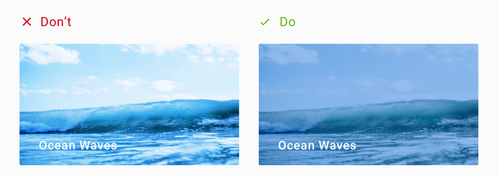
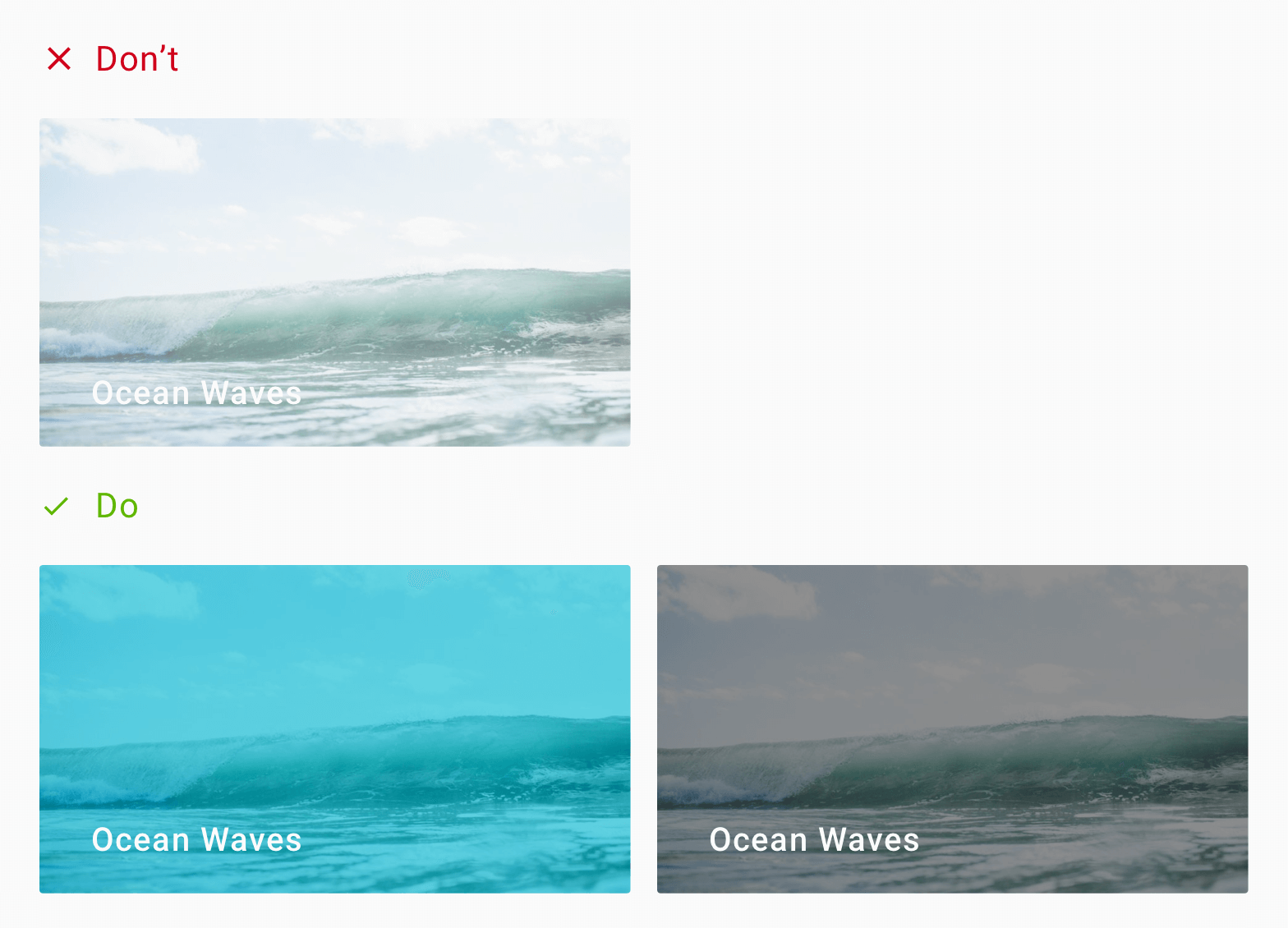
1. Using a Scrim
A Scrim is a semi-transparent gradient layer that helps Text appear more readable against backgrounds.
A scrim is a solid to a transparent gradient that sits behind a Text Label. So for instance, your text label could be a constant white. Then, your scrim would be a gradient going from, say 40% black to transparent.
I leave the opacity percentage to you. Again that’s a matter of personal taste.
But a 40% black to transparent works really well. It’s not too evident and doesn’t disturb the image. It fades smoothly, giving the text label the contrast it needs, making it readable.
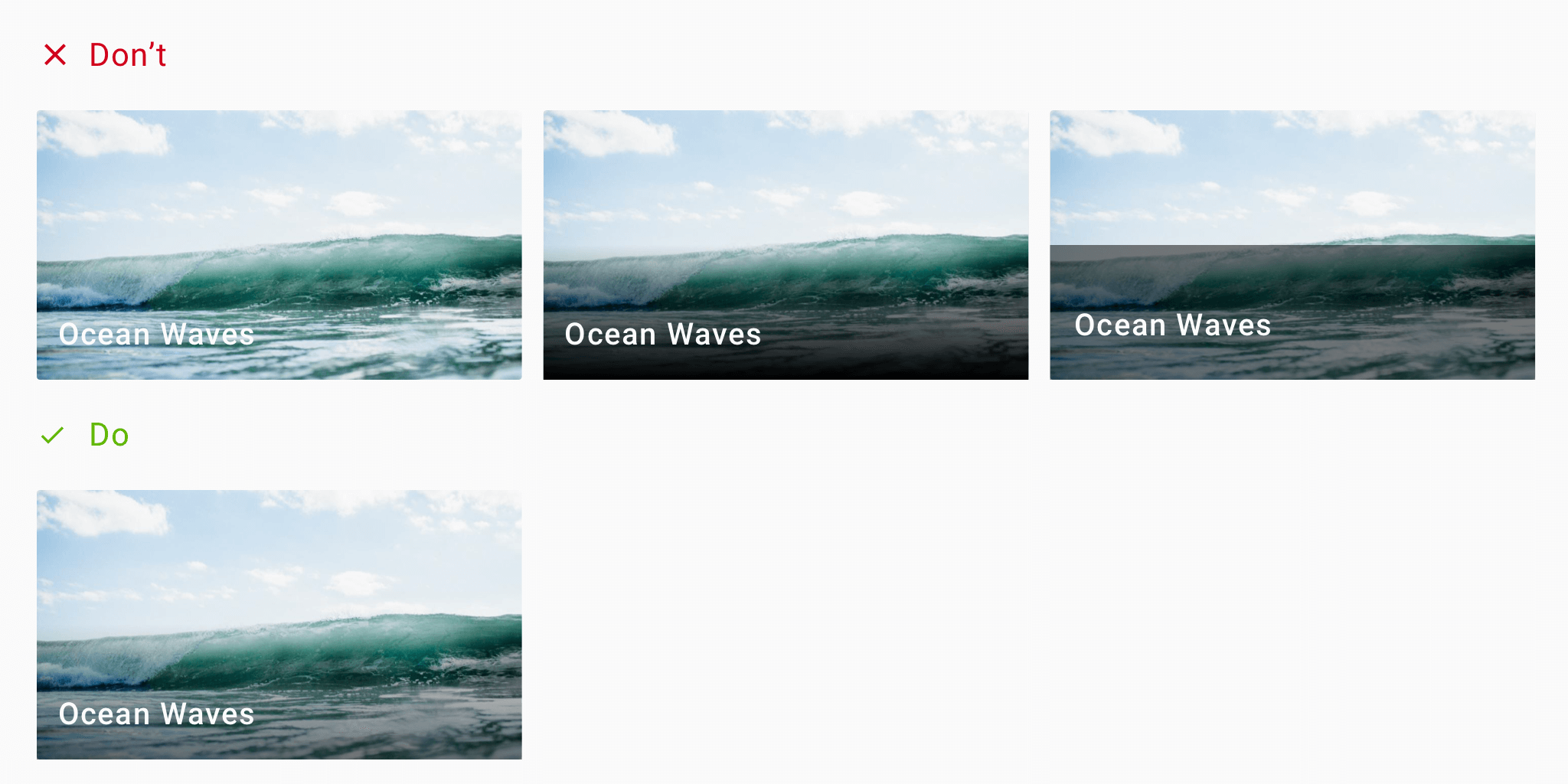
Scrim – gradient overlay Recommended Scrim guidelines:
- 40% opacity
- gradient settings
- height: 50% of image height
These are not hard rules. But as you can see from the above design, these settings work well.
You can read about this in the Material Design Imagery guidelines.
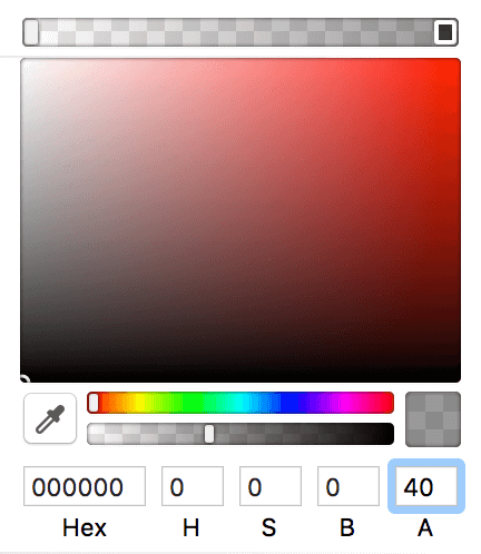
Scrim gradient settings in Sketch Advantages:
- Most simple and common solution
- Increases contrast for better text readability
- A subtle design change which is hardly noticeable
Disadvantages:
- Sharp gradients can break the image’s appeal
- Can block the image if visibility is too high
By far, using a scrim is the most popular solution for solving the text overlay issue with images.
But wait, don’t go yet! There are other solutions which might suit your taste better.
2. Overlay the entire image
Like the scrim solution, and instead of a gradient, you’d apply a full 40% black to the whole image.
That’s right. Maybe the image isn’t important to you. The text label is your priority. Or maybe the text covers the entire image’s size.
In such a situation, using a scrim doesn’t make sense. Since the scrim is a gradient, your text becomes unreadable half-way across.
So since the text covers the whole image, the solution is to darken the entire image.
In short, that’s a 40% opacity black on the image.
Advantages:
- Useful for large text (headings?) that covers the entire image
- When text is your priority and not the image
Disadvantages:
- Can obscure the entire image
- Could sacrifice image visibility
- Can diminish the background image as if it exists only for aesthetics
Here are some popular apps that use this approach:
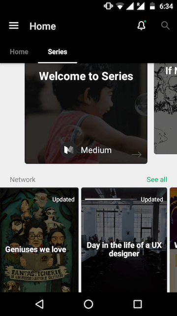
Medium Series on Android 85000+ Status and Quotes 2017 Android App by Pratik Butani 3. Color Overlay
This is like an overlay. But instead of using black or white to darken or lighten the image, we use a different color.
Setting a color overlay on an image is the perfect way to neutralize a busy image. It blocks out all the different colors, making the image monotone.
Here is an example.
Usually, the color of choice is the brand color.
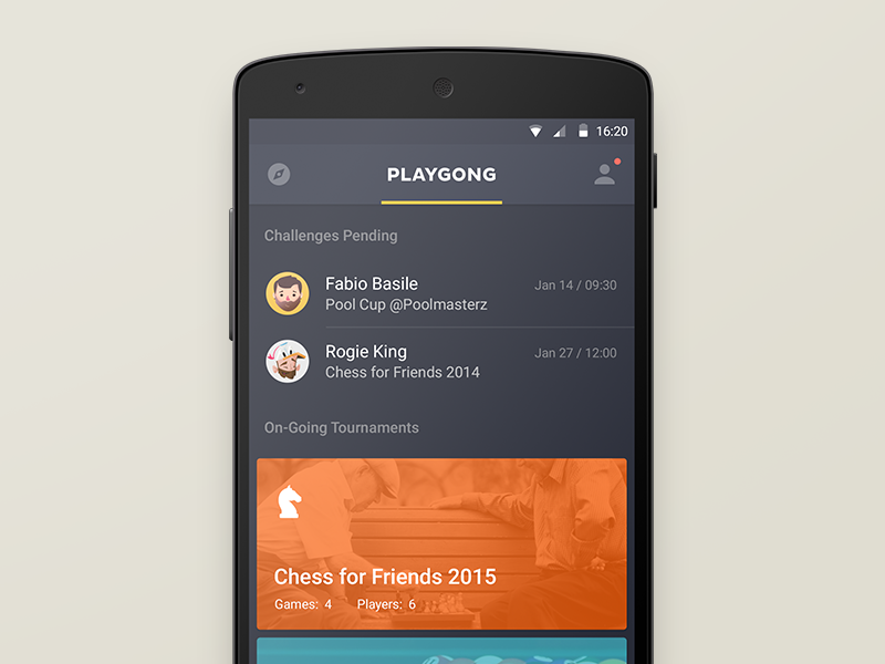
Playgong App by Deividas Graužinis If you have trouble deciding color, check out Canva’s Color Wheel Tool. It uses color theory and color combinations in design to help you find colors that look good together!
4. Soft gradients
Remember that to use this correctly, your text should have enough contrast.
Also, when you use gradients, don’t use visually jarring colors. Chose colors that work together in harmony.
You can use web tools such as Coolors and Kuler by Adobe. These can help you generate color pairs that work well together.
Here’s an example.

Web Agency by Mohammad Shohag Advantages:
- Better brand emphasis (if brand color used)
- Single color tone allows room for better text contrast
Disadvantages:
- Not suitable for pictures of people as it may not be recognizable
5. Semi-Transparent Image
This technique involves using a semi-transparent image against a solid color background. It helps ‘calm’ the noisy background, so the text can stand out.
The technique consists of 3 layers (from the bottom):
- Bottom – solid color
- Middle – semi-transparent image (40% opacity)
- Top – Text layer
Advantages:
- Softer image allows text to stand out
- Makes image monotone, reducing image noise
Disadvantages:
- Image may lose important details
- Only suitable for images whose purpose is eye candy
6. Blur
Applying a Gaussian blur softens an image allowing text to become more readable.
Smoothing of images by reducing image noise and detail – Gaussian Blur
iOS folks will be familiar with this technique. iOS design principles use blur to denote depth. Whereas Android (Material Design) uses shadows to denote depth (elevation).
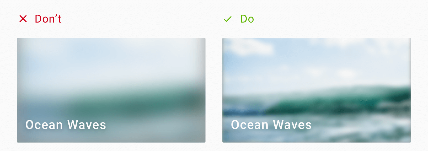
Here’s a 16px blur on the left, and 4px blur on the right. Make sure you don’t blur the image too much that the underlying image is completely unrecognizable!

Blur doesn’t solve same text and image color problem Advantages:
- Helps reduce the ‘busyness’ in images
- Softened images allow text to stand out
Disadvantages:
- Completely sacrifices the image for text
- Still doesn’t solve same-color overlay issue
- May not suit your product style. Using blur in a Material Design world?
7. Text Highlight
Here, we apply a background color to the text itself. This effect mimics the traditional way of highlighting text on paper.

Text with Highlighter effect This technique works well when the design has minimal text and a spacious background.
Remember that the highlight color doesn’t always have to be black. The example on the right borrows the dominant color from the image. This creates a higher sense of belonging with the image.
Advantages:
- Good text clarity against any background image
- Good contrast
Disadvantages:
- Choice of highlight color may make text feel disconnected from image
- Can completely block the underlying image
8. Go Grayscale
Alright, this is more of altering the image than the text. But we can still use it to achieve what we want.
By using a grayscale image.
Greyscale image filter However, remember that greyscale includes colors from the brightest white to the darkest black. These alone, are on the polar ends of vibrancy. Hence you might want to consider toning down the image first. You can do so via a mix and match with any other techniques mentioned here.
For example, here’s a grayscale image with text at the bottom. However, by default this wouldn’t look good. So we add a scrim at the bottom.
Greyscale image with bottom Scrim combined Notice how the scrim naturally blends very well with the image. The image is greyscale and our scrim is a black to transparent gradient. Hence the two techniques go hand-in-hand, quite well.
9. Playing with color and positioning
Sometimes, no matter what, the image remains the same. Say, for example, a category page will use a constant header image depicting its category.
In such a situation, you know what image to expect. You can use this information to design your text. This can be the font, size, color or even positioning the text.

Universitet Modules by Flatstudio Notice the smart positioning of text, away from images. Also, the calm pastel background colors are not distracting. Both work in favor of allowing the text to stand out in addition to the graphic.
TL;DR – Use enough contrast
The state of being strikingly different from something else in close association. – Contrast
Did you notice? All the techniques discussed above are ways to increase text contrast. Contrast is what makes an element appear distinct from one another. There should be high contrast between text and image. It allows text to be readable.
There is also no need to sacrifice image visibility for text. Both can coexist together if we use the right technique. For instance, using a scrim allows text to be readable. At the same time, the image is visible as well.
As a general rule, using greyscale colors work well. Which means, white text against a dark background. Or black (dark grey) text against a light background always works best.
Conclusion
We looked at techniques that make text readable, without sacrificing the background image. Techniques such as the scrim are perfect examples of this. Or, using a color overlay can help reinforce your brand by using its primary color. This is especially useful when the image feels out of place in your design. Moreover, the blur technique is useful as well. But you will have to see if it aligns with your design style.
Remember that good design is thoughtful and knows how to balance aesthetic visuals with usability and clarity. It is not enough to let people use your app. It must be easy and pleasing to use.
You can even mix and match two techniques. Your imagination is the limit. Color overlay with scrim anyone?
So which technique are you going to use? Have I missed any popular method? I’d love to hear your thoughts. Let’s talk in the comments below.
-

Stop Using Loading Spinner, There’s Something Better
Stop using those boring loading spinners in your user interfaces. Seriously. It’s killing your apps’ experience more than you know.
A loading spinner might be the solution to your content loading problems. But I’m here to tell you that it’s not.
(more…) -
Design App Mockups with Adobe Illustrator & InVision
Designing app mockups allow us to quickly visualize how our app might ultimately look like. In this article tutorial, let’s learn how to do this really quick with Adobe Illustrator and InVision. I will also tell you the benefits of doing this and guide you every step of the way.
(more…)

