The App Intro or Product Tour is an introductory welcome experience for first-time users to your product. In this article, we will look at how to design great app intros by learning from the best mobile apps. The App Intro or Product Tour is the first part of your overall onboarding experience and hence, the most important. For the sake of this article, I will stick to calling it the App Intro. At first, I too was calling Intros as Onboarding but for the sake of brevity and not to mislead, I felt it would be best if the correct terms were used. Now the terms ‘App Onboarding’ and ‘App Intro’ might be used interchangeably sometimes. So it is best we clarify the difference between the two. In this article, let’s begin by first clarifying the difference between the two terms. Next, we’ll look at the problem that mobile apps typically face and how an app intro can help. Then, we will look at how app intros are designed by 3 popular mobile apps. We will then learn from these examples to design a mobile app intro of our own. Lastly, I will leave you with some brilliant resources to further learn from. So with that said, let’s dive in.
Onboarding VS App Intro
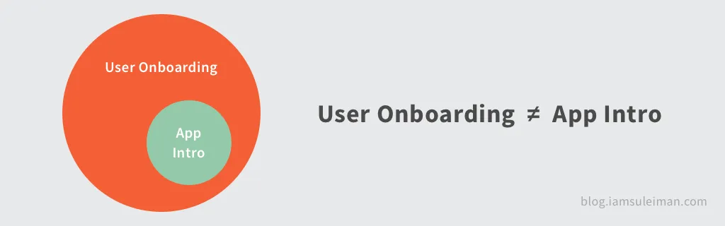
Instead of me trying to explain the difference to you in words, I hope the image below does a better job.
READ: Implement Material Design On-boarding in Android
What’s evidently clear is that User Onboarding is NOT the same as the App Intro. They are two entirely different things. The App Intro only serves as an introduction or as a welcome to new users, giving them an overview of what the app is. The intro is simply a small part of the entire app’s overall onboarding experience. User Onboarding
“User onboarding is the process of increasing the likelihood that new users become successful when adopting your product.” — Samuel Hulick of UserOnboard.com
Want to learn more about onboarding? Chameleon has a great guide to onboarding flows with useful tips and examples. App Intro
The intro screen is a great way to showcase your app’s greatest features. It is simply, one of the ways by which you can increase retention rates. The App Intro screen is a small part of the overall onboarding experience that you can build for your app.
Want more app intro inspiration? You can see 40+ example designs for mobile apps here. For the sake of this article, we’ll focus on just mobile app intros.
The problem with mobile apps
A good rule of thumb for creating mobile apps is to understand that your users are always on the go and hard-pressed for time. Hence it’s essential that we keep these constraints in mind. The purpose of apps is to be laser-focused on helping users do the one thing they need to do, really well and quickly.
Get users to be able to do what they want via your app, in the fastest way possible.
It is no secret that mobile apps have always struggled with retention. On average, mobile apps could lose 75% of their users in 3 months.

“Nobody cares about the thing you’ve designed unless you can get them past the beginning.” — Julie Zhuo, Product Design VP, Facebook
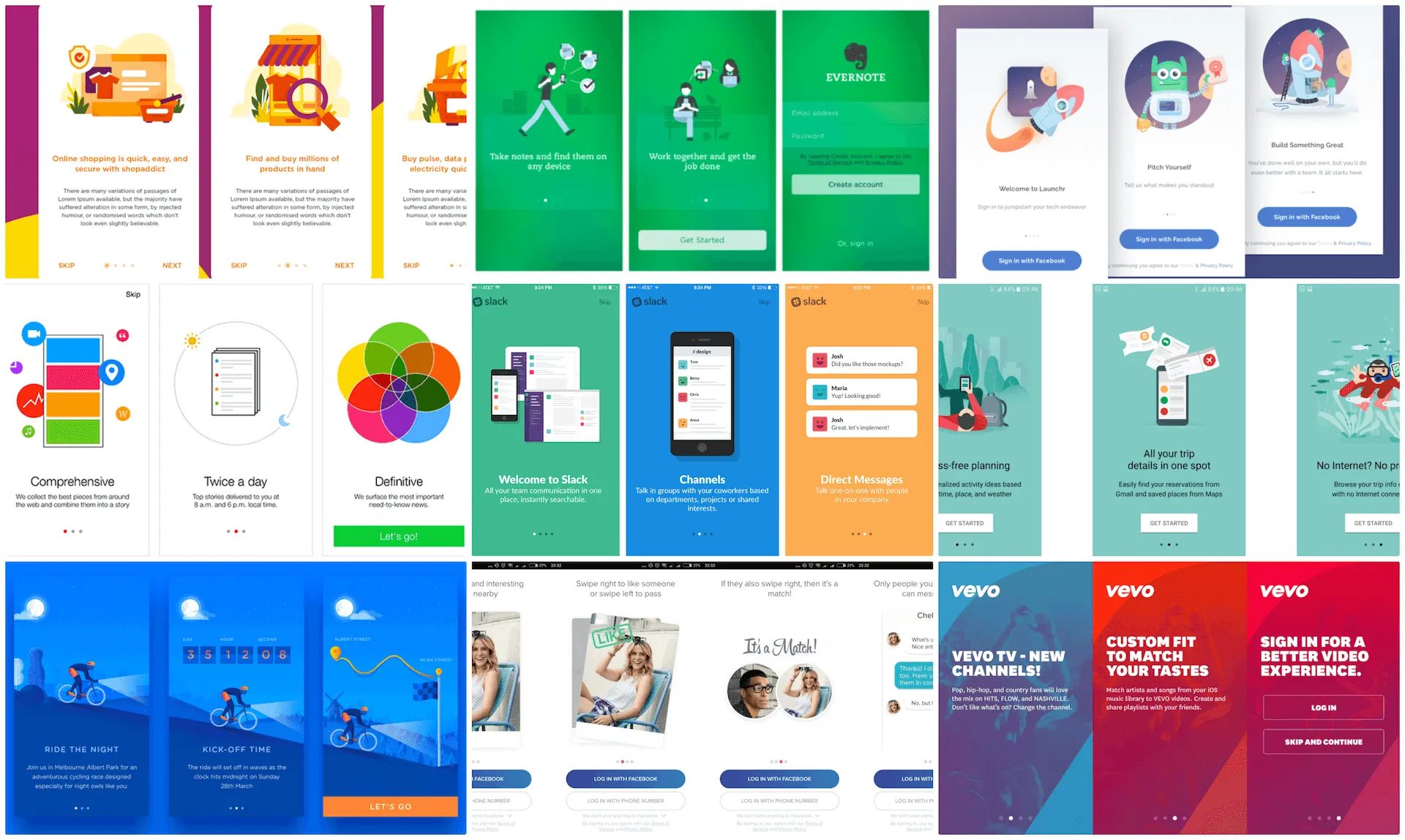
Really Good Mobile App Intro Designs To Learn From
Now we know what an app intro is and it’s importance in helping retention rates. Next, we’ll look at 3 really good mobile app intros, do a breakdown of each and see why it works well. We will then learn from these 3 examples and see how to bring it all together for your app. In design, there never is a ‘one size fits all’ solution. So instead of trying to decide upon one approach, let’s take a look at 3 best onboarding experiences on apps. Keep in mind that I am deliberately trying to be device agnostic. The goal is to look at how app intros have been designed so Android or iOS has no effect on this. The 3 apps that we’ll look into are:
- Evernote
- Spotify
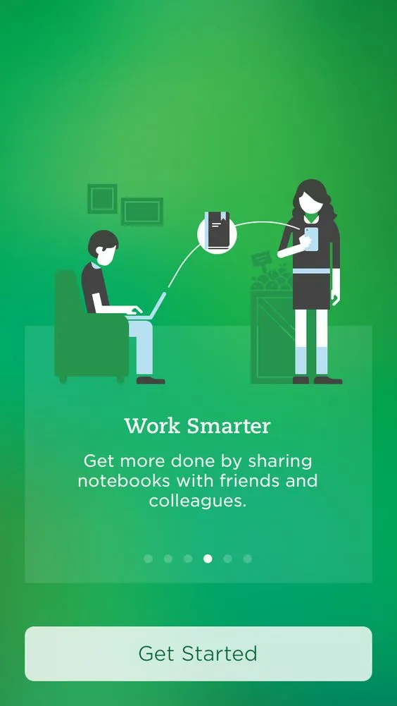
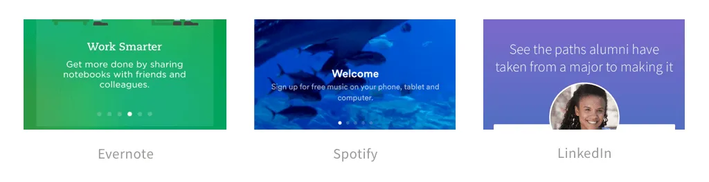
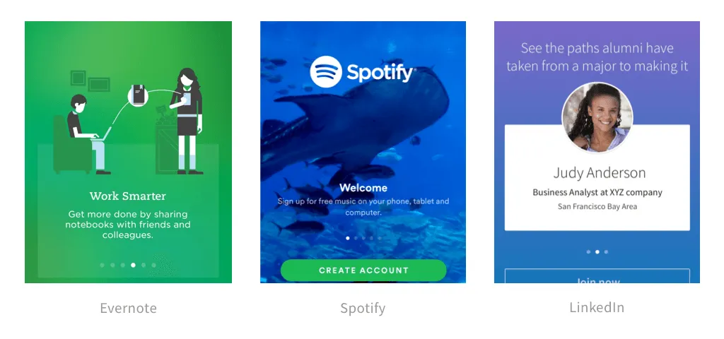
1. Evernote
An extremely popular app for note-taking, to-do lists and much more.
2. Spotify
Spotify is a digital music service that gives you access to millions of songs.
Notice how Spotify breaks down its value proposition into simple, digestible chunks, displayed one at a time in a carousel.

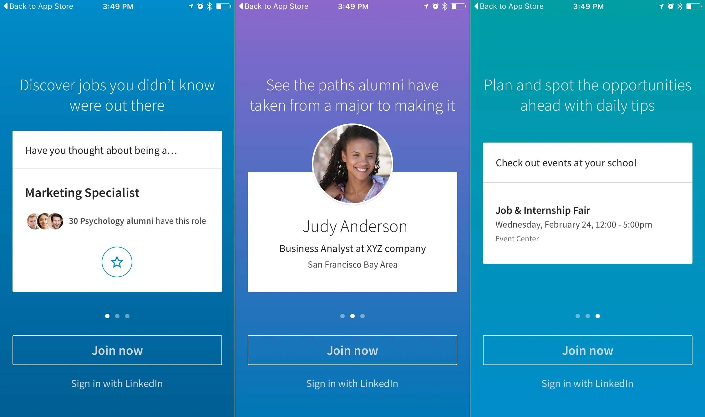
3. LinkedIn
Linkedin is a professional networking service that includes recruiters, job seekers and alike.
Identifying what works
Remember there is no straightforward answer or a ‘one size fits all’ solutions. But I am sure that those who designed those app intros have a pretty solid understanding of that. So what we can do is learn from these designs. By looking at the three app intro designs, we can learn from them and identify common patterns. This will help us establish a foundation to build upon for our own apps. With that said, let’s go through the common components that make up a good app intro.
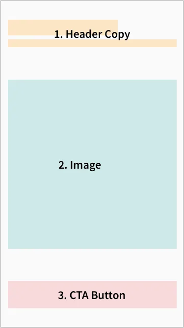
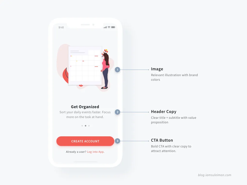
The image above highlights the most common components of app intros. If you looked at all the app intro examples previously mentioned above, you can see the relation. Next, we will focus on each of these components individually and make note of the design choices each have taken and why that may be. This will further help us design our own app intros better.
1. Header Copy
Most headers include a distinct headline followed by a two-line text description. LinkedIn however, opted to not visually distinguish their copy keeping it simple. Note that each description uses a thoughtful choice of words that evokes clarity on what the app has to offer users.
Takeaways:
- Clear heading and subheading (except for LinkedIn)
- Distinct typography between heading and subheading
- Short headlines and clear copy
- Simple words used to indicate value proposition
2. Image
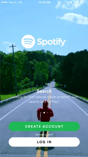
We’ve seen app intros using simple, full-blown imagery with great photography to videos. We’ve also seen delightful animations as well. Perhaps now, what we’ve come to increasingly see is custom illustrations like the one you see in Spotify. However, that’s not to say that what’s currently trending is the way to go. Look at the image choices used by Spotify. Notice the meaningful imagery used for ‘Search’. A long road ahead tells that there’s a lot to be discovered along the way. A beautiful representation for Search. unsplash.com provides brilliant photography that you can use for free. Be it photographs, UI components with animations or custom illustrations, they are all simply a design choice. You can already see the variety used here in these three apps. So pick one that goes with your brand or app’s character. In other words, opt for a style that obeys your visual language that resonates across your app.
READ: Techniques to Display Text over Images
Personally, I like how Spotify uses clean illustrations to visually depict what it has to offer. From a technical standpoint, SVG illustrations are more light-weight than PNG images. But images can still be powerful to convey meaning or evoke emotion if the right one is used. Takeaways:
- Distinct, simple illustrations that respect brand character (Evernote)
- Using professional photography as a full-blown background image (Spotify)
- Using pieces of the UI to ‘educate’ users on what to expect (LinkedIn)
- Visual indicator for a swipe-able carousel that reveals more features of the app
3. CTA Button
The Call-to-Action (CTA) button for almost every app intro is to either create a new account or log in. A CTA present throughout the app intro implies something very important. You want your (first-time) users to know what your app has to offer. But you also don’t want to force them to see through it all. You don’t want your users to sit, swiping through multiple carousels before they can get to the signup screen. Then, the signup is another bunch of screens before they can actually get to use the app.
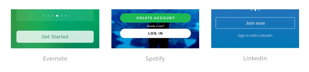
Don’t force your users to see what you have to offer. If they’re interested in knowing, they will go through it. Maybe they already know about your product. Don’t forcefully re-educate them again. Allow them to skip to log in, signup or directly to the home screen. Remember that mobile users are impatient. We need to remember, respect that and let them get down to using your app, in the fastest way possible. Takeaways:
- One simple button to ‘Get Started’, although it can be ambiguous (Evernote)
- Clear buttons that respect both first-time and returning users to sign up or login respectively (Spotify)
- Clever button design with clear visual distinction for emphasis on ‘sign up’ rather than ‘sign in’ (LinkedIn & Spotify)
Putting it all together - Design your own App Intro
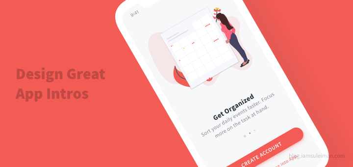
Up till now, we’ve identified the three common components that make up a good app intro. Then we looked at how our three app approach and design these components. Next, we will harness all that we’ve learned and design an app intro of our own. Here’s what I’ve designed. I also took some extra liberty to make a Dribbble shot because, why not?
Let me better explain the design choices here and how I copied *cough* drew inspiration from others.
- Image: Opted for a minimal, clean SVG illustration that respects the brand color palette. In this way, it better fit with the minimal design I was going for, rather than an actual photograph. Also, I got this beautiful SVG illustration for free from unDraw.co.
- Header Copy: Used a simple, clear font Source Sans Pro. Personally, I’m not a fan of using two different fonts. I rather stick with one and play around with font weights and colors for consistency. But use-cases can vary.
- CTA Button: Primary action indicated by a bold, vivid button that gets most of the attention. The secondary action could’ve been a button too. But it could fight for attention with the primary action.
Going beyond a simple ‘App Intro’
In this article, we’ve spoken extensively about how to design an app intro. But it doesn’t just stop here and you should take it to the next level. Remember that the intro is just one part of the entire onboarding experience. Onboarding can be more personal and in-context. Moreover, to learn about great product onboarding, don’t just restrict yourself to mobile apps. Amazing inspirations can be found on websites too. Look to how websites implement their onboarding and you’d be amazed to see what you can take away from there and implement in your own apps. A great starting point is the User Onboarding Teardowns by Samuel Hulick. There are detailed case studies where you can learn a lot from popular apps.
Key Takeaways
In this article, we saw how to design app intros by seeing how some of the best apps do it. We then identified that there are 3 main components that must be included in your app intro designs - the header copy, an image and a CTA. Lastly, remember that the app intro is only the beginning and a very small part of the overall onboarding journey. Apps need to deliver to their users fast! So get them familiar with your apps in the fastest way possible. Remember that mobile app users will not wait. Educate them early and educate them fast. More Resources: Mobile Onboarding inspiration gallery - mobile-patterns.com.