
Many Android and iOS apps have horizontal scrolling lists. Maybe it’s also combined inside a vertical list. But is it necessary? Even assuming it is, are you doing it right?
Horizontal lists are better-suited for mobile, as gestures are both horizontal and vertical.
Yet, people including you and me both, mostly vertical scrolling. I mean seriously, what’s the first natural thing you do, when you open an app? You scroll. Vertically. Okay, maybe you check your notifications, but even there, you scroll. Vertically. So how do you tell people that they can horizontal scroll too? Or rather, when should we use horizontal scrolling?
When to use Horizontal Lists
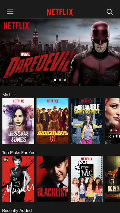
Horizontal lists work best when you want to display a subset of homogeneous content that’s part of a heterogeneous set.
Makes sense? Take the Play Store app for Android. Sure the Play Store is all about finding new apps. But for us to search better, apps need to be categorized right? For example, you can subcategorize apps into games, utility and social, to name a few. Hence each category of apps, can be in a horizontal list.
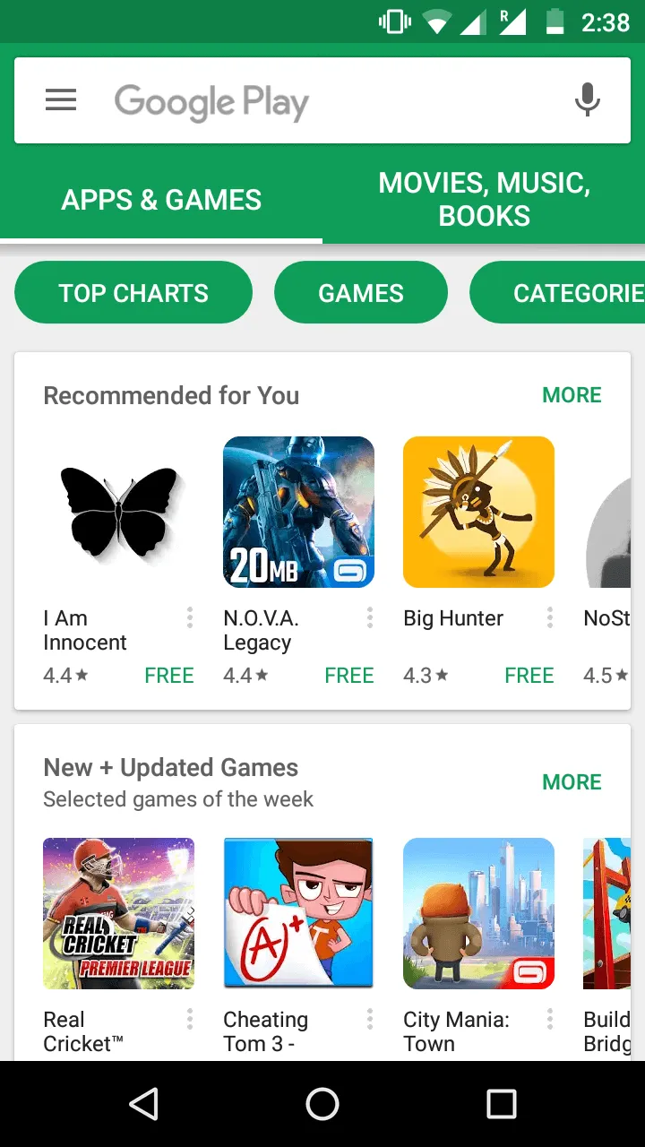
As you can see, Play Store gives us an assortment of apps. There’s a bunch of ‘Recommended’ apps you can browse (horizontally). Then, there’s a set of apps that are ‘New+Updated’. So to go by the definition above, each subcategory of apps are in a horizontal list. These child lists are put into a (parent) vertical list. You can scroll vertically to find more such subcategories. Here’s another example.
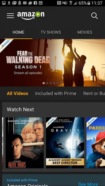
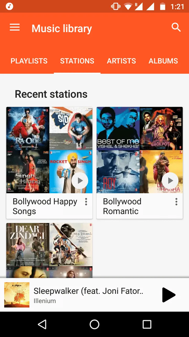
Amazon Prime Video — Android App. Image Credits: pcadvisor.co.uk
Design Tips for Horizontal lists on Mobile
In the web, arrows show that there is a horizontal list of content you can scroll. This is typically a carousel. It uses a combination of arrows for navigation, dots for indication and scrollbars. These are indicators (affordances) that tell people how to navigate a carousel.

But how would you design horizontal lists on mobile? Mobile apps are touch based and support gestures. Would you still be using point and click mechanisms such as arrows? I’m sure not. Moreover, given mobile size constraints, using the same web paradigms makes little sense. Hence there must be a better way. Expect users to scroll the same way they would in a vertical list. Here are some design tips to keep in mind. They can help you make better and effective horizontal lists.
Show Visual Indicators
The design must leave a visual hint that a set of content is horizontally scrollable.
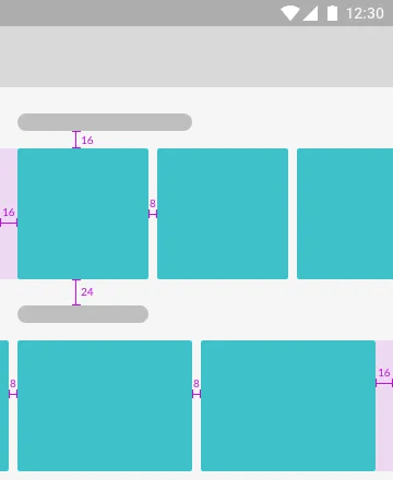
Assume you’re displaying a horizontal list of cards. You’d want the last card on the right, to peek out from the edge.
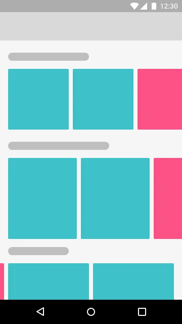
So for this particular device width, we can show two cards. To see the third card and beyond, we need to scroll horizontally. Notice the design teases a bit of the third card. Yes, the pink cards at the extreme ends that are partially hidden. This ‘tease’ provides a subtle hint that there’s more content. Since the flow of content is horizontal, it naturally indicates users in which direction to scroll. Hence, the user’s natural instinct is to scroll in that direction (horizontally).
Use a ‘See More’ Button
See More, See All, View All, View More, Show More … Call the button what you want. Essentially, it should mean one thing:
A ‘See More’ button tells users there’s more of where that came from. It’s hints that there’s more of similar content available.
Keep in mind, that each subcategory (horizontal list), is just a tease of what kind of content you can expect.
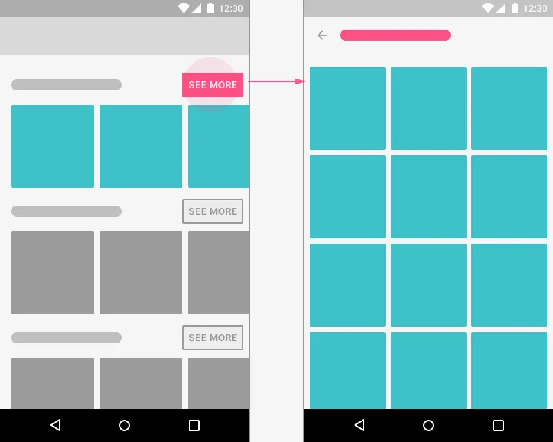
So when a user taps on “See More”, you want to show them all that’s there to show for that subcategory. For example, assume the user clicks the subcategory called “Top Action Games” in the Play Store app. Then the ‘See All’ screens shows all the best action games in that subcategory. Remember that vertical scrolling is the most natural and fastest.
Vertical scrolling increases the user’s ability to skim through content
Hence, it makes sense to use a vertical grid in the See All screen.
Design for Responsiveness
Keep in mind that mobile app interfaces are responsive. So make sure that this subtle hint is always present. Otherwise, you might see a horizontal list that looks like a grid.
So tell me. From the UI above, can you tell that each subcategory is a horizontal list? Moreover, can you even tell if it’s horizontally scrollable? I’m sure not. But you’re not to blame. It’s the design’s fault. There is NO visual indication! Trust me, that’s not what you want people seeing. It looks just like a vertical grid. If it looks like that, then every user’s natural instinct is to scroll vertically.
Adapting Horizontal lists for Tablets
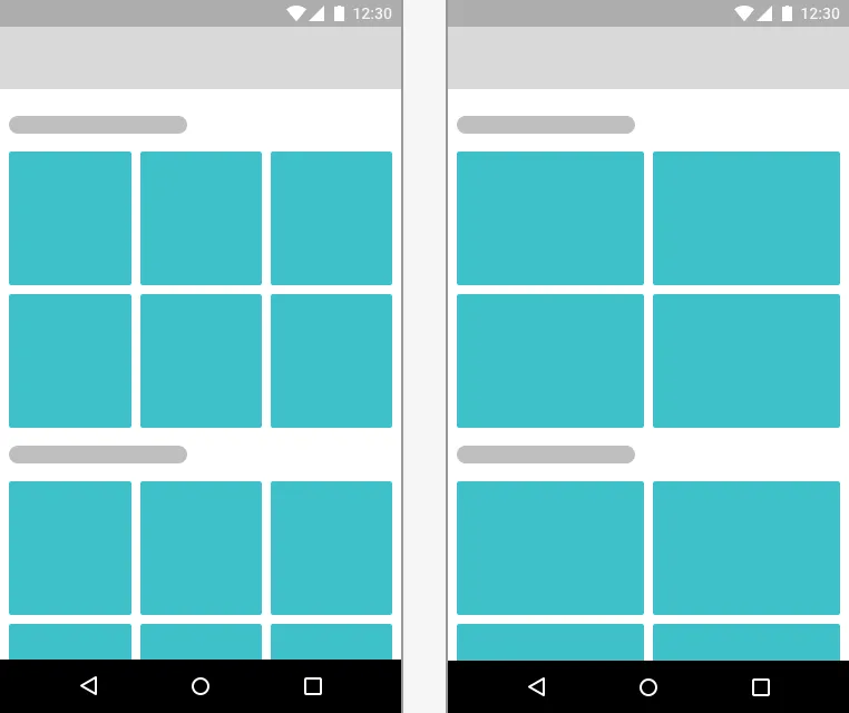
So how do you design horizontal scrolling lists on larger devices? Say tablets for example? You can convert your horizontal list into a grid with N items per row. The above UI design displays five items per row. With a see all button that indicates that a user can see more of this kind of content, on a new screen.
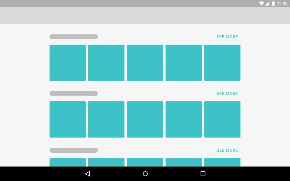
Hence, on mobile, it can be a scrollable horizontal list of say, ten cards. However on Tablets, you could have five or six, non-scrollable cards. Read: Getting Started with Material Design for Tablets - Android
Limit horizontal content on tablets
Tablets grant larger screen width. So it’s wise to take advantage of large screen real-estate. But let’s focus on just horizontal scrolling for a moment. It’s perfectly fine on mobile. You show 3 contents by default. The rest is can be viewed by scrolling horizontally. This means that the additional content which is hidden, is optional. If users are interested, they can scroll to see more. Or if they’re interested in seeing all of it, they can tap the ‘See More’ button. Now let’s get back to Tablets. Your natural instinct would be to simply show more content horizontally. It totally makes sense to do so right? When large width is available, it’s natural to make use of it. Right? No. Let me tell you why.
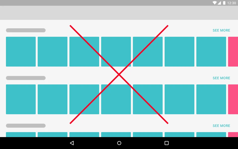
Giving a ‘tease’ of five to six contents is more than enough to tell people what to expect from a category. Remember that the user may scroll horizontally to see more. But they definitely will scroll vertically. Moreover, if they want to see everything a category has to offer, they can tap the See All button. Hence, it makes sense to just show a non-scrollable grid of 5-6 items per subcategory. Giving too many choices is a sign of increased cognitive load for users. That’s not a good thing.
Every time you visit a website, a process of learning is initiated. Your brain has to learn how to use the site while keeping track of the reason you came there in the first place. The mental effort required during this time is called cognitive load. - Design Principles for Reducing Cognitive Load.
Alright, that may be in the context of a website. But it all the more holds true on mobile. Attention span on mobile is shorter than you think and an article by The Telegraph agrees too!
Snap Horizontal Scrolling
This is a technique that prevents freeform scrolling. Although not entirely. Here’s a GIF that will explain it better.

Here, can you see horizontal scrolling is snapped? Whenever the user scrolls horizontally, the next item becomes slightly visible. This is a subtle hint that even after scrolling, there’s more content available. Although this is hardly noticeable, its a great tip to keep in mind. It’s a very subtle, yet powerful hint that indicates whether there is more content or not.
Indicate the starting and ending of a list
Agreed that when the scrolling stops, we know we’ve reached the end of the list. But unless we scroll, we don’t know right? Android uses a neat animation to denote the end of a list. But that’s only when the user scrolls. Which means the user finds out AFTER they have scrolled. Image Credits: Stack Overflow Would you expect your users to scroll to find out? Wouldn’t it be better if you could visually indicate that too? Use extra spacing to denote the end of a list. This is the extreme left and right.
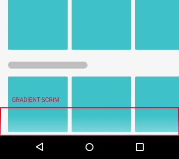
Indicate Vertical Scrolling too
Assume your app supports both horizontal and vertical scrolling. We’ve already discussed leaving visual hints indicating horizontal scrolling. How do you indicate vertical scroll? Websites indicate a vertical scrollbar on the side. But what about mobile? Here’s a neat trick you can use, although not seen in many apps. Use a light faded scrim at the bottom.
Don’t confuse Tabs with Horizontal Lists
Let me put this one bluntly. Assume your app has Tabs and one of them includes a horizontally scrolling list. Say, something like this.
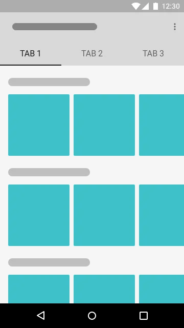
How do you switch between Tabs? You swipe. Horizontally. How do you scroll the list? Horizontally. Can you see that one gesture is used for two different actions? When used in Tabs, differentiate between horizontal scrolling and swiping. You don’t want users to scroll to the end of a horizontal list, and then be taken to the next Tab. So what can we do? The easiest solution is to disable horizontal Tab swiping. The hardest solution is to rethink your navigation.
Horizontal List Alternative
The very purpose of a horizontal list is to show similar content that belongs to a particular category. Most apps who do this, display N scrollable items for a category. The remaining contents are hidden behind the SEE ALL button. So either way, you’re not showing ALL contents of a category. Assuming you display 10, users will have to tap ‘See All’ to view the remaining 50 plus whatever contents. If that’s what your horizontal list does, you don’t need a horizontal list at all.
Use a Grid instead
With no horizontal scrolling, users can now skim through your content faster. They just have to scroll in one direction. Vertically. We have already seen how Tablet designs adapt to this.
The second example is even better. Google Play Music app does it very well. It shows 4 contents of a playlist, collaged together. You can access other music in the playlist by directly tapping the thumbnail itself.
There are two advantages to this design decision:
- you retain the user’s natural flow of consuming content
- a user sees more initial content, than what a horizontal list shows
Speaking of the second point, you may argue that a horizontal list shows more. Okay, I agree. But you need to scroll to see that don’t you? The point of an alternative is for you to rethink. Do you really need those nested, horizontal scrolling lists? Users naturally scroll vertical by default. I say this multiple times because anything that breaks this flow, breaks the ability to skim quickly through content. So before you decide upon horizontal lists, it’s worth weighing its negatives. Otherwise, before going with it, you can always try one of the methods above.
Tip for Android Devs.
Embedding a horizontally scrollable list in a vertical parent list is hard. In other words, nesting RecyclerView is easy to do, but difficult to get it right. But don’t sweat it. Nick Butcher has done this for Google’s I/O 2016 app and open-sourced it! It includes some neat performance tweaks too. You can see it on GitHub.
TL;DR If you want to display different categories of a content, consider using horizontal lists. However, don’t include it in screens that belong to Tabbed navigation.
Conclusion
Today, content-heavy apps use nested scrolling with horizontal lists. While that’s not wrong, it’s implementation must be right. Horizontal scrolling feels more intuitive on mobile due to gestures. But use it with caution, because it breaks our natural flow of consuming content. Which is reading vertically. So make sure you have good reason to include it in your app. Remember at the start of this article, we talked about Google’s Play Store app. We also saw why using a horizontal list is suitable in their scenario. As UI/ UX designers, it’s our responsibility to ensure that we don’t confuse users. After all, scrolling is the most fundamental and highly-used gesture on mobile!