If you’ve gone through my Implement a Floating Action Button post, it shows you how to setup a neat FAB by using a library with relatively minimal effort. This post is for those who would like to avoid using one (like me) and make your own instead. I’ll show you how to make a FAB very easily using XML only. I’ll first show you how to imitate one for pre Lollipop, and then how we can tweak that to give an authentic experience on Lollipop devices exclusively in part 2.
Pre Lollipop
Now there are a couple of DIY methods:
- Make a custom view component by extending ImageButton class. For example in futuresimple’s library, you can see how he’s done it.
- Simple XML method with a circle drawable to your ImageButton and add a shadow drawable below it.
- Create a layer-list
Personally, I prefer the second approach because I like to keep it simple and stick to XML for my UI as much as possible.
The Approach
What we’ll be doing is similar to what we’ve done for our Toolbar. Which is create the layout in a separate XML file then reference it in our mail layout using the <include /> tag. We’ll create an ImageButton which serves as the main FAB layout. Add a View below it for its shadow via a drawable. All this will be wrapped within a FrameLayout, finally to be referenced in our main layout.
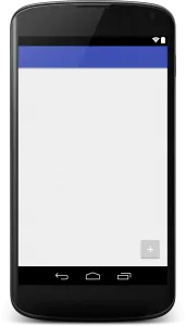
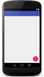
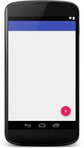
My Floating Action Button
Create a new layout res/layout/myfab.xml. The root element here is a FrameLayout. The general layout for our FAB is this:
If you’re wondering why the shadow view is ABOVE the FAB while it actually must be BELOW, the thing is:
in a FrameLayout, the z-index is defined by the order in which the items are added
So whatever place above, is drawn first. Our shadow will be rendered first, while our FAB will come next, overlapping the shadow.
Positioning the FAB
Unless, you’re not familiar with the guidelines for a Floating Action Button, it says:
The floating action button should be placed 16dp minimum from the edge on mobile and 24dp minimum on tablet/desktop.
Since our FrameLayout will be holding the entire FAB layout, we’ll start off by positioning it as per the guidelines. Position it at the screen’s bottom right via layout_gravity with a 16dp margin.
The frame’s width and height will be set to 100dp because we need some spacing around our FAB for the shadows. You can also notice that I’ve not set the 16dp margins as specified by the guidelines. Why? Some simple math.
Calculation
FAB Size: 56dp FAB Shadow (to be defined): 80dp Frame: 100dp Now, our layouts within the Frame are centered within. So anything within 100dp can be contained within comfortably. 100 (frame) - 16 (margins) = 84dp (remaining) 80dp is taken up by the shadow (FAB included). So that’s 4dp extra remaining in our Frame! This will be useful for Lollipop’s elevation property, which we will be using to “elevate” the FAB upon click in the next part. We do not want our shadows do be clipped off due to lack of spacing. Now THAT would be ugly! I’m sure we can allow ourselves a few dps of freedom for our FAB to float comfortably. Unless you want to strictly adhere to the guidelines, then simply alter the FrameLayout’s dimensions as you see fit.
FAB Layout
We’ll leave the View for now, and dive straight into our ImageView which is essentially our FAB.
The dimensions are the recommended size for a regular FAB, centered in our FrameLayout. The src is nothing but your FAB icon, whatever you want to keep. The background attribute is what will define our FAB’s shape, color and its click selector as well.
FAB Selector
This is our basic selector. The first two are self-explanatory, that being the pressed and focused states for our FAB respectively. The last item is the default layout our FAB will use when not responding to any touch events.
We essentially need to define a circular shape for our FAB, its color (accent) and its color change (darker tone) upon touch for visual feedback. Within each item tag, we’ll start by setting its shape and color.
The color will only be different for the last item which is our default. The first two hold the pressed state for our FAB. Now you needn’t worry that we’ve not set any size for it because this will be defined by the ImageView that references the selector. Finally, your selector should look like this:
FAB Shadow View
I’m using a custom drawable png for my shadow here, so its dimensions should definitely be higher so that it can be visible behind the FAB. Now I’ve found 80dp to be a good value that works for me. Feel free to adjust as you see fit.

I found a neat shadow drawable being used in a Floating Action Button library by makovkastar. It’s what I’ve used for my FAB and from trial and error I can say for sure that compared to those layer list shadows, this one looks best by far. There are drawable pngs for all densities. Grab the zipped file here.
Putting it together
Until now, what we’ve done is:
- Created a separate XML for our Floating Action Button
- Added the ImageView for our FAB.
- Referenced a selector for the ImageView that defines shape & color
- Added a View above the FAB layout for the shadow
- Referenced a shadow drawable png as a background for our View
Finally, we add our fab layout to our main activity layout file, just like we do for a Toolbar. <include layout="@layout/myfab" /> Make sure to add this as the LAST element in your XML as the FAB must be the top most view of your layout.
You can check out my code sample over at GitHub. For the sake of this post’s length and simplicity, I’ll be continuing the Lollipop part in my next post. To augment your FABs on Lollipop, head over to Part 2 of this post!