What is a Floating Action Button?
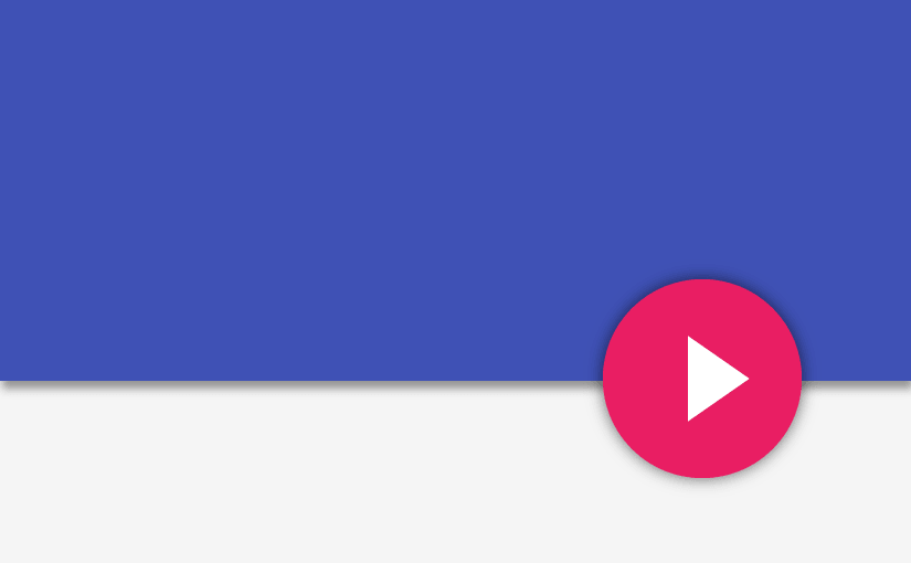
A new component introduced in Material Design is the Floating Action Button. It is an elevated circular view that floats above the UI in the bottom right. Its usually noted by its distinct visual that emphasizes that screen’s most important action.

I’ll show you how we can quickly set up one that works on devices preceding Lollipop in this relatively simple tutorial.
Floating action buttons are used for a promoted action. They are distinguished by a circled icon floating above the UI and have motion behaviors that include morphing, launching, and a transferring anchor point. - Material Design source
Set Up
Create new project in Android Studio and set minSdkLevel to 14 (Icecream Sandwich). Why Icecream Sandwich you ask? Well, by using API Level 14 and above you’re targeting more than 90% of the Android devices. I’m sure you’d agree with me when I say that its worth the sacrifice. We should be focusing on delivering quality for current users rather than sacrificing for supporting very old devices. The world’s moving forward, so should you and your apps.
Quick implementation with library
Let’s start off by adding a gradle dependency for a wonderful Floating Action Button library created by futuresimple. We’ll be implementing our Floating Action Button with this. Not too fancy, but its just what we need.
dependencies {
    compile 'com.getbase:floatingactionbutton:1.9.0'
}
Why use a library?
- Avoid building from the ground up
- Can quickly set up what we need with minimal effort
- Saves LOADS of time and frustration
- Most of all, easy to use!
With this library implementation, we immediately can create a FAB like any other normal UI widget in XML. We can also set its properties easily. With the complex part of the UI code handled by the library, that leaves us to focus on building our actual app faster. As a rule of thumb, if you’ve found a good library that’s not too heavy on file size and suits your purposes well. Then I’d suggest you go for it. Why do you want to build something from scratch, when the exact same thing already exists, available for use? Enough talk, let’s get to adding a FAB to our layout.
Adding FAB to the layout
Open up your activity_main.xml under res/layout and add this to it.
I’m wrapping my FAB within a RelativeLayout, hence why you see the alignParent properties used. Suppose you wrap it within a FrameLayout, use android:layout_gravity="bottom|right"instead. The properties with the fab namespace belong to the library. According to Material Design guidelines, the FAB must be:
- positioned at the bottom right of screen
- elevated higher that other views, such that it appears to be floating above them
- maintain a margin of 16dp from the bottom and right edges of the screen
- have a size of either 56dp (default) or 40dp (mini)
Don’t worry if your Preview doesn’t show you much of a
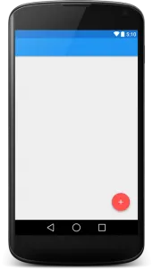
FAB, just compile and run. The emulator should show you what you expect to see. We’ve now got a nicely positioned FAB at the bottom right. Note that the only thing we’ve done is add the fab to our layout and we’ve already got all of its visual aspects set such as the shadow mimicking elevation, thanks to the library. For the sake of this tutorial whose purpose is to show you how a fab works, I will use a simple RecyclerView that holds a list (for scrolling). Now if some of you have issues with your fab not changing color on tap, or not detecting your taps entirely, its mostly a layout ordering issue. Note that within my RelativeLayout, I have a RecyclerView that holds some dummy data for a list. Now the fab layout must be below the RecyclerView for it to work.
Click Listener
Go to your MainActivity.xml and reference the FAB from XML. It is setup like any other normal click listener.
FloatingActionButton fab;
@Override
protected void onCreate(Bundle savedInstanceState) {
...
fab = (FloatingActionButton) findViewById(R.id.fab);
fab.setOnClickListener(new View.OnClickListener() {
@Override
public void onClick(View v) {
// Your FAB click action here...
Toast.makeText(getBaseContext(), "FAB Clicked", Toast.LENGTH_SHORT).show();
}
});
...
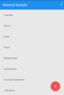
}The final output will be like this. A Floating Action Button positioned correctly, that reacts on click events.
Sum it up
We’ve seen how to setup a Floating Action Button quickly using a library. We then added it to our layout and defined its custom properties. We’ve also seen how to handle it’s click events with a simple Toast message. Check out part 2 where I’ll be showing you how to add some neat animations to our FAB!