DIY Floating Action Button Part 2

In this post, I’ll show you how to make your Floating Action Button behave as it should on Lollipop devices. Elevation and ripple effects is what we’ll be achieving.
Part 1 of this post already covered how to make a Floating Action Button (FAB) and set it up for pre Lollipop. Check out part 1 first if you haven’t already.
NOTE:
There is now a native widget for a Floating Action Button (FAB). You can learn how to implement it from here.
In order to give those special treats for Lollipop devices, what we’re going to do is:
- Remove the shadow beneath the FAB
- Replace the FAB selector with a selector
- Add a ‘State List Animator’ to the FAB (elevates the FAB on touch)

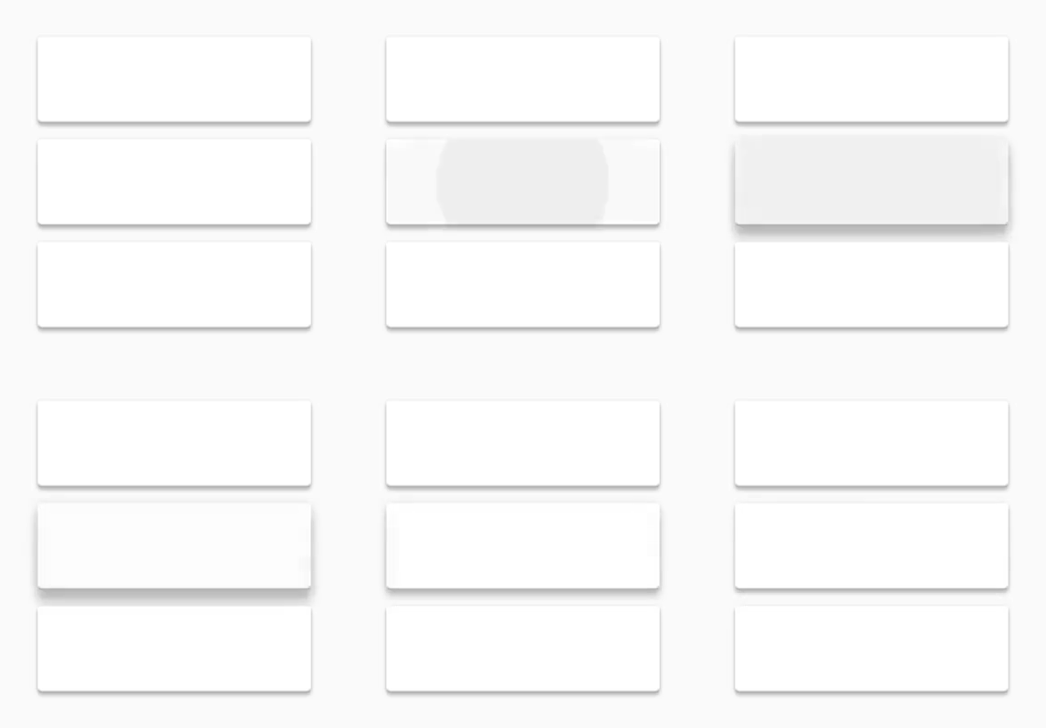
ripple & elevation effect
Removing the shadow
By removing what we’ll do is, take out the shadow from the layout completely if the phone’s running Lollipop.
This can be done simply by using a Build check such as:
if (Build.VERSION.SDK_INT >= Build.VERSION_CODES.LOLLIPOP) {...}
Now, if the build version is Lollipop and above, we’ll remove the shadow using the setVisibility method for our shadow like this:
fabShadow.setVisibility(View.GONE);
setVisibility() method
The method allows you 3 options for its parameter:
View.VISIBLE– this is the default by which the view will be visible. You won’t be using it unless you want to bring back an invisible view.View. INVISIBLE– exact opposite of the previous one (obviously, its in the name). The view remains in the layout, but cannot be seenView.GONE– this takes the view OUT of the layout. It doesn’t exist or reside in the layout.

FAB without shadow
While both INVISIBLE and GONE don’t display the view, INVISIBLE makes the view still exist, while GONE completely takes the view off the layout.
We don’t need the shadow beneath our FAB at all, which is why we’ll use View.GONE
 if (Build.VERSION.SDK_INT >= Build.VERSION_CODES.LOLLIPOP) {
            fabShadow.setVisibility(View.GONE);
}
State List Animator
This is what will replace our removed shadow. This is nothing but a regular selector, but its items will be an objectAnimator. Using this we will alter the Z translation of our FAB which will elevate higher on click, and come back to its default elevation afterwards.
This feature is part of the Lollipop SDK, and for it to be used properly, it must be placed in its proper folder.
Create a new folder res/animator. This folder holds the XML animations exclusive to Lollipop. Create fab_elevation_selector.XML under it.
Our default Selector framework is this:
<selector>
    <item
        android:state_enabled="true"
        android:state_pressed="true">
        <!-- Used when the FAB is clicked -->
        <objectAnimator />
    </item>
    <item>
        <!-- Default state -->
        <objectAnimator />
    </item>
</selector>
For our pressed item, the objectAnimator will change the FAB’s translationZ from 8 to 12dp. The default animator do the opposite. Change the translationZ from 12 to 8dp (bring it back to its original state).
<selector xmlns:android="http://schemas.android.com/apk/res/android">
    <item
        android:state_enabled="true"
        android:state_pressed="true">
        <objectAnimator
            android:duration="@android:integer/config_shortAnimTime"
            android:propertyName="translationZ"
            android:valueFrom="8dp"
            android:valueTo="12dp"
            android:valueType="floatType" />
    </item>
    <item>
        <objectAnimator
            android:duration="@android:integer/config_shortAnimTime"
            android:propertyName="translationZ"
            android:valueFrom="12dp"
            android:valueTo="8dp"
            android:valueType="floatType" />
    </item>
</selector>
I’ve chosen the default short animation time for the duration. Gives us a smooth enough elevation.
Now we’ve got to tell our FAB to use it. A state list selector is referenced differently than a regular background selector. Unlike its drawable or color which is changed on click, a state list selector changes its property (translationZ) here upon click.
Add this line in your FAB’s ImageView:
android:stateListAnimator="@animator/fab_elevation_selector"

With stateListAnimator
Notice how its referenced as @animator instead of @drawable or @anim. While the property may read as a stateListAnimator, the XML that it references is actually a selector XML.
Ripple Effect
Personally, I love the ripple effect. A new XML tag dedicated solely to this effect has been introduced since the advent of Lollipop <ripple />. It’s pretty easy to use, but the only thing to keep in mind is it must reside in the drawable-v21 folder.
So lets go about creating it. Create res/drawable-v21/ripple_accent.xml
Why name it accent? Because my FAB uses the accent color, and so will its ripple!
<ripple xmlns:android="http://schemas.android.com/apk/res/android"
    android:color="@color/accent_700">

    <item>
        <shape
            android:shape="oval">
            <solid android:color="@color/accent_500"></solid>
        </shape>
    </item>

</ripple>
Yep, its as simple as that. The color belonging to the ripple tag, is the ripple color itself. The one in the item, bounds the ripple to a shape and gives it a base color. Not including the item would give us a ripple on a transparent FAB!
With that done, we just have to change the background selector for our FAB (ImageView). Remember that we’ve already set a background selector in Part 1. This is the one the FAB will use by default. For Lollipop, we need to tell it to use the ripple selector instead.
We can do this simply by adding a line to our already existing Build check:
if (Build.VERSION.SDK_INT >= Build.VERSION_CODES.LOLLIPOP) {
            fabShadow.setVisibility(View.GONE);
            fabBtn.setBackground(getDrawable(R.drawable.ripple_accent));
}
Well, maybe the ripple may seem to subtle for you. But if you ask me, its already a bit heavy on the animations and a more prominent ripple would be overkill. Though feel free to alter the ripple if you wish via its XML. 🙂
You can head over to my GitHub repository to check out the code samples.
That’s all there is to it! All we’ve done is, hide our ‘fake’ shadow drawable and replaced it with a stateListAnimator that adds a shadow via elevation. Then replace the background selector to a ripple drawable.
IMAGE CREDITS (card ripple gif) : android-developers.blogspot.com


