In this Android tutorial we’ll create an on scroll, collapsing Toolbar animation.
The Design support library for Android makes it easy to create great animations. Let’s look at how to create an app with a collapsing Toolbar animation. It’s know as the Flexible Space with Image pattern, a popular scrolling technique.
I didn’t know this pattern actually had a name until Ian Lake happened to point it out for me.
This article has been updated for AndroidX!
Flexible Space with Image Pattern
A scrolling technique that supports an image header with a scrollable view below it. Upon scrolling, the ‘Flexible Space’ (image header) gets tinted with or. At the same time, it collapses into a Toolbar.
– Material Design guidelines
This pattern is a popular scrolling technique. In familiar terms, you can see this in WhatsApp’s contact detail screen.
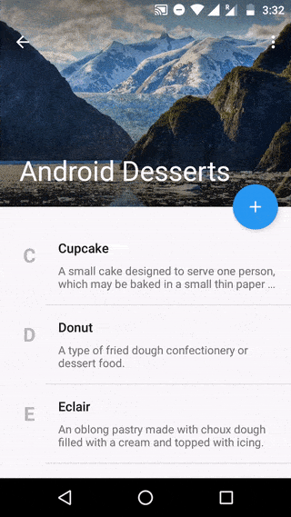
Here’s the step-by-step screenshots of the Flexible Space animation. Should give you a clear picture of what’s going on.
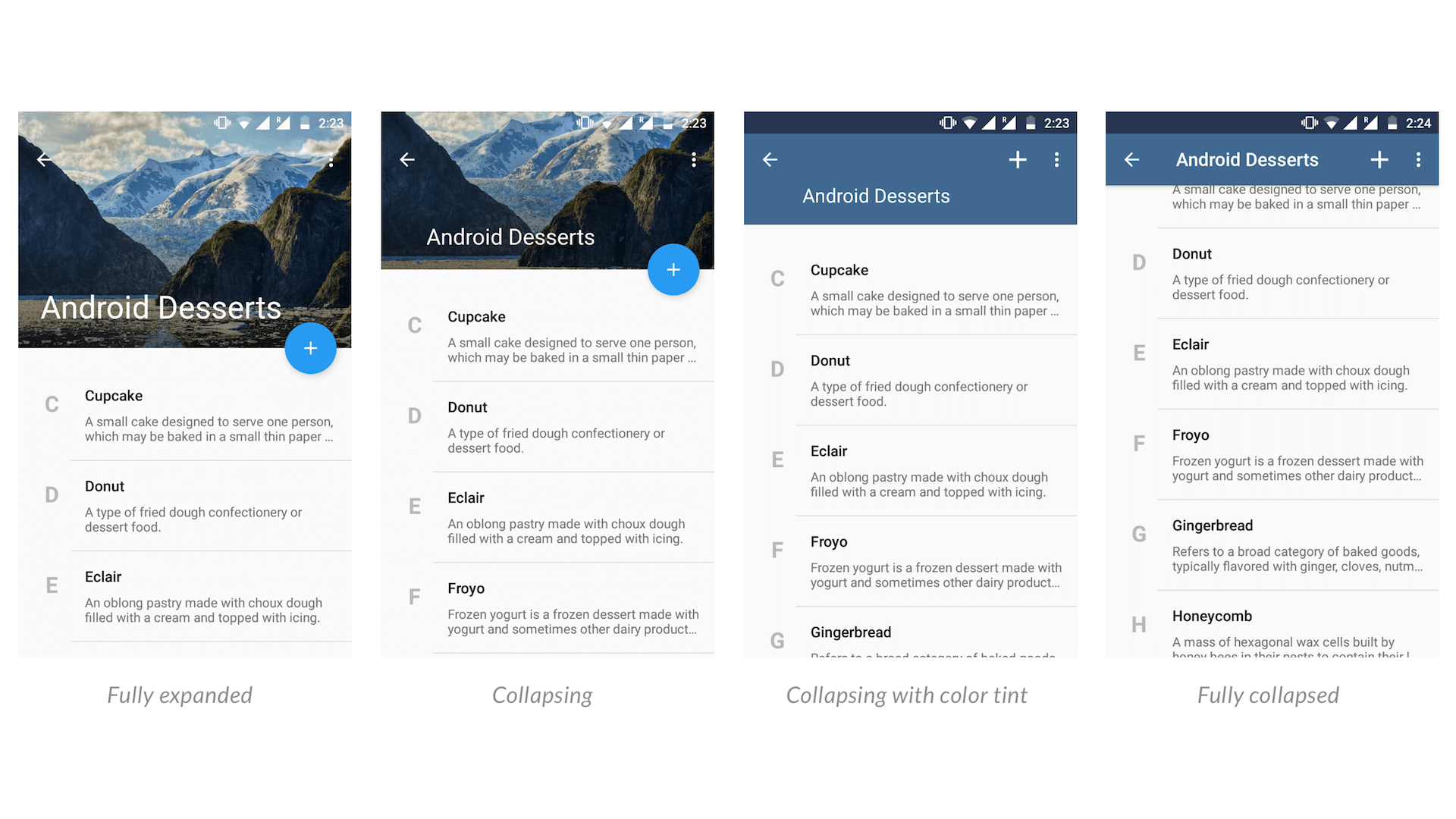
Notice the Toolbar dynamically changes color, depending on the image. It takes on the most dominant color present in the image.
We can do this with the Palette API, but more on that later.
You might immediately start to freak out with the amount of code it might take. But rest assured, there’s no scary Java code to write. Most of it is XML, so cheers to that!
Other Design Support Library tutorials:
- Material Design Navigation Drawer
- Parallax Scrolling Tabs with header image
- Material Design Tabs Layout
- Quick Return pattern
Here’s a useful index for navigating the article. Sections include not just how to implement the pattern. But also how to do it correctly, in terms of UI and UX.
Table of Contents
- Getting Started
- Floating Action Button
- Dynamic Colors with Palette API
- Complete Activity Code
- Toolbar Animation in Action
Getting Started
Start by adding the Design Support Library to your app/build.gradle file.
NOTE
The Design Support package is now part of Android X.
dependencies {
    …
    implementation 'androidx.appcompat:appcompat:1.1.0'
    implementation 'com.google.android.material:material:1.0.0'
}
Layout Structure
As always, we’ll get started with the XML first. Open your activity.xml layout.
Here’s the layout skeleton.
<androidx.coordinatorlayout.widget.CoordinatorLayout>
   <com.google.android.material.appbar.AppBarLayout>
      <com.google.android.material.appbar.CollapsingToolbarLayout>
         <ImageView />
         <androidx.appcompat.widget.Toolbar />
      </com.google.android.material.appbar.CollapsingToolbarLayout>
   </com.google.android.material.appbar.AppBarLayout>
   <!-- Your scrollable content here -->
</androidx.coordinatorlayout.widget.CoordinatorLayout>
Design Support UI Widgets
I understand if all these layouts might appear new to you. But you won’t have to worry. I’ll do my best to explain them in the easiest way.
1. CoordinatorLayout
A powerful FrameLayout that specifies behavior for child views for various interactions. It also allows anchoring of floating views in your layout.
2. AppBarLayout
It is a special kind of vertical LinearLayout. It helps respond to its children’s scroll events (scroll gestures). Additionally, it’s responsible for implementing many features of Material Design’s AppBarLayout.
But, there’s one thing to note. Its usage relies on being a direct child within CoordinatorLayout. The layout skeleton above demonstrates this.
3. CollapsingToolbarLayout
It is a Toolbar wrapper which makes the ‘Flexible Space’ pattern possible. It collapses the image header while decreasing the expanded title to a Toolbar title.
What’s left is the ImageView which holds our actual header’s image and Toolbar which we’re familiar with.
4. FloatingActionButton
I’m sure you’re familiar with what a Floating Action Button is, aren’t you? Android gave it a thumbs up by giving us an official UI widget. It’s a part of the Design Support Library.
Defining the XML Layout
Alright, with that out of the way lets get to the actual XML.
A word of caution. The layout below might look threatening in size!
<?xml version="1.0" encoding="utf-8"?>
<androidx.coordinatorlayout.widget.CoordinatorLayout xmlns:android="http://schemas.android.com/apk/res/android"
    xmlns:app="http://schemas.android.com/apk/res-auto"
    xmlns:tools="http://schemas.android.com/tools"
    android:layout_width="match_parent"
    android:layout_height="match_parent"
    android:fitsSystemWindows="true">

    <com.google.android.material.appbar.AppBarLayout
        android:id="@+id/appbar"
        android:layout_width="match_parent"
        android:layout_height="@dimen/appbar_header_height"
        android:fitsSystemWindows="true"
        android:theme="@style/ThemeOverlay.AppCompat.Dark.ActionBar">

        <com.google.android.material.appbar.CollapsingToolbarLayout
            android:id="@+id/collapsing_toolbar"
            android:layout_width="match_parent"
            android:layout_height="match_parent"
            android:fitsSystemWindows="true"
            app:contentScrim="?attr/colorPrimary"
            app:expandedTitleMarginStart="@dimen/activity_margin_content"
            app:layout_scrollFlags="scroll|exitUntilCollapsed|snap">

            <ImageView
                android:id="@+id/header"
                android:layout_width="match_parent"
                android:layout_height="match_parent"
                android:background="@drawable/header"
                android:fitsSystemWindows="true"
                android:scaleType="centerCrop"
                app:layout_collapseMode="parallax" />

            <View
                android:layout_width="match_parent"
                android:layout_height="80dp"
                android:layout_gravity="top"
                android:background="@drawable/scrim_topdown"
                android:fitsSystemWindows="true" />

            <View
                android:layout_width="match_parent"
                android:layout_height="160dp"
                android:layout_gravity="bottom"
                android:background="@drawable/scrim" />

            <androidx.appcompat.widget.Toolbar
                android:id="@+id/anim_toolbar"
                android:layout_width="match_parent"
                android:layout_height="?attr/actionBarSize"
                app:layout_collapseMode="pin"
                app:popupTheme="@style/ThemeOverlay.AppCompat.Light" />

        </com.google.android.material.appbar.CollapsingToolbarLayout>

    </com.google.android.material.appbar.AppBarLayout>

    <androidx.recyclerview.widget.RecyclerView
        android:id="@+id/scrollableview"
        android:layout_width="match_parent"
        android:layout_height="match_parent"
        android:clipToPadding="false"
        android:paddingTop="@dimen/activity_margin_content"
        android:paddingBottom="@dimen/activity_margin_content"
        app:layout_behavior="@string/appbar_scrolling_view_behavior"
        tools:listItem="@layout/item_dessert" />

    <com.google.android.material.floatingactionbutton.FloatingActionButton
        android:layout_width="wrap_content"
        android:layout_height="wrap_content"
        android:layout_margin="@dimen/fab_margin"
        android:clickable="true"
        android:focusable="true"
        android:src="@drawable/ic_action_add"
        app:backgroundTint="#279AF1"
        app:fabSize="normal"
        app:layout_anchor="@+id/appbar"
        app:layout_anchorGravity="bottom|right|end" />

</androidx.coordinatorlayout.widget.CoordinatorLayout>
This is not complex code. XML just tends to be a little verbose. But you’re welcome to try replicating the Flexible Space scroll animation in Java. Then I’m sure you’d truly appreciate how easy the Design Support library is!
However, I have highlighted the essential lines you need to focus on.
What you need to know from this?
- line 24:
layout_scrollFlags
Tells theCollapsingToolbarLayoutand its children, how to behave on a scroll.
Here’s what the flags mean, straight from the developer’s blog:
- scroll:
this flag should be set for all views that want to scroll off-screen. For views that do not use this flag, they’ll remain pinned to the top of the screen. - exitUntilCollapsed:
causes the view to scroll off until it is ‘collapsed’ before exiting - snap:
enables the expanded view to snap to either a collapsed state, or expanded state. There is no in-between state. If theViewhas been dragged more towards expanding, it expands completely. If its dragged more towards collapsing, theViewcollapses completely.
- scroll:
- line 33:
layout_collapseMode
Indicates how theImageViewreacts while collapsing on-scroll.
There are 2 collapse modes:
COLLAPSE_MODE_PARALLAX(use forImageView)COLLAPSE_MODE_PIN(use forToolbar)
- line 63:
layout_behavior
TheCoordinatorLayoutperforms most of its magic usingBehavior. Behaviors tell how its child Views must interact with each other.
- line 73:
layout_anchor
Remember we spoke about anchoring Views earlier? This attribute tellsFloatingActionButtonto anchor’ itself toAppBarLayout. - line 74:
layout_anchorGravity
This attribute tells ourViewwhere to display, on its anchorView.
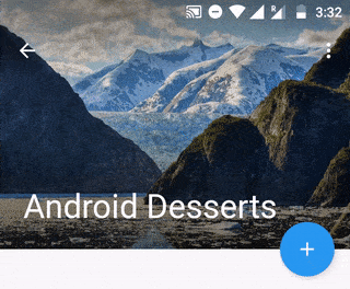
Here’s what the Android Studio’s Preview pane shows us.
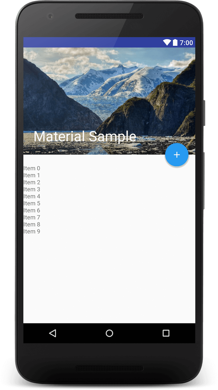
But wait. Does the expanded title look clear enough to you? I’m sure it’s not.
Whenever you display a label (TextView) against a background image, use a ‘scrim‘. It will help make the text more readable.
TIP
Use a Scrim for clear, readable Text
A Scrim is a semi-transparent gradient layer that helps Text appear more readable against backgrounds.
Just below your ImageView, add a simple View with a gradient Drawable as background.
<View
    android:layout_width="match_parent"
    android:layout_height="160dp"
    android:layout_gravity="bottom"
    android:background="@drawable/scrim"/>
Here’s the Drawable scrim.
<shape xmlns:android="http://schemas.android.com/apk/res/android"
       android:shape="rectangle">
    <gradient
        android:angle="90"
        android:endColor="@android:color/transparent"
        android:startColor="#66000000"/>
</shape>
See the difference for yourself.
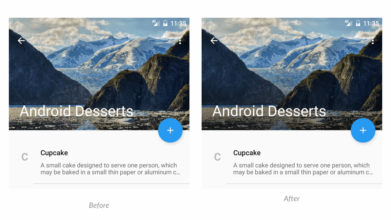
While the difference is subtle, the latter is much better right? Additionally, you can apply another scrim for the Toolbar. It can help the back and overflow icons be more visible. I leave this as an exercise for you.
There are many other techniques that you can use to display text over images.
Getting the Parallax Scroll right
I’ve already mentioned a hint above on parallax scroll. But there’s more to it. We can achieve parallax scrolling with ImageView by setting its layout_collapseMode to parallax.
Parallax Scrolling involves the background moving at a slower rate to the foreground.
– Creativebloq.com
Did you notice an extra collapse mode attribute for the Toolbar? Yes, you must use this as well. Why? Because, while the ImageView should collapse, the Toolbar must persist on scrolling.
Toolbar must use collapseMode:pin, because we want it to persist and remain on top, as the user scrolls down.
Note that I haven’t set any color for the Toolbar. The CollapsingToolbarLayout takes care of this. It dynamically picks up a color from our image and sets it to the Toolbar.
Floating Action Button
Let’s look at the Floating Action Button for a bit. I’ll stick to calling it FAB from now on. If you tried to create a FAB earlier, you’d realize how hard it was. Yes, my previous posts on the FAB are now redundant. Sigh.
But with the Design Support Library, that’s not the case anymore. The layout above shows, how easy it is!
Notice that I haven’t explicitly defined a size for the FAB. By default, it takes its regular width and height of 56dp. But, you can define this by using the following attribute.
app:fabSize="regular"Optionally, you can set the fabSize as mini, which is a miniature version of the FAB at 40dp in size.
Next, in the layout, we position the FAB with alignment to the AppBarLayout. We do this with the layout_anchor attribute.
    <com.google.android.material.floatingactionbutton.FloatingActionButton
        ...
        app:layout_anchor="@+id/appbar"
        app:layout_anchorGravity="bottom|right|end" />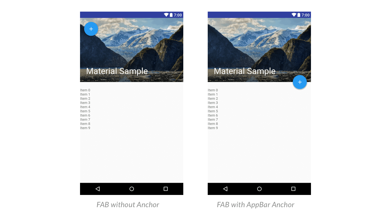
That’s a wrap for the XML part. The good news is, this XML is all that’s required to trigger the Flexible Space scroll animation.
But wait! There’s still one thing that seems a bit off. What about the FAB’s action? After scrolling, the action goes hidden. It becomes available, only when you scroll, all the way to the top.
The Hidden Action
Once the AppBar collapses, we need to show the FAB’s action somewhere.
Now I’m not saying this is the recommended approach. But my suggestion is that once the FAB vanishes, we add the action to the Toolbar’s menu.
To do this we’ll need a listener first. We have to listen to the when the AppBarLayout expands and collapses. To be precise, we need an OffsetChangedListener.
If the AppBarLayout’s ‘verticalOffset’ is zero, then its fully expanded. So when the verticalOffset is almost equal to the fully expanded height, add the action to Toolbar’s menu.
First, let’s look at how to set the listener. Here’s how to do it.
appBarLayout.addOnOffsetChangedListener(new AppBarLayout.OnOffsetChangedListener() {
  @Override
  public void onOffsetChanged(AppBarLayout appBarLayout, int verticalOffset) {
   //  Vertical offset == 0 indicates appBar is fully expanded.
   if (Math.abs(verticalOffset) > 200) {
    appBarExpanded = false;
    invalidateOptionsMenu();
   } else {
    appBarExpanded = true;
    invalidateOptionsMenu();
   }
  }
 });
Here are some key takeaway points from the above code snippet.
verticalOffsetreturns negative values, so we wrap it withMath.abs(verticalOffset)appBarExpandedis a boolean flag that I’m maintaining to know whenAppBarLayoutis expanded or collapsedinvalidateOptionsMenu()is called every time ourAppBarLayout’s height crosses a threshold (200)
Now I wish there was a simpler way to know the AppBarLayout’s state. But I guess this solution works good enough.
Updating Toolbar Menu
invalidateOptionsMenu() helps update our Toolbar Menu. But we need to tell our Menu when to add and remove our extra Action.
Note that the FAB’s action is an ‘Add’ function.
First, we need a reference for the existing Menu. You can get this from the onCreateOptionsMenu() method.
@Override
 public boolean onCreateOptionsMenu(Menu menu) {
  getMenuInflater().inflate(R.menu.menu_main, menu);
  collapsedMenu = menu;
  return true;
 }
collapsedMenu is a global variable of type Menu. It allows us to keep a copy of the original Menu.
Next, we need to update our Menu. We’re already calling invalidateOptionsMenu() in the scroll listener. This will trigger the onPrepareOptionsMenu() method. Hence, we’ll add our dynamic Menu logic here.
    @Override
    public boolean onPrepareOptionsMenu(Menu menu) {
     if (collapsedMenu != null &&
      (!appBarExpanded || collapsedMenu.size() != 1)) {
      //collapsed
      collapsedMenu.add("Add")
       .setIcon(R.drawable.ic_action_add)
       .setShowAsAction(MenuItem.SHOW_AS_ACTION_IF_ROOM);
     } else {
      //expanded
     }
     return super.onPrepareOptionsMenu(collapsedMenu);
    }
You’ll notice that I haven’t done anything for the expanded state. We don’t need to either. I’ll tell you why.
After onPrepareOptionsMenu(), the onCreateOptionsMenu() is called. What do we need to do in the expanded state? The FAB becomes visible, which means we should hide the ‘Add’ action from Toolbar menu.
Since onCreateOptionsMenu() inflates the original Menu again, we don’t have to worry about manually removing it.
So now, when the FAB hides, its Action will be added to Toolbar Menu. When the AppBarLayout collapses and FAB hides, the ‘Add’ action becomes visible in the Toolbar Menu.
Now all that remains is to do the usual UI initialization in Java. So let’s setup our Toolbar and then call in the Palette API.
Dynamic Colors with Palette API
The palette API is a support library that extracts prominent colors from images.
To use the Palette library, we first need to add it to your project. So open up your app/build.gradle and add the following line.
dependencies {
    …
    implementation 'androidx.palette:palette:1.0.0'
}
Remember that we have to initialize our UI first. So open your Activity.java and type away. Or copy-paste this instead.
toolbar = (Toolbar) findViewById(R.id.anim_toolbar);
setSupportActionBar(toolbar);

collapsingToolbar = (CollapsingToolbarLayout) findViewById(R.id.collapsing_toolbar);
collapsingToolbar.setTitle("Suleiman Ali Shakir");

ImageView header = (ImageView) findViewById(R.id.header);
Now you might ask me, why I have set a title for CollapsingToolbarLayout, instead of Toolbar? That’s a valid question.
Take a look at the Flexible Space with Image scroll animation. Yes, the GIF which I shared at the beginning of this post. Notice there’s an expanded title, which on scrolling, collapses into the Toolbar title.
The CollapsingToolbarLayout handles this for us. Hence we set the title for that, instead of a Toolbar.
Additionally, the CollapsingToolbarLayout also handles tinting our Toolbar using the Palette API. I’ll show you how to do this.
Using the Palette API
First, pass the ‘header’ ImageView’s bitmap to the Palette API. Then the API will generate colors based on the header image, in an AsyncTask.
Once it completes, we can fetch a color we want and set it to CollapsingToolbarLayout. This, in turn, tints our Toolbar to our chosen color, when we scroll.
Let’s look at some code.
Palette.from(bitmap).generate(new Palette.PaletteAsyncListener() {
 @Override
 public void onGenerated(Palette palette) {
  int vibrantColor = palette.getVibrantColor(R.color.primary_500);
  collapsingToolbar.setContentScrimColor(vibrantColor);
  collapsingToolbar.setStatusBarScrimColor(R.color.black_trans80);
 }
});
I am fetching my bitmap from my resources directory. But, in a real-world scenario, you would be downloading the image from an URL. Then saving it as a bitmap and passing that to the Palette API.
The Palette API offers several color options (variations). Here are the basic four:
- Light
- Dark
- Vibrant
- Muted
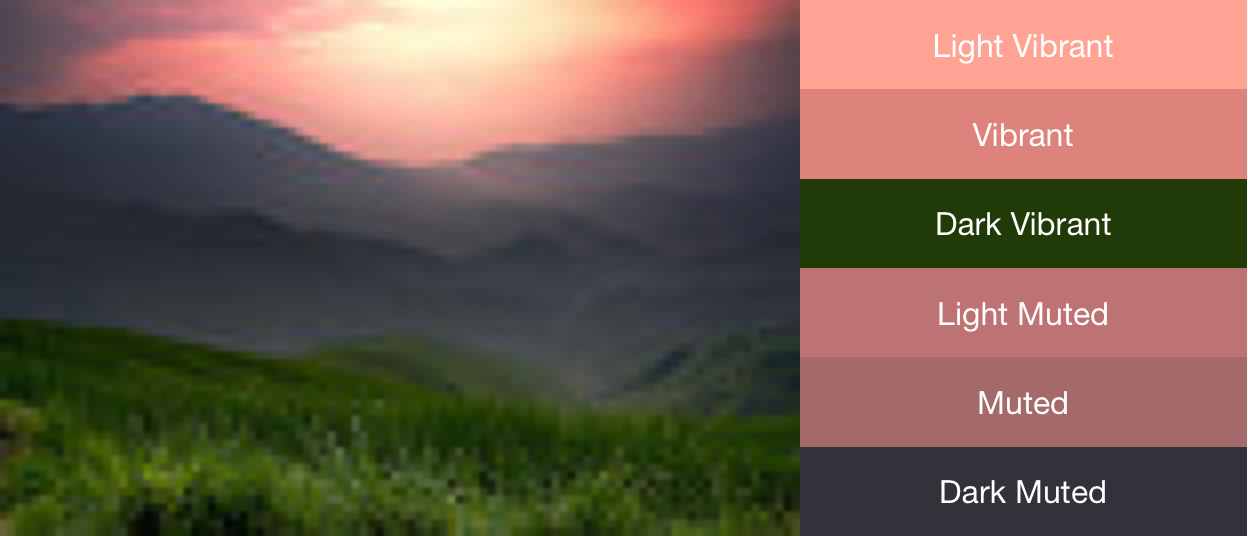
You can also increase the number of colors generated from the image. Or you can even retrieve the entire color swatch! If you’re interested in playing around with the Palette API, I’d suggest you go through Chris Banes’ post.
Complete Activity Code
Here’s the complete Activity for your reference.
[gist id=”5b4bcebde5d4315cf02ad63d72405650″ file=”5b4bcebde5d4315cf02ad63d72405650.js”]
Output – Toolbar Animation Results
Finally, we’ve completed what’s needed for the Toolbar animation. In fact, much more than what’s required! So go ahead, run your app and watch the magic.
To be honest, it was surprising to see such a smooth Toolbar animation. Even the FAB beautifully reacts upon touch with a higher elevation.
Source Code:
Available on GitHub
Material Design is a powerful visual language that can help you design a brilliant app. The Design Support Library makes it easy to create powerful animations, like this. It allows us to create rich app experiences our users can enjoy.
How are you using the Design Support Library? Do you have your own take on the ‘Flexible Space with Image’ animation pattern? Let me know in the comments below.
Also, if you liked reading this, don’t forget to share with your friends.