
Version 23.2 of the Android Support library is a huge update. The Design Support Library made Material Design easy. The new update made it a step easier by adding my personal favorite, Bottom Sheet! In this post, we’ll look into making just that.
What’s a Bottom Sheet?
A Bottom Sheet is a sheet of material that slides up from the bottom edge of the screen. Displayed only as a result of a user-initiated action, and can be swiped up to reveal additional content. It can be a temporary modal surface or a persistent structural element of an app. – Material Design Spec
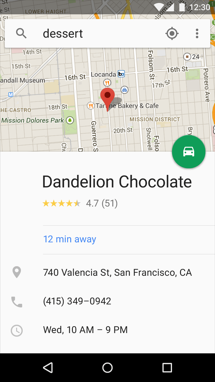
Here are some examples:
[su_row][su_column size=”1/2″]
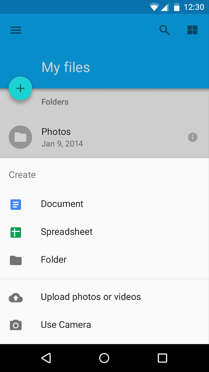
[/su_column] [su_column size=”1/2″]
[/su_column] [/su_row]
We’ll be making the exact Bottom Sheet on the right (excluding the map).
Getting Started
Start off by updating your support libraries to 23.2.0.
dependencies {
    compile fileTree(include: ['*.jar'], dir: 'libs')
    compile 'com.android.support:appcompat-v7:23.2.0'
    compile 'com.android.support:design:23.2.0'
    ...
}
Also, for this tutorial I’m using:
- Build Tools v 23.0.2
- Android Studio 1.5.1
- Gradle (Build Tools) 1.5.0
If you aren’t familiar with the Design Support Library, now is the time to do so. Read these Design Support Library tutorials:
- Toolbar Animation (Flexible Space with Image)
- Material Design Tabs
- Easy Material Design Navigation Drawer
Adding a Bottom Sheet via XML
For those familiar, we include our scrollable view within CoordinatorLayout, below AppBarLayout in XML. To include a Bottom Sheet, we add it below our scrollable view.
NOTE: The Bottom Sheet does not use any special tag. It is just a NestedScrollView using a Behavior.
<android.support.design.widget.CoordinatorLayout
  xmlns:android="http://schemas.android.com/apk/res/android"
    xmlns:app="http://schemas.android.com/apk/res-auto" >

    <android.support.design.widget.AppBarLayout >

        <android.support.v7.widget.Toolbar />

    </android.support.design.widget.AppBarLayout>

   <!-- Your scrollable view -->
    <android.support.v7.widget.RecyclerView
        app:layout_behavior="@string/appbar_scrolling_view_behavior" />

   <!-- Adding any other scroll view, with BottomSheetBehavior -->
    <android.support.v4.widget.NestedScrollView
    app:behavior_peekHeight="312dp"    app:layout_behavior="android.support.design.widget.BottomSheetBehavior" />

</android.support.design.widget.CoordinatorLayout>
For the sake of clarity, you might want to include the Bottom Sheet XML via a separate file. To keep it simple, I’ve only included the XML’s hierarchy. But here’s my complete layout.
Note the layout_behavior attribute for the NestedScrollView. It refers to the BottomSheetBehavior provided by the Design Support Library. In this way, we’re telling CoordinatorLayout we want NestedScrollView to behave like a Bottom Sheet.
By default, only a part of the Bottom Sheet is visible. We drag to expand, and continue scrolling. Use behavior_peekHeight to define how much of the Bottom Sheet you want visible.
Yep, that’s all you pretty much need to get Bottom Sheet working. Just pure XML. This is what the Design Support Library has been about. Easy Material Design.
So far, here’s what we got.

But I’m sure we’re not here for just that? What if you want to listen to state changes? The folks at Android figured you’d want to. So they provided a set of neat flags. Sweet!
Listening to Bottom Sheet state changes
If you read the official blog post about 23.2, you’d notice the Google Maps Bottom Sheet. The Floating Action Button there, caught my eye. Its a perfect UI element to demonstrate the callbacks.
Action Plan
Here’s what we’re going to do. Let the Floating Action Button (FAB), be visible when the Bottom Sheet is resting (not expanded). It becomes invisible once the Bottom Sheet expands. We’ll handle FAB’s visiblity with a neat grow / shrink animation.
Grow / Shrink Animation
These animations are defined in XML. You can get the animations from here.
Then simply reference these animations in your Activity like this:
Animation growAnimation = AnimationUtils.loadAnimation(this, R.anim.grow);
Animation shrinkAnimation = AnimationUtils.loadAnimation(this, R.anim.shrink);
Listening to State Changes
Now, onto the real deal. First, reference the Bottom Sheet from your CoordinatorLayout.
CoordinatorLayout coordinatorLayout = (CoordinatorLayout) findViewById(R.id.coordinator);
View bottomSheet = coordinatorLayout.findViewById(R.id.bottom_sheet);

BottomSheetBehavior behavior = BottomSheetBehavior.from(bottomSheet);
Don’t forget to reference your FAB. Notice that we’ve also referenced the BottomSheet’s Behavior. This is needed to set the callback.
Attach a BottomSheetCallback() to your behavior object. It provides 2 methods to override:
- onStateChanged()
- onSlide()
onStateChanged()
There are 5 flags in total:
- STATE_DRAGGING: intermediate state while the user is dragging the bottom sheet up or down
- STATE_COLLAPSED: default state
- STATE_EXPANDED: fully expanded state of the bottom sheet.
- STATE_HIDDEN: allows users to swipe down on the bottom sheet to completely hide it. Disabled by default
- STATE_SETTLING: brief time between when the View is released and settling into its final position
Only the first 3, among 5 is what we need. Your onStateChanged() method will look like this:
behavior.setBottomSheetCallback(new BottomSheetBehavior.BottomSheetCallback() {
          @Override
          public void onStateChanged(@NonNull View bottomSheet, int newState) {

              switch (newState) {
                  case BottomSheetBehavior.STATE_DRAGGING:
                      if (showFAB)
                          fab.startAnimation(shrinkAnimation);
                      break;

                  case BottomSheetBehavior.STATE_COLLAPSED:
                      showFAB = true;
                      fab.setVisibility(View.VISIBLE);
                      fab.startAnimation(growAnimation);
                      break;

                  case BottomSheetBehavior.STATE_EXPANDED:
                      showFAB = false;
                      break;
              }
          }
        ...
      });
While the Bottom Sheet is dragged, we want to shrink the FAB. STATE_COLLAPSED is the default resting position of the bottom sheet. This is where we want our FAB to appear with a grow animation.
showFAB is a Boolean that tracks if the FAB needs to be shown or not while dragged.
ALTERNATE APPROACH:
Here’s another way to do the FAB animation. Adjust the rate of growing / shrinking depending on the rate of the Bottom Sheet’s drag. Grow if you drag down, shrink if you drag up. I leave that for you to try.
With all this in place, lets see how our Bottom Sheet looks now.
Final Output

Our Bottom Sheet sure does have some life now doesn’t it? With the help of its callbacks, we were also able to do this nice little grow / shrink animation.
The new Android Support Library 23.2 is a nice update, with Bottom Sheets added to it, just made it better.
SOURCE CODE: GitHub
What designs did you come up with? Drop ’em in the comments below. Or share the post if you liked it!