Material Components are a set of UI components that helps you build Android apps with Material Design.
In this post, I’ll cover every Material Design component available to us. In addition to components, popular design patterns can be recreated as well. That too, quite easily. For example, the ‘Collapsing App Bar on scroll’ (Read as Flexible Space with Image Pattern).
Moreover, I’ll tell you how to use each Material Component with links to detailed Android tutorials.
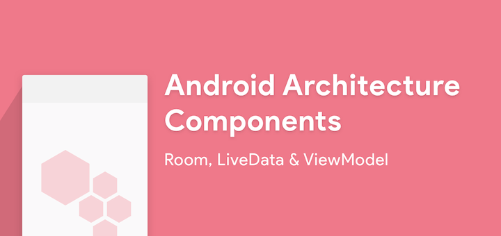
During the concluded Google I/O 2017, there were some amazing announcements about Android. Say hello to Android Architecture Components. For once, these are announcements that ease our lives as Android Developers.
Android Architecture Components
A new collection of libraries that help you design robust, testable, and maintainable apps. – developer.android.com
It helps us developers address two pain points:
Manage our UI components lifecycle
Persist data over configuration changes
In fact, these are the two biggest problems we Android Developers face. Period.
Maintaining data over orientation changes and handling our objects with lifecycle is hard. That’s why, to avoid the hassle, you lock your apps in Portrait mode, don’t you? Don’t lie. Even I’ve done it.
But don’t worry, Android Architecture Components will help alleviate both our fears.
There are 3 main architecture components:
Room
LiveData
ViewModel
So first, let’s find out what these components actually are. Then, we’ll learn how we can use them.
We’ll even make a handy app that keeps track of what people borrow. This will help us learn better about how all these 3 components work together.
Room
Remember the amount of boilerplate code you had to write to create and manipulate even a very small database? You had to define the database structure, create an SQLiteHelper class etc.
Room is a library that saves you all such trouble. Now you can query your data without having to deal with cursors or loaders. You can define your database by adding annotations in your Model class. Yes, it’s that simple.
If you’ve used third-party ORMs like Sugar, you’ll feel right at home here. In fact, from now on, I wouldn’t even want to use one. Room is that brilliant! Why would you want to use a third-party library, when the official Android libraries give you an equal, or if not, better solution.
Architecture
In this app, we will follow an architecture called MVVM – Model View ViewModel.
In MVVM, the ViewModel exposes the required data and interested parties can listen to it.
But you don’t have to worry. We’ll do a simple implementation for this article. You’ll have no problem following.
So in our case, the Activity will listen on the data and make changes in the UI.
Getting started
Create a new project in Android Studio.
First, Add Google’s maven repository to your project-levelbuild.gradle file.
import java.util.Date;
@Entity
public class BorrowModel {

    @PrimaryKey(autoGenerate = true)
    public int id;
    private String itemName;
    private String personName;
    @TypeConverters(DateConverter.class)
    private Date borrowDate;

    public BorrowModel(String itemName, String personName, Date borrowDate) {
        this.itemName = itemName;
        this.personName = personName;
        this.borrowDate = borrowDate;
    }

    public String getItemName() {
        return itemName;
    }

    public String getPersonName() {
        return personName;
    }

    public Date getBorrowDate() {
        return borrowDate;
    }
}
You might see an error at DateConverter.class. But don’t panic, we’ll create that next. So for now, pay attention to the Annotations used here.
We use the @Entity annotation to tell Room to use the current class as a database table.
Any attribute preceded by the @PrimaryKey annotation will serve as a primary key for the table. Here we use 'autoGenerate = true' so that the key is automatically generated every time an entry is made.
SQL cannot store data types like Date by default. That’s why we need a way to convert it into a compatible data type to store it in the database. We use the @TypeConverters to specify the converter for the borrowDate attribute. So to help us with this conversion, we’ll create a class called DateConverter.
NOTE:
Make sure to import java.util.Date;
import java.util.Date;
class DateConverter {

    @TypeConverter
    public static Date toDate(Long timestamp) {
        return timestamp == null ? null : new Date(timestamp);
    }

    @TypeConverter
    public static Long toTimestamp(Date date) {
        return date == null ? null : date.getTime();
    }
}
As you can see, the class just converts Date to Long and vice versa.
Data Access Object
Next up, we need to create a DAO – Data Access Object class. This class will be used to define all the queries we will perform on our database.
@Dao
@TypeConverters(DateConverter.class)
public interface BorrowModelDao {

    @Query("select * from BorrowModel")
    LiveData<List<BorrowModel>> getAllBorrowedItems();

    @Query("select * from BorrowModel where id = :id")
    BorrowModel getItembyId(String id);

    @Insert(onConflict = REPLACE)
    void addBorrow(BorrowModel borrowModel);

    @Delete
    void deleteBorrow(BorrowModel borrowModel);

}
We use @Dao to tell Room that this is a DAO class.
We define our queries as strings and pass them as a parameter to @Query. Each @Query annotation is paired with a method. When the paired method is called, the query gets executed.
Next, we use the @Insert annotation for methods that insert entries into the table. We can similarly use @Delete and @Update for deletion and update methods respectively.
In case there are conflicts during such manipulation operations, we have to specify a conflict strategy too. In our example, we are using REPLACE. It means that the conflicting entry will be replaced by the current entry.
Make sure you import REPLACE correctly using import static android.arch.persistence.room.OnConflictStrategy.REPLACE;
Creating the database
Now, all we need to do is create a RoomDatabase class. So create an abstract class called AppDatabase.
@Database(entities = {BorrowModel.class}, version = 1)
public abstract class AppDatabase extends RoomDatabase {

    private static AppDatabase INSTANCE;

    public static AppDatabase getDatabase(Context context) {
        if (INSTANCE == null) {
            INSTANCE =
                    Room.databaseBuilder(context.getApplicationContext(), AppDatabase.class, "borrow_db")
                            .build();
        }
        return INSTANCE;
    }

    public abstract BorrowModelDao itemAndPersonModel();

}
We annotate the class with @Database which takes two arguments:
An array of the Entity classes(the tables)
The database version which is just an integer.
This class is used to create the database and get an instance of it. We create the database using
TIP:
We have to create an abstract method for every DAO class that we create. This is really important.
And that’s it. Our database is ready to roll.
ViewModel
Earlier in the post, we mentioned ViewModel. ViewModels are entities that are free of the Activity/Fragment lifecycle. For example, they can retain their state/data even during an orientation change.
ViewModels do not contain code related to the UI. This helps in the decoupling of our app components.
In Room, the database instance should ideally be contained in a ViewModel rather than on the Activity/Fragment.
Create the AndroidViewModel
We create a ViewModel for our borrowed items.
public class BorrowedListViewModel extends AndroidViewModel {

    private final LiveData<List<BorrowModel>> itemAndPersonList;

    private AppDatabase appDatabase;

    public BorrowedListViewModel(Application application) {
        super(application);

        appDatabase = AppDatabase.getDatabase(this.getApplication());

        itemAndPersonList = appDatabase.itemAndPersonModel().getAllBorrowedItems();
    }


    public LiveData<List<BorrowModel>> getItemAndPersonList() {
        return itemAndPersonList;
    }

    public void deleteItem(BorrowModel borrowModel) {
        new deleteAsyncTask(appDatabase).execute(borrowModel);
    }

    private static class deleteAsyncTask extends AsyncTask<BorrowModel, Void, Void> {

        private AppDatabase db;

        deleteAsyncTask(AppDatabase appDatabase) {
            db = appDatabase;
        }

        @Override
        protected Void doInBackground(final BorrowModel... params) {
            db.itemAndPersonModel().deleteBorrow(params[0]);
            return null;
        }

    }

}
Every ViewModel class must extend the ViewModel class. If the ViewModel needs the application context, then it must extend the AndroidViewModel class. The ViewModel will contain all the data needed for our Activity. In our example, we are using something called LiveData.
LiveData is a wrapper that lets interested classes observe changes in the data inside the wrapper.
We wrap our list of borrowed items inside LiveData so that the Activity can observe changes in the data and update the UI.
In our ViewModel, we first get an instance of our database using AppDatabase.getDatabase(this.getApplication())
First, we need to load the list of borrowed items from the database. For that, we should use the query we defined in the DAO class, getAllBorrowedItems().
Next, call the abstract method we created for DAO and then call the query method. Refer to this snippet in the BorrowedListViewModel class.
Now we need to make our Activity observe the changes in the ViewModel. So first, get a reference to the LiveData inside the ViewModel. Then, add an observe() method to the reference.
The observe() method takes 2 parameters:
The owner of the Lifecycle. In our case, it is the Activity.
Whenever there is a change in the data, the onChanged() callback is executed and we get the new data. We can update the UI accordingly.
Simple Exercise – Create the ‘Add Item Screen’
Now we have an Activity that can display a list of borrowed items. But how do we add items to the database?
It’s simple. You need to create an AddItemActivity.
The entire procedure is exactly the same as before. But in this case, you need to call the addBorrow() DAO method and pass a Borrow object as a parameter. And that is it. Our app is ready.
I encourage you to try this screen on your own. But in case you get stuck, you can refer to my files on GitHub.
Output
So go ahead and run your app. You should get an output similar to this.
Room demo GIF
The Android Architecture Components give us great advantage and relief. Hence, we don’t have to worry about
lifecycle changes
memory leaks
data retention across configuration changes
If you recount, these are the biggest challenges faced by even veteran Android developers.
Source Code:
As always, the code from the post can be found on GitHub.
Wrap up
In the post, we got introduced to Android Architecture Components. Then, we learnt about Room and used it to create databases in a fast and easy way. Next, we also learnt how to make our UI respond to changes in data. Also, by using LiveData and ViewModels, we did not have to use a lot of callbacks.
Additionally, we even learnt a bit about the MVVM architecture.
We have barely scratched the surface in terms of what’s possible with these new components. So I hope to discover more as I continue to tinker with Android Architecture Components.
So are you going to use these components? Would you consider Room in any of your apps? Or maybe ViewModels to simplify your code? I’d love to hear your comments.
Many Android and iOS apps have horizontal scrolling lists. Maybe it’s also combined inside a vertical list. But is it necessary? Even assuming it is, are you doing it right?
In this post, we’ll look at creating a Material Design style, image Gallery app for Android. It will support image gestures like zoom, as well as shared element transitions.
This is part two of the Create an Image Gallery App with Android Studio and Glide post. Previously, we created an Image Gallery app using Glide and Android Studio templates. If you’re not familiar with the basics, I strongly recommend you read part one. It will give you a solid understanding of Glide and Layout Managers.
It’s become popular to overlay text labels on background images. But the image could be anything. How does your user interface design accommodate that? Can text overlay remain readable always?
The last thing you’d want is your users straining to read such text. This is all the more important on mobile. Smaller screens and smaller text make it slightly harder to read.
But don’t worry. There are a couple of design techniques you can follow to ensure that.
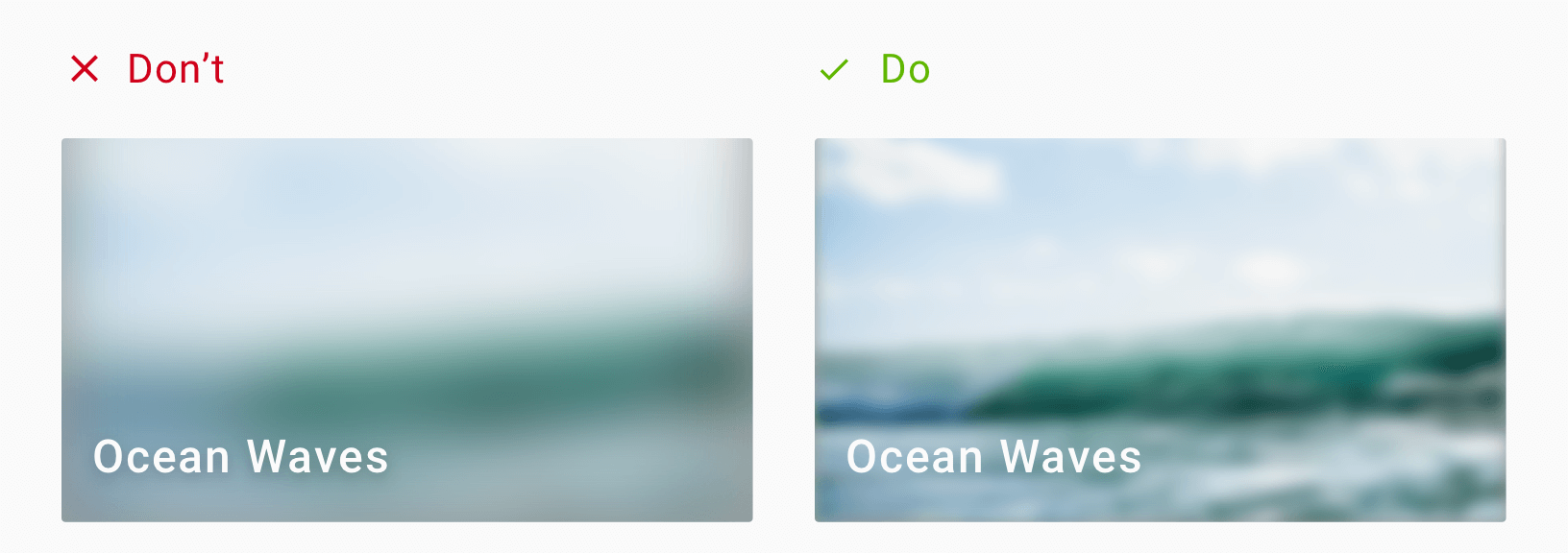
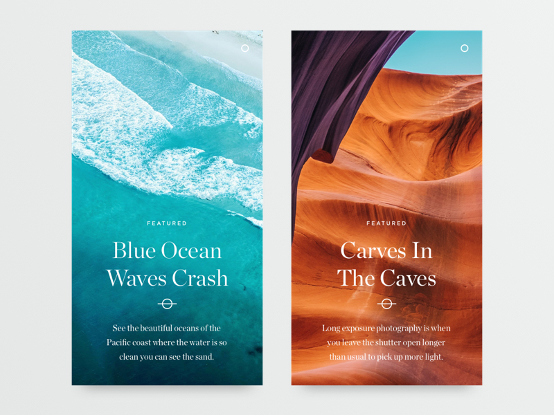
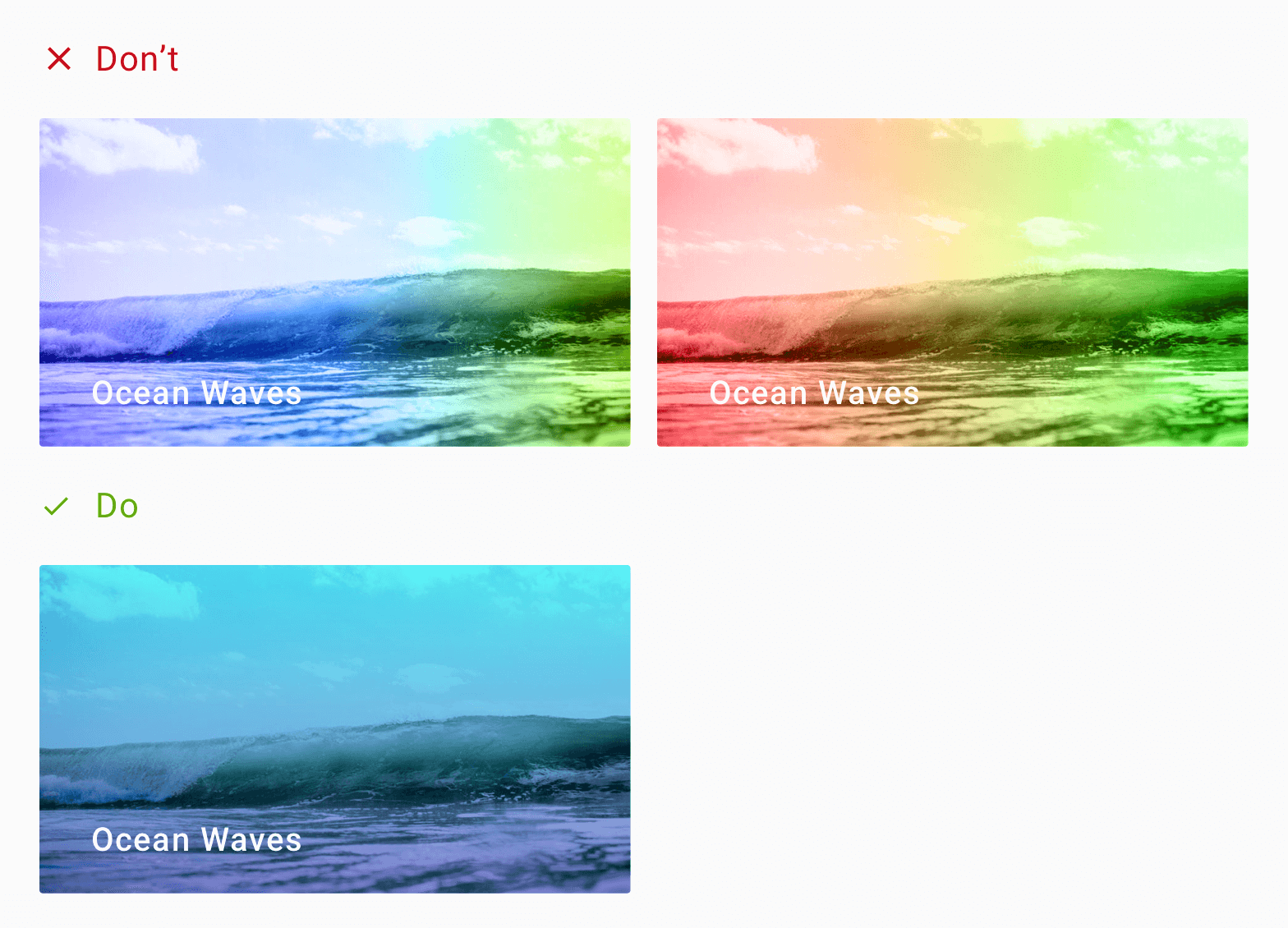
First, let me show you some design mockups that use text overlay.
Photography Portfolio by Winart Foster on Dribbble
Here’s another.
Article Cards Alternate by Oliur on Dribbble
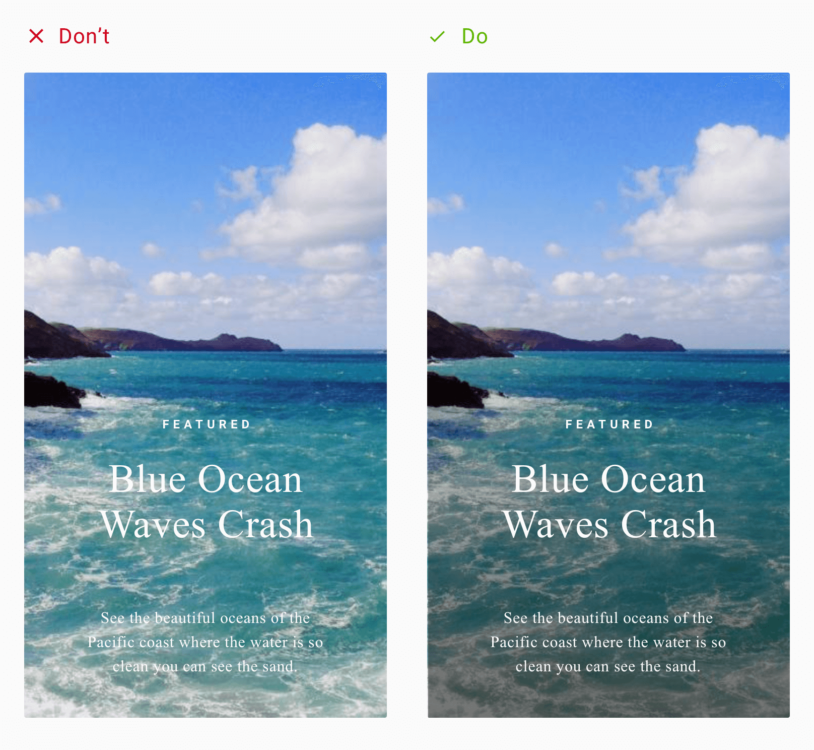
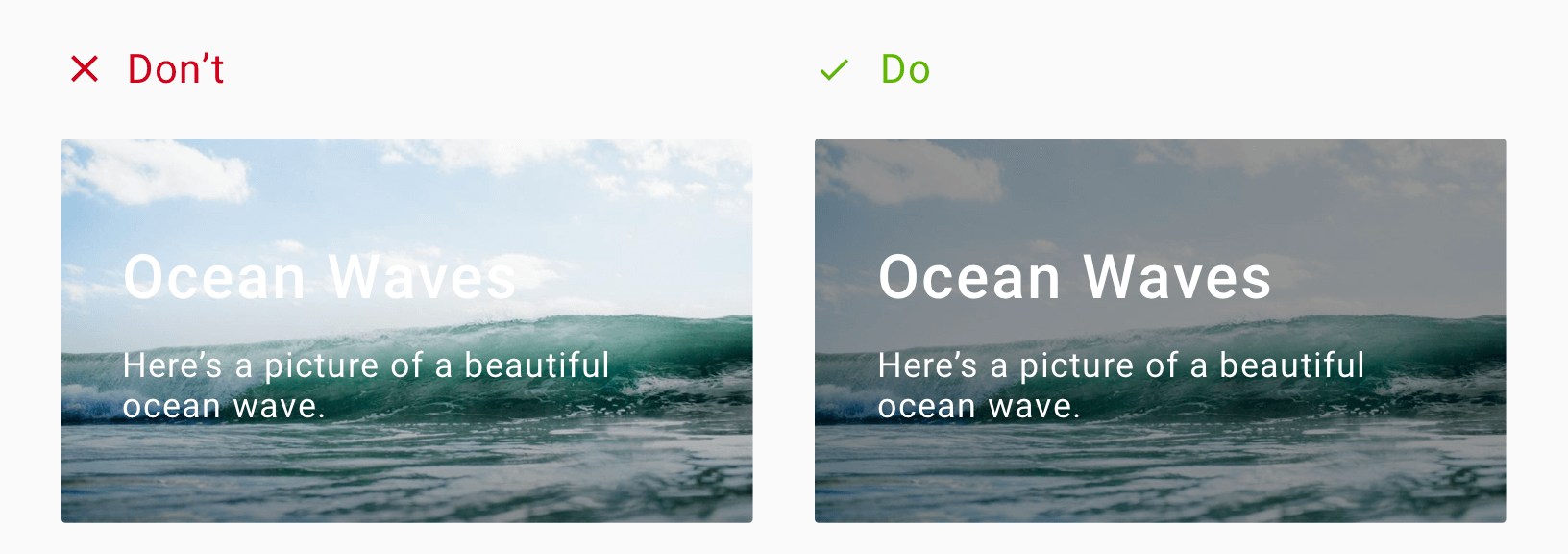
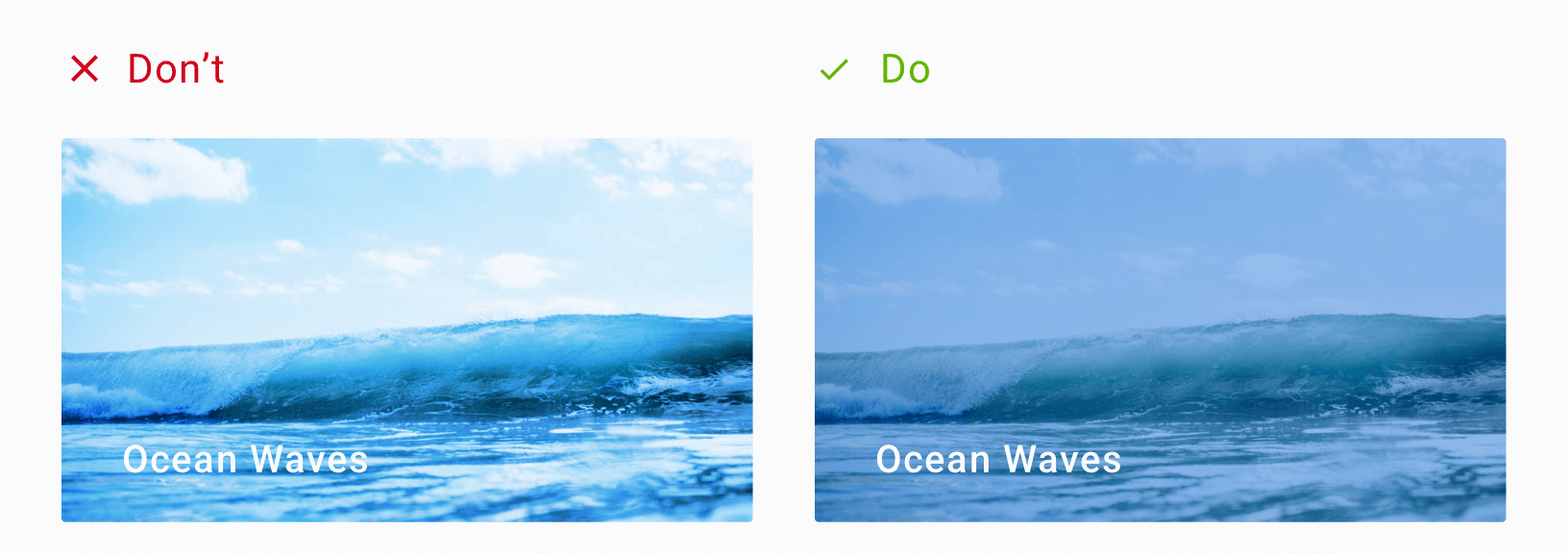
A good eye will immediately notice the problem with these two designs. Take the second one with the sea waves. If the wave foam was on the lower half of the image, would that text be readable?
Let me try to recreate that design for you.
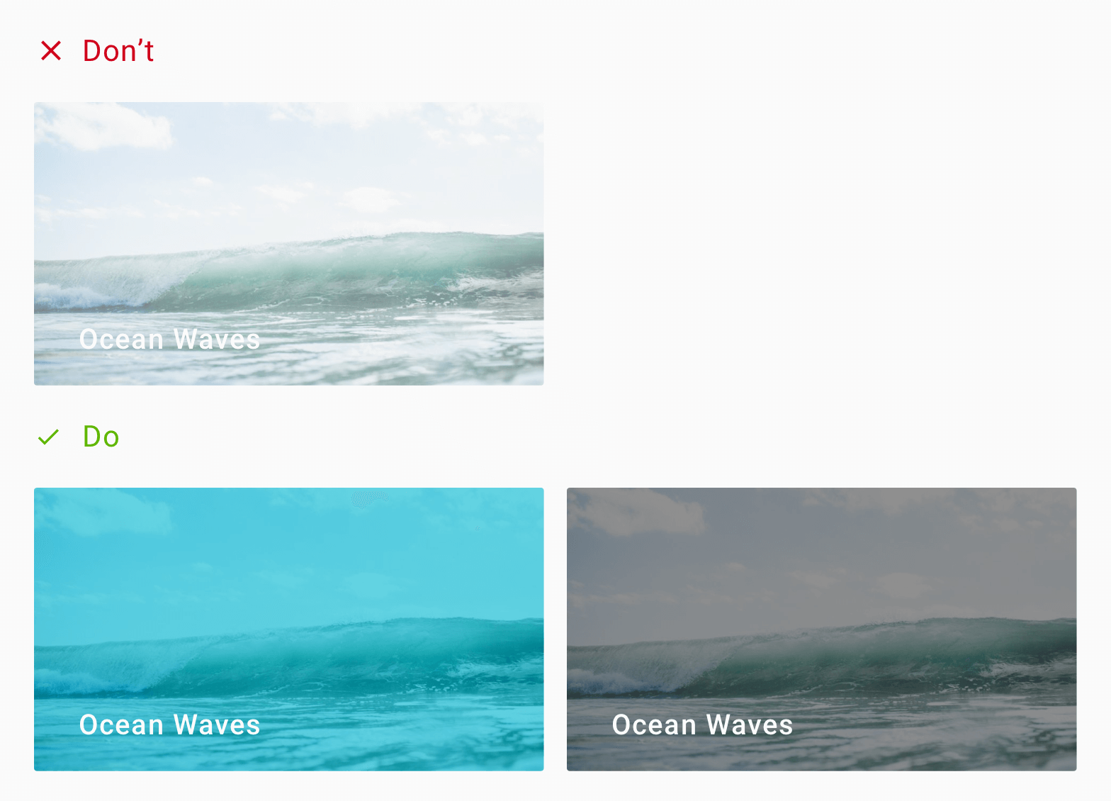
Text with scrim overlay
How readable is the text now?
Alright, its not the same picture. But it’s still ocean waves.
The background image is outright disturbing. But the image is not to blame. After all, when you decide to overlay text, you must be ready for ANY image. Which means, the image could be anything.
Good design is when we factor in all possible scenarios.
Now don’t get me wrong. Those 2 designs are not bad in any way. In fact, I love the typography used in the second one. Both are well-designed interfaces by talented people. It’s just that, some interface designs (mockups) are only for aesthetic purposes.
Anyone who translates them into a working project will immediately recognize what’s wrong. The text displayed, does not account for its background images.
However these mockups are only examples. It assumes that whatever be the image, the text will be readable. But my design attempt just showed you that that’s not the case.
The 2-in-1 problem with text overlay
Now we could say that this pattern became overly popular thanks to Card design. I mean, most of the card designs include an image, with text overlaid on top. Not to say that its bad, but there are two things that are largely not considered.
When you overlay text on an image, you sacrifice two things:
Image clarity
Text readability
Readability is the ease with which a reader can understand a written text. It is a measure of how easily a reader can distinguish individual letters or characters from each other. – Wikipedia
Overlaying a text prevents viewing the image completely. Moreover, your text may not be readable.
The image can be anything
Now, most of the examples above are mockups. Which means those are ideal scenarios. The text matches perfectly against its background. Things can immediately go wrong if your using white text over a whitish or light image. The same holds true for black or darker tones.
Now we know the mess we’re getting ourselves into. So let’s look at what we can do about it.
Text Overlay Solutions
There are different approaches to making our overlay text readable. I want you to understand that these are different solutions to a single problem. There is no single solution answer.
Moreover, deciding on what to use ultimately boils down to your personal preference. Or you can even decide upon one, depending on what fits your brand style.
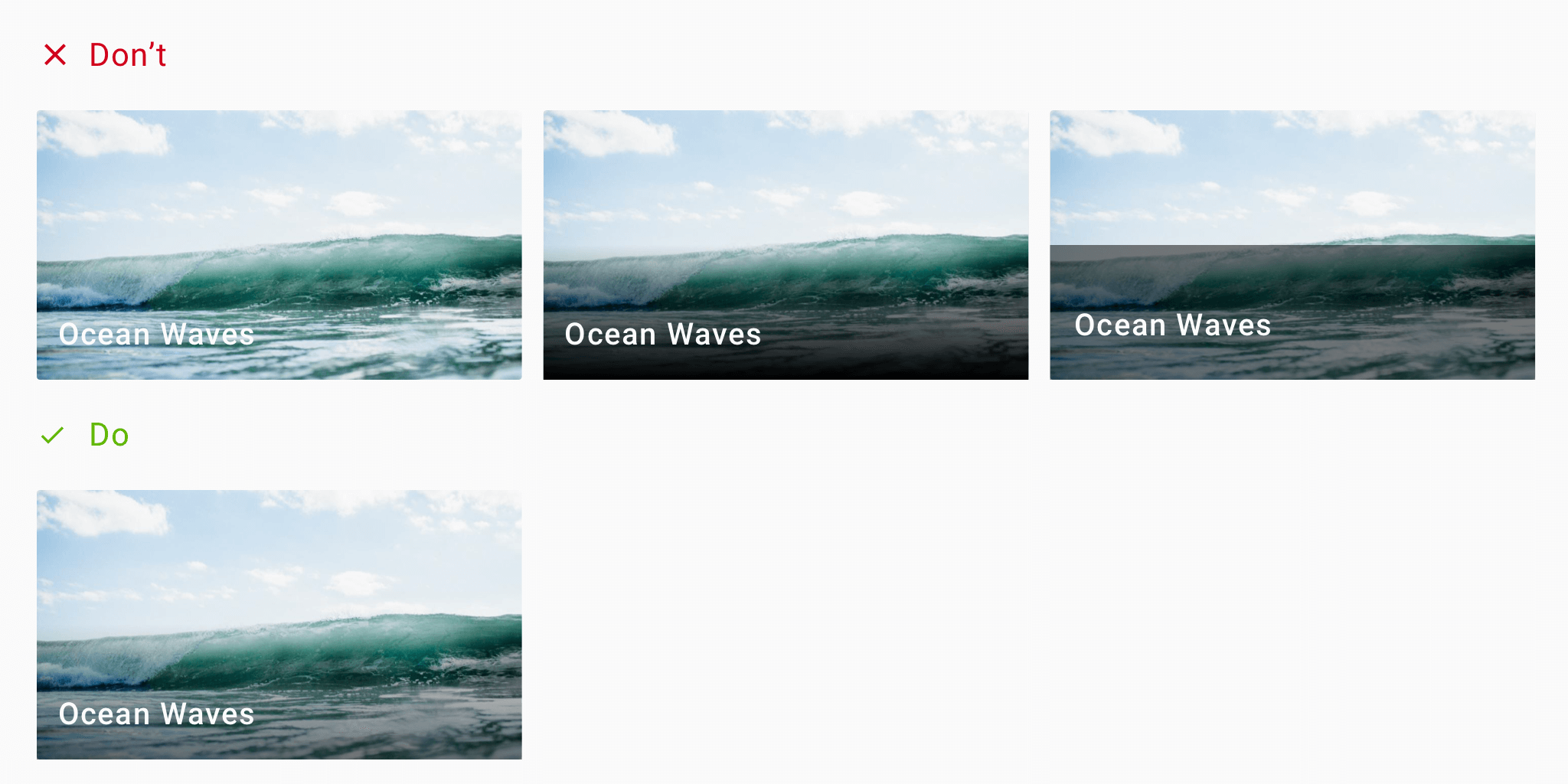
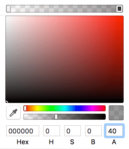
1. Using a Scrim
A Scrim is a semi-transparent gradient layer that helps Text appear more readable against backgrounds.
A scrim is a solid to a transparent gradient that sits behind a Text Label. So for instance, your text label could be a constant white. Then, your scrim would be a gradient going from, say 40% black to transparent.
I leave the opacity percentage to you. Again that’s a matter of personal taste.
But a 40% black to transparent works really well. It’s not too evident and doesn’t disturb the image. It fades smoothly, giving the text label the contrast it needs, making it readable.
Scrim – gradient overlay
Recommended Scrim guidelines:
40% opacity
gradient settings
height: 50% of image height
These are not hard rules. But as you can see from the above design, these settings work well.
By far, using a scrim is the most popular solution for solving the text overlay issue with images.
But wait, don’t go yet! There are other solutions which might suit your taste better.
2. Overlay the entire image
Like the scrim solution, and instead of a gradient, you’d apply a full 40% black to the whole image.
That’s right. Maybe the image isn’t important to you. The text label is your priority. Or maybe the text covers the entire image’s size.
In such a situation, using a scrim doesn’t make sense. Since the scrim is a gradient, your text becomes unreadable half-way across.
So since the text covers the whole image, the solution is to darken the entire image.
In short, that’s a 40% opacity black on the image.
Advantages:
Useful for large text (headings?) that covers the entire image
When text is your priority and not the image
Disadvantages:
Can obscure the entire image
Could sacrifice image visibility
Can diminish the background image as if it exists only for aesthetics
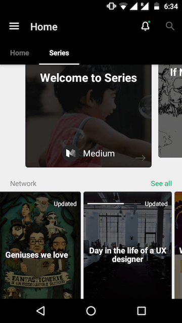
Here are some popular apps that use this approach:
Medium Series on Android
85000+ Status and Quotes 2017 Android App by Pratik Butani
3. Color Overlay
This is like an overlay. But instead of using black or white to darken or lighten the image, we use a different color.
Setting a color overlay on an image is the perfect way to neutralize a busy image. It blocks out all the different colors, making the image monotone.
Here is an example.
Usually, the color of choice is the brand color.
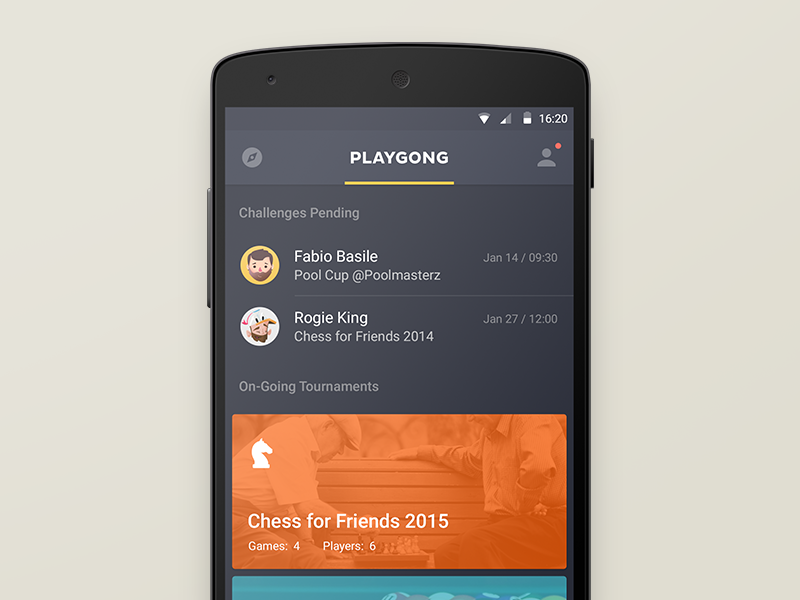
Playgong App by Deividas Graužinis
If you have trouble deciding color, check out Canva’s Color Wheel Tool. It uses color theory and color combinations in design to help you find colors that look good together!
4. Soft gradients
Remember that to use this correctly, your text should have enough contrast.
Also, when you use gradients, don’t use visually jarring colors. Chose colors that work together in harmony.
You can use web tools such as Coolors and Kuler by Adobe. These can help you generate color pairs that work well together.
Here’s an example.
Web Agency by Mohammad Shohag
Advantages:
Better brand emphasis (if brand color used)
Single color tone allows room for better text contrast
Disadvantages:
Not suitable for pictures of people as it may not be recognizable
5. Semi-Transparent Image
This technique involves using a semi-transparent image against a solid color background. It helps ‘calm’ the noisy background, so the text can stand out.
The technique consists of 3 layers (from the bottom):
Bottom – solid color
Middle – semi-transparent image (40% opacity)
Top – Text layer
Advantages:
Softer image allows text to stand out
Makes image monotone, reducing image noise
Disadvantages:
Image may lose important details
Only suitable for images whose purpose is eye candy
6. Blur
Applying a Gaussian blur softens an image allowing text to become more readable.
Smoothing of images by reducing image noise and detail – Gaussian Blur
iOS folks will be familiar with this technique. iOS design principles use blur to denote depth. Whereas Android (Material Design) uses shadows to denote depth (elevation).
Here’s a 16px blur on the left, and 4px blur on the right. Make sure you don’t blur the image too much that the underlying image is completely unrecognizable!
Blur doesn’t solve same text and image color problem
Advantages:
Helps reduce the ‘busyness’ in images
Softened images allow text to stand out
Disadvantages:
Completely sacrifices the image for text
Still doesn’t solve same-color overlay issue
May not suit your product style. Using blur in a Material Design world?
7. Text Highlight
Here, we apply a background color to the text itself. This effect mimics the traditional way of highlighting text on paper.
Text with Highlighter effect
This technique works well when the design has minimal text and a spacious background.
Remember that the highlight color doesn’t always have to be black. The example on the right borrows the dominant color from the image. This creates a higher sense of belonging with the image.
Advantages:
Good text clarity against any background image
Good contrast
Disadvantages:
Choice of highlight color may make text feel disconnected from image
Can completely block the underlying image
8. Go Grayscale
Alright, this is more of altering the image than the text. But we can still use it to achieve what we want.
By using a grayscale image.
Greyscale image filter
However, remember that greyscale includes colors from the brightest white to the darkest black. These alone, are on the polar ends of vibrancy. Hence you might want to consider toning down the image first. You can do so via a mix and match with any other techniques mentioned here.
For example, here’s a grayscale image with text at the bottom. However, by default this wouldn’t look good. So we add a scrim at the bottom.
Greyscale image with bottom Scrim combined
Notice how the scrim naturally blends very well with the image. The image is greyscale and our scrim is a black to transparent gradient. Hence the two techniques go hand-in-hand, quite well.
9. Playing with color and positioning
Sometimes, no matter what, the image remains the same. Say, for example, a category page will use a constant header image depicting its category.
In such a situation, you know what image to expect. You can use this information to design your text. This can be the font, size, color or even positioning the text.
Universitet Modules by Flatstudio
Notice the smart positioning of text, away from images. Also, the calm pastel background colors are not distracting. Both work in favor of allowing the text to stand out in addition to the graphic.
TL;DR – Use enough contrast
The state of being strikingly different from something else in close association. – Contrast
Did you notice? All the techniques discussed above are ways to increase text contrast. Contrast is what makes an element appear distinct from one another. There should be high contrast between text and image. It allows text to be readable.
There is also no need to sacrifice image visibility for text. Both can coexist together if we use the right technique. For instance, using a scrim allows text to be readable. At the same time, the image is visible as well.
As a general rule, using greyscale colors work well. Which means, white text against a dark background. Or black (dark grey) text against a light background always works best.
Conclusion
We looked at techniques that make text readable, without sacrificing the background image. Techniques such as the scrim are perfect examples of this. Or, using a color overlay can help reinforce your brand by using its primary color. This is especially useful when the image feels out of place in your design. Moreover, the blur technique is useful as well. But you will have to see if it aligns with your design style.
Remember that good design is thoughtful and knows how to balance aesthetic visuals with usability and clarity. It is not enough to let people use your app. It must be easy and pleasing to use.
You can even mix and match two techniques. Your imagination is the limit. Color overlay with scrim anyone?
So which technique are you going to use? Have I missed any popular method? I’d love to hear your thoughts. Let’s talk in the comments below.
One of the highlights in Android O is the ability to use custom font resources. In this article let’s look at using custom fonts in our apps.
Before Android O, how difficult was it to use a custom font in our apps? We had two options:
Write a custom View
Use a library
Both options need considerable effort, for just a simple font. Extending your custom View in EVERY layout.xml, instead of TextView is tedious. Moreover, using a third-party library for something basic as text, can be a risky call.
How many times have you admired a beautiful font, and wanted to use that in your app? But the sheer thought of integrating it, made you feel it’s not worth it? Well, not anymore!
Seeing Android O giving official support to custom fonts brought a big smile to my face. I hope it did to you as well.
Getting Started with Font Resources
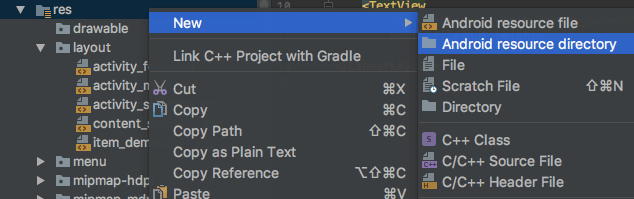
Android O supports custom fonts via font resources. The magic lies in the app/res folder.
Create new resource directory in Android Studio
Creating the font folder is easy. It is like every other resource such as menu, values, drawable, etc.
So right click the res folder and create a new font folder.
Create a new font resource directory
Now you’re ready to drop in your fonts. So go ahead and pick a font of your choice.
Font Formats
Android O supports both .otf (OpenType) and .ttf (TrueType) font formats.
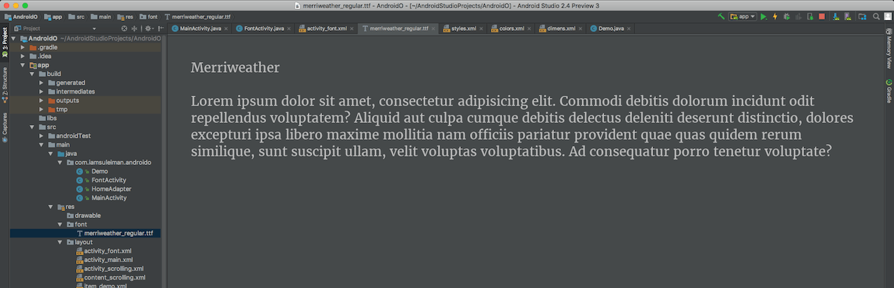
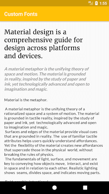
I’m going to create a simple page design. Like a book, where the heading is a large serif font.
What we’ll be creating
Using Custom Font Resources in Android O
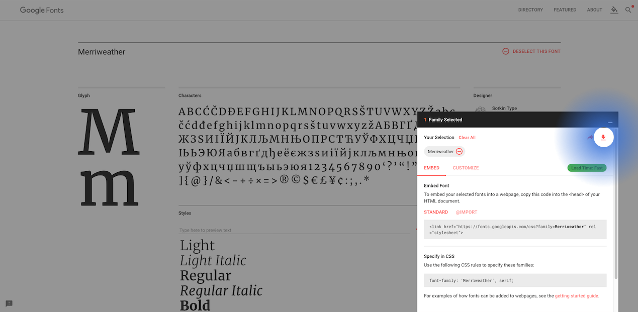
For this Android O tutorial, I’m going to pick my fonts from Google Fonts. They have a great collection, so definitely check that out!
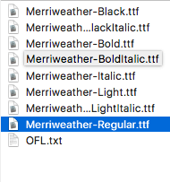
Here are the available font styles for Merriweather. I’m happy with just the regular font so I’ll take that alone.
Download font via fonts.google.com
You can download the .otf or .ttf fonts of your choice and drop them in the res/fonts folder.
Note: Keep in mind, that resource files should use lowercase alphabets and underscores. For example, the downloaded font was Merriweather-Regular.ttf. When you copy it to the res/fonts folder, rename it to merriweather_regular.ttf.
Once you drop in your custom font files in the fonts folder, you can preview your fonts. Simply double-click on a font, and Android Studio previews the typeface. Neat right?
Font Typeface preview
We’re going to need two fonts. One for the heading, and one for the body text. Look closely at the design above. The headline uses a serif font, while the content body is a sans-serif. In other words, the heading will use Merriweather while the content body will use Lato.
Remember, I encourage you to use whatever you like. Feel free to experiment. I’m just using a simple example to show you what’s possible.
Using Custom Fonts via XML
Head over to your XML layout file. Let’s skip the layout design and go straight to using our fonts.
There’s something interesting to note here. If you’re using a font family, you’ll have the same font, with different weight.
You know what I’m talking about. If you download a font and extract the .zip file, you’ll get multiple font variations like this.
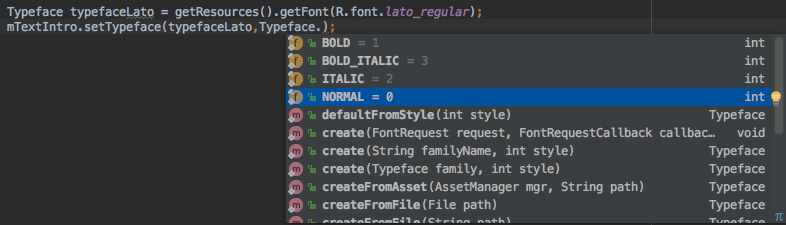
So for example, assume I’m using Merriweather-Regular. If Iset the typeface style to bold, Android will choose Merriweather-Bold from my font-family and display that.
Now that I’ve dropped a hint about font family, you might be wondering what exactly it is. So let’s talk about that next.
Using a font family
As we’ve seen above, what if you want to use the same font in its different styles? Alright, maybe you can get away using the default Typeface style of bold or italic. But what if you want a thinner font? Thin and italic?
When you downloaded the .zip file from Google Fonts, did you notice there wasn’t just a single font? There was a multitude of them. All varying in weight or thickness. You can group all these different fonts, and use them together as a font family.
Creating a Font Family
You can do this in 3 easy steps.
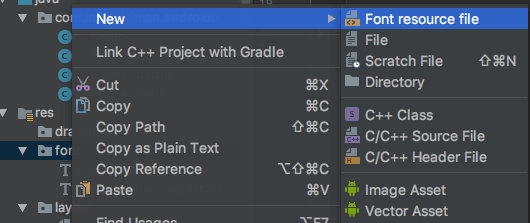
1 Right click the res/fonts folder and create a new ‘Font resource file‘.
Create New Font resource file
2 Add an element for EVERY font variation you wish to include. Let’s go back to the design we’re trying to do. Font styles that are thin, thick and in italics would be nice. So let’s add three.
I only wish to vary fonts for the body content. So let’s add 3 font variations for Lato.
If you’re unsure about the fontWeight, a quick look at Google Fonts will clear your doubts.
After that, using a single font from a font family is the same. Just reference them via the font attribute
android:fontFamily="@font/lato_black"
Just remember to first add all your font variations to the font folder. Then create a ‘Font resource file‘. Then add an element per font variation. Finally, reference your font style just like a regular single font.
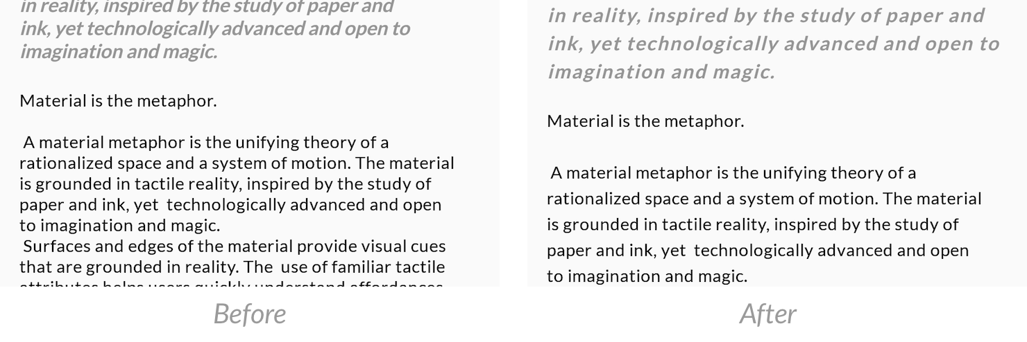
Customizing Font Styles for Readability
Using the fonts outright on a TextView does not guarantee good readability. Take a look for yourselves.
Default TextView
Seriously, that’s bad. It hardly readable. Keep in mind that a smartphone is a small device, compared to a desktop or tablet. This makes it harder to read the text.
So if your app’s priority is for users to read content. Then its also your priority to make sure the content is easy to read.
The key lies in playing around with two attributes:
letterSpacing
lineSpacingExtra
So with that in mind, here are my TextView elements in the layout.
With these extra attributes, font should now be easy to read. See the difference for yourself. Its better right?
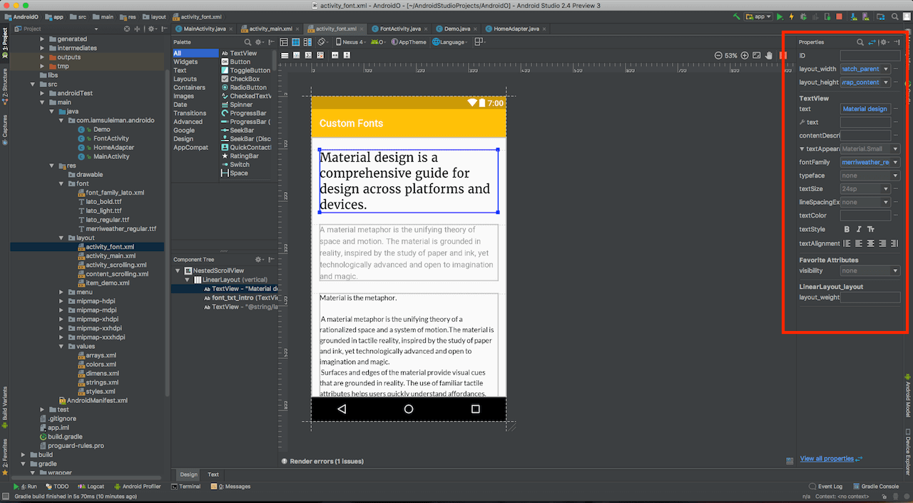
If you have a hard time remembering the different attributes, use the ‘Design‘ Pane in the XML Editor. The ‘Properties‘ pane on the right, lists all available attributes that you can change.
TextView Properties in Design view of XML editor
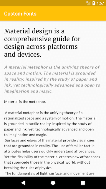
Final Results
Here’s how the app finally looks like.
What we’ll be creating
Now take a breather here and notice how easily this was. We used 3 different custom fonts without breaking a sweat. Using a font of your choice is as simple as drag and drop! Then, all it took was a single attribute to reference the font file.
I’ve used merriweather_regular for the large title heading. The following introduction text is like a quote. That uses lato_bold, with Typeface.ITALIC.
While using custom fonts is something basic, its good to know its finally added. Also, it’s relative ease of use makes this feature adoptable by many Android Developers.
So what’s your take on custom fonts? How are you using it? Let me know in the comments.
Also, I’ll be covering other new Android O tutorials in future articles. So don’t forget to subscribe below.
The Android O SDK (API 26) dropped recently and the internet went nuts! The Developer Preview SDKs brought along many new features. But these new SDKs are the pre-final ones.
It’s that time of the year when Android Developers like you and me need to keep up with what’s latest.
I usually refrain from writing about Developer Previews, until a stable release arrives. But it’s better we get to know what’s new now. Rather than coping with changes in the future. So transitioning our apps to Android O will be smooth when the time comes.
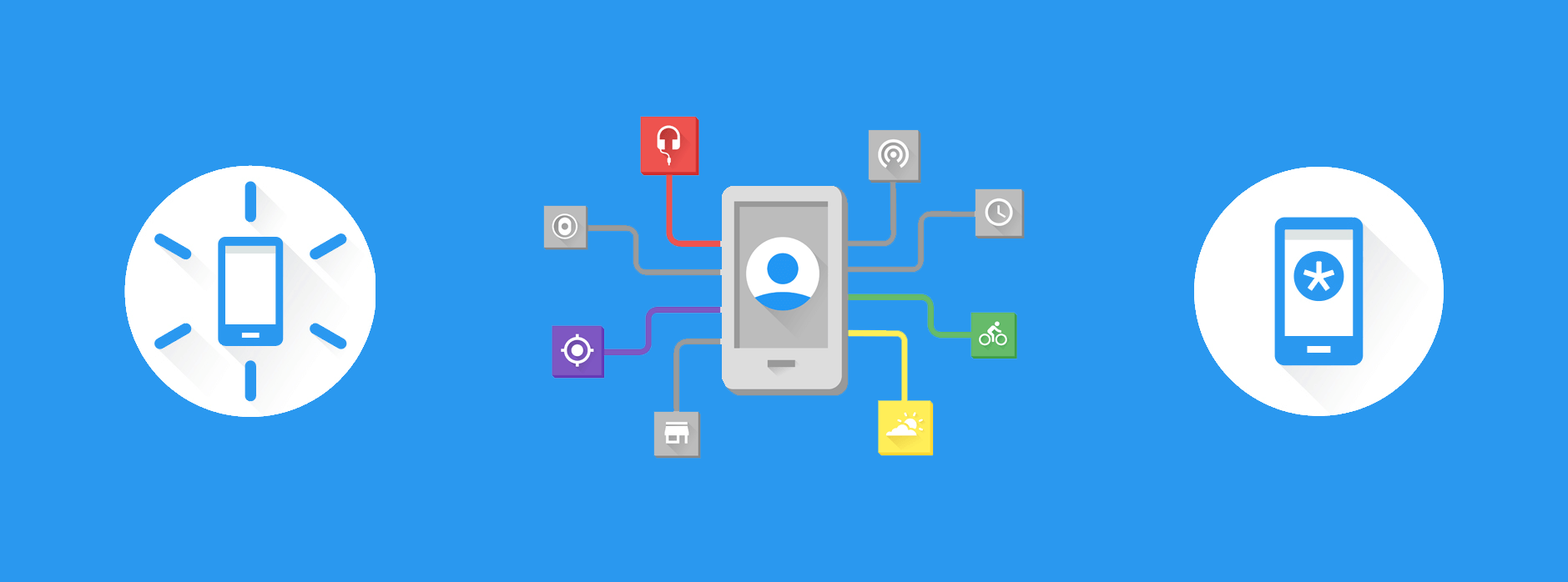
A while ago, Google announced something really interesting called the Awareness API. According to Google Developers – Android Awareness API bridges the physical world of users, and the digital world of Android to help you build more assistive and context-aware apps.
The last sentence can be a bit confusing. So here are some examples that will help you realise how powerful the Awareness API is:
Imagine you pass by a pharmacy and your phone reminds you that you have to buy medicines. Or as soon you enter your car, your phone automatically connects to the car’s Bluetooth and your navigation app opens up in driver mode.
App Shortcuts were introduced Android Nougat 7.1. They allow you to access primary actions of your app directly from the launcher icon.
You can also pin certain shortcuts to the launcher for faster access.
Consider you have the Uber app and you want to book a ride home. You would normally open up the app and then book a cab with your Home as the destination. Instead of doing all this, wouldn’t it be great if a there was a shortcut right in your launcher that does all this in once click? That’s exactly where App Shortcuts come in.
In this post, we will learn how to easily implement App Shortcuts.


