Stop Using Loading Spinner, There’s Something Better
Stop using those boring loading spinners in your user interfaces. Seriously. It’s killing your apps’ experience more than you know.
A loading spinner might be the solution to your content loading problems. But I’m here to tell you that it’s not.
You might even use some of those fancy animated loading Spinners. But they’re not any better either.

Why Loading Spinner doesn’t work
From a long time we’re following, or rather influenced by hard rules from design languages. I don’t blame you, though.
The key to wisdom is this – constant and frequent questioning, for by doubting we are led to question and by questioning we arrive at the truth. – Peter Abelard
Loading Spinner is one of the most used progress indicators in user interface design. But it has its own flaws which are generally overlooked.

No sign of progress
What does the loading spinner tell you? It denotes that content is currently loading. But does it say how much has loaded? Does it say how much remains to load?
No, it doesn’t.
Moreover, it’s difficult to determine. If it could, we’d be using a progress bar right?
That period of uncertainty
How long did you spend looking at that? Were you expecting some content to load after some time? I’m sorry to disappoint.
Ok, let’s assume that GIF loading actually completed and some content displays. Ask yourselves these questions and give me an honest response. I’m sure you’ve stared at enough Loading Spinners to know.
- When you looked at the Loading Spinner, did you know how much time remains to complete?
- How much of the content has loaded?
- How much remains to load?
We simply sit staring at a Loading Spinner. Hoping that it loads in time, with no answer to either of those 3 questions.
Moreover, network connections might be unstable. So we can never take for granted that content will always load fast.
Perceived to be slower than actual
Loading Spinners make loading appear slower.
It’s like a clock, constantly ticking. It shows the time you’re wasting by staring at it. Like that GIF above, which I made you stare at.
What comes next is a surprise
Until everything has loaded, do you have any idea what to expect on screen? I bet you don’t. You might even get surprised once the UI and content display.
Now think about your users. Until everything has loaded, they have completely no idea what to expect on screen. I bet they’ll get surprised too.
This won’t be their fault. You didn’t tell them what to expect in the first place!
A ‘Surprise’ isn’t always a good thing
An unexpected or astonishing event, fact, etc. – Surprise
From the very definition of the word, a surprise indicates an ’unexpected’ event. People tend to have polarizing reactions to such events. This could either positive or negative.

Surprises don’t often tend to leave a positive impact on people. Unless it’s their birthday. It depends upon how a person takes it. Thus, herein lies the problem.
Take a good look at both the images. See the image on the right. Could you honestly predict the UI would finally look like that? I’m sure not.
Alright, the final UI is a low fidelity design. But you get the point.
I deliberately did not pull examples from existing apps. Because you and I both know what it will look like. With a known app, we’ve already seen the interface, even before its loaded.
Emotions affect our sense of time
Did you know? We humans can actually predict time. That too quite accurately.
But under an emotional influence, our sense of time is significantly clouded.
We’ve all experienced this. Time seems to fly when you’re doing what you love. But if it’s something you hate, time seems to drag. Even when you’re bored, staring at the clock waiting for your favorite show. Time moves even slower then.
The same holds true for our interfaces.
The point I’m trying to make is. Your content might not take much time to load. In fact, it might not be a big deal. But it may appear longer than it actually takes. It is just how people might perceive it, and there’s nothing we can do to change it.
But what we can do, is help change their perception. We can make our app appear faster than it actually is.
NOTE
Don’t get too carried away trying to fake it. Your interface needs a combination of real and perceived speed to succeed.
The Illusion of Alternatives
Typically, we have two options to denote loading content:
- Finite progress bar – if we can determine load times
- Loading Spinner (infinite loading progress) – if load times are unknown
But take a closer look at the choices again. Do you realise, there is no real choice here?
We can’t use a finite progress bar because we cannot measure load times. Also, we already know that the Loading Spinner is no good.
A good progress indicator
A good progress indicator is one which obviously doesn’t have any of the negatives I mentioned above. But for a more optimistic tone, let me list them out.
- gives immediate feedback
- provides a sense of time ( how much has progressed, and how much is pending)
- removes doubt (gradual progress reassures people that the app is working)
Some proof as backup
Some of you might not believe what I said. But trust me. If I was me, I wouldn’t believe what I said either. After all, where is the proof? Do loading indicators really harm? Who has experienced it?
Well, then consider yourself lucky. You get to learn from someone else’s mistakes. The iOS app Polar strongly suggests avoiding the Spinner.
Polar received a lot of complaints about their app being slow. This was because of the loading spinners they included in their app.
With progress indicators, we had made people watch the clock. As a result, time went slower and so did our app. We focused on the indicator and not the progress, that is making it clear you are advancing toward your goal not just waiting around.
– Polar
I guess I’ve rambled enough about why Loading Spinners are bad. The problem with Spinner lies in not providing a sense of progress. Though, we can remedy this.
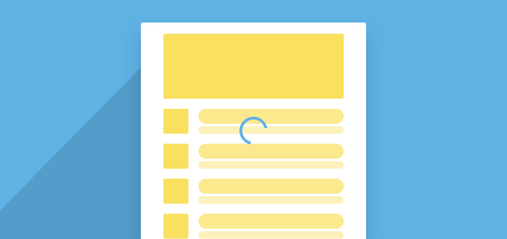
How, you ask? The answer is ‘Skeleton Screens‘.
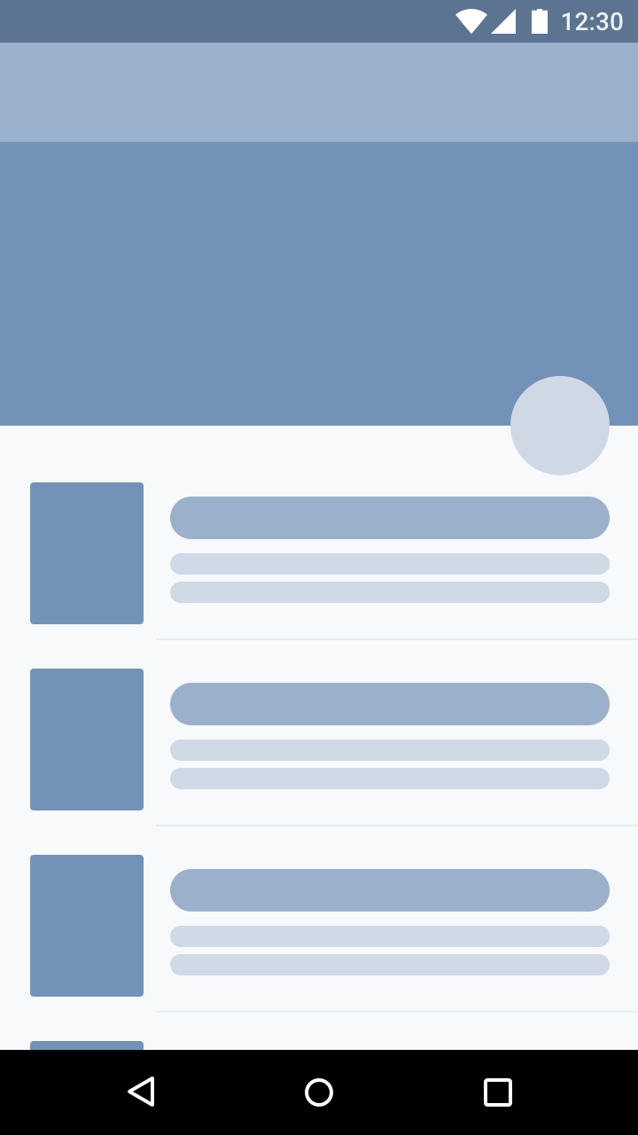
Skeleton Screens to the rescue
Unlike Loading Spinners, where the UI displays all at once. A skeleton screen helps load a user interface gradually, a little at a time.
This means that the barebones UI displays first. Then the loaded content is gradually populated on-screen.
“A skeleton screen is essentially a blank version of a page into which information is gradually loaded.”
– Luke Wroblewski
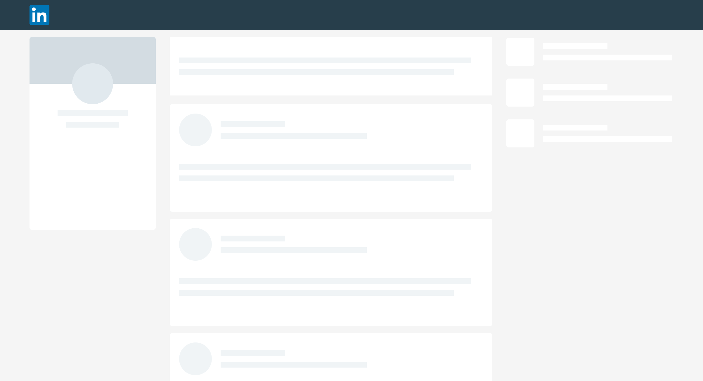
Skeleton screens shift the attention of users. It makes people focus on the progress, rather than the wait time.
Skeleton screens visually tells users what to expect from the interface. It gives them a heads up on what’s going to come and creates a sense of gradual progress.
Most of all, it makes people perceive your site to be faster than it actually is. Remember that we are designing interfaces for use by real people. We need to give people the illusion of speed.
The more the system gives information about the waiting time the better the satisfaction of the user.
– How to Improve Perceived Waiting Time in HCI
Using a skeleton screen gives you the following benefits:
- Helps people perceive your screen to load faster
- Eliminates surprises
- Gradual loading of UI – clear indication of progress
- Shows exactly what’s loaded and what’s yet to load
Gradual Progression
I know it’s a fancy term. What it means is, loading your content gradually. Folks from web design and development know this as ‘Lazy-loading’.
Defer initialization of an object until the point at which it is needed.
– Lazy Loading
First, lay out the bare bones UI (Skeleton screen). Next load the text data. The user knows they’ve received the content. Finally lazy load the images. The user understands that most of the content has loaded. What’s left are the images.
In this way, you’ve given users:
- a clear sense of progress
- what to expect next
- what’s left to expect
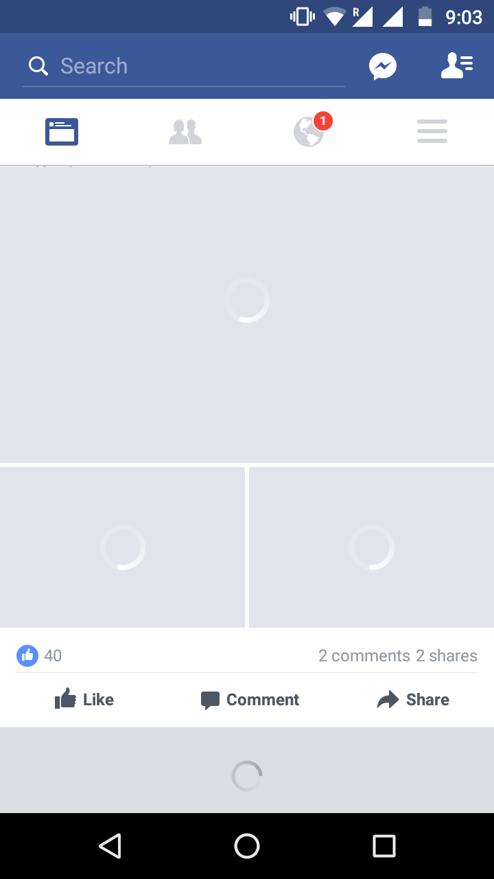
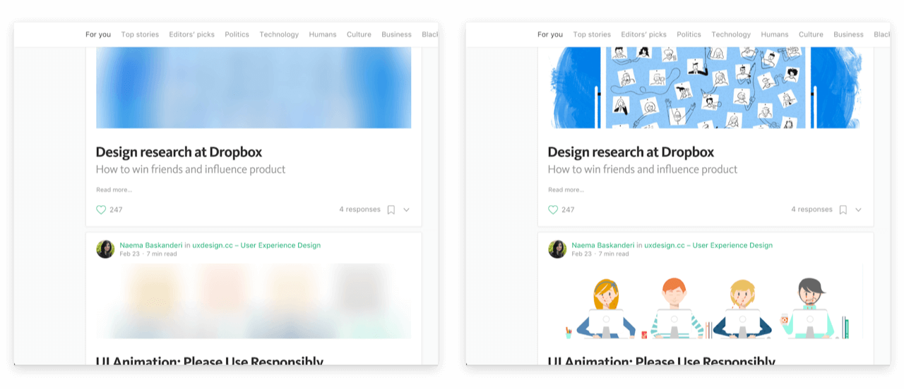
Notice how Instagram intelligently handles loading here.
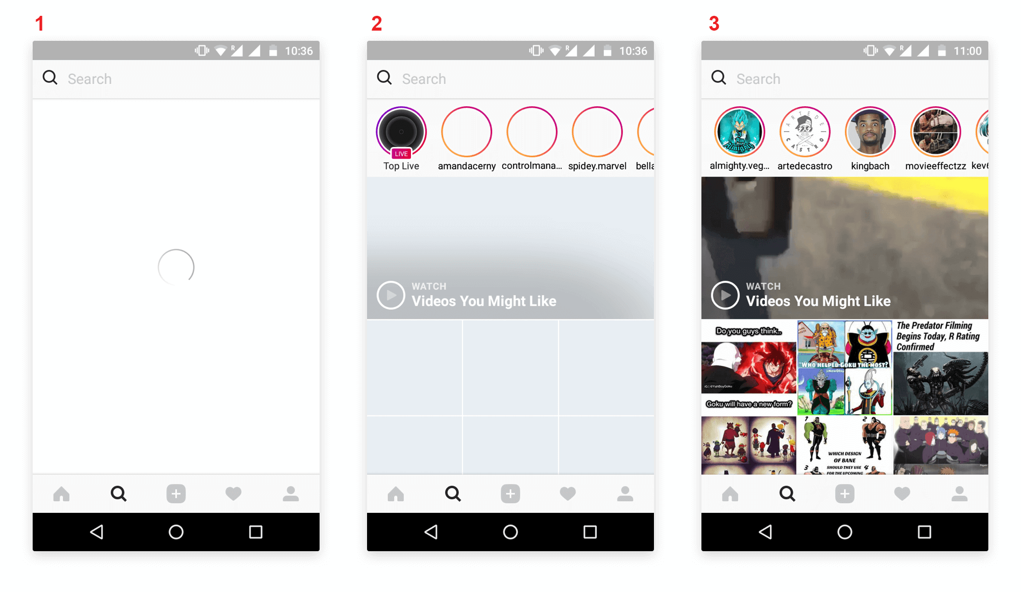
First, Instagram shows a loading spinner for a brief period. Next, it lays out the barebones UI. This is the skeleton screen or Placeholder UI. This indicates the place will content will eventually fill.
Also, notice that the text data has already populated the screen. Finally, in the third screenshot, the images are gradually loaded into place.
Here are some websites that use skeleton screens to show loading.
You might argue that these websites use Loading Spinners. But notice how it is used. A Spinner alone is not displayed from start to finish. It is shown only for a brief period, followed by the Skeleton Screen.
TIP
If your load time is longer, you can briefly display a Loading Spinner, before Skeleton UI. This can buy your task some more time to complete.
Progressive Loading for Images
You can even apply gradual progression to image loading. For example, Medium and Google use progressive loading for their images.
I’m sure you’ve seen either one of these. Maybe you didn’t know it had a proper name until now.
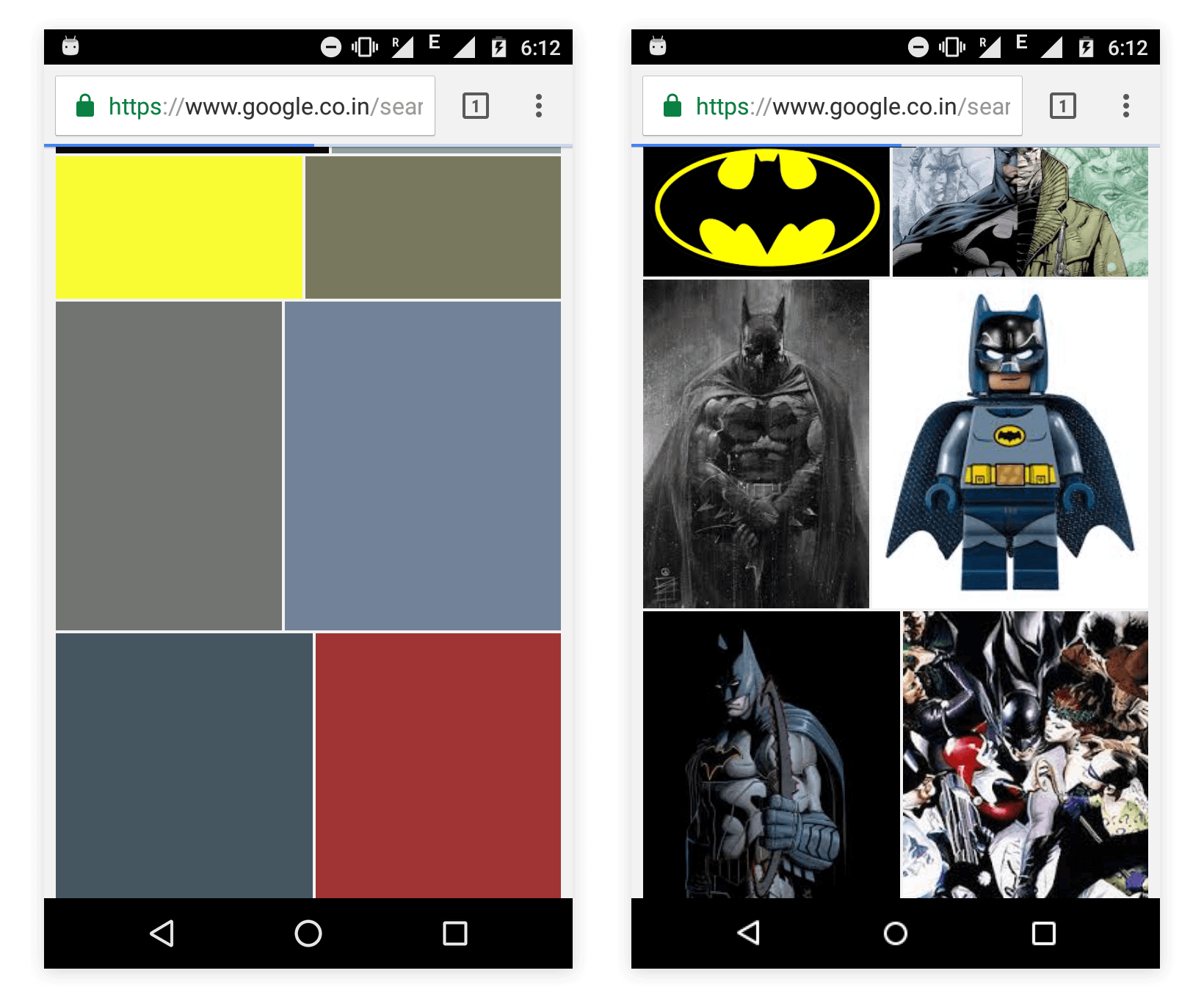
Here are the generic steps on progressive loading for images.
- Display the skeleton screen
- Load a very low quality (pixelated) version of the image (or prominent color)
- Load the high-quality image in background
- Fade in the high-quality image, replacing the previous low-quality one
Of course, what to display first varies. Medium chooses to use an extremely small pixelated image and applies a blur filter over it. Later it loads a higher quality image to replace it. Whereas Google displays the image’s prominent color first.
Note that you’ve not given then a clear indication of WHEN the task will complete. There is still no solid time estimate. But you have told that what has completed and what remains. That itself is clear sign of progress.
Skeleton Screens on Android and iOS
You might argue saying most of the skeleton screen examples are websites. So how do I do this on mobile? You’re absolutely right. Reading all this wouldn’t be worth it if I didn’t even give you hint on how to do this.
Facebook has written a library called Shimmer for both Android and iOS.
It works just like how Facebook using skeleton UI to load incoming content. The shimmer animation depicts that content is currently loading.
You can use this library to display skeleton screens to denote loading in your apps.
Handling Failure with Skeleton Screens
There’s no guarantee that a request will always execute successfully. So we cannot assume that if a content loads gradually, it will eventually complete. Chances are, it might fail mid-way. The most common reasons include faulty, slow or no connectivity.
Assume you’ve started a request to load content. Next, the skeleton screen is also displayed. Then suddenly, your internet goes off. How would you handle this?
Typically, you must inform the user and allow them to retry.

Remember that giving feedback is good interaction design and positive user experience.
Empty states occur when an item’s content can’t be shown.
TIP
Consider using ‘ Empty States ’. It allows you to provide clear feedback with a ‘Call to Action’ (CTA) button.

Connectivity in Android and iOS
Here are a couple of resources that can help you handle connectivity.
Android
- Use Snackbar to provide feedback with CTA button
- Connectivity – network handling class
iOS – Swift
- iOS Alerts – collection of alert libraries to chose from
- Reachability – network handling
Wrapping Up
Apps are getting smart. People are starting to realize that the Loading Spinner is hurting their UX. It’s about time you did too.
Skeleton screens provide incremental progress in loading your interface. Such incremental feedback gives better user experience, and reduces uncertainty. Moreover, people would be willing to wait a bit longer.
So what do you think about Skeleton screens? Is it a viable alternative to a Loading Spinner? Let me know in the comments below.


Can you address the accessibility implications of this approach. Lazy loading is detrimental to many users with disabilities. If you have good solutions for accessibility considerations they should be represented in this article.