Parallax Scrolling Tabs with Android Design Support Library

Material Design has seen the rise in on-scroll animations in Android apps.
Certain designs include a parallax scroll effect with a header images, along with Tabs. In this post, we’ll look at just that.
Parallax scrolling is a popular pattern. Previously we’ve seen such examples with the Flexible Space with Image and Quick Return pattern. In this post, we’ll look at making parallax scrolling Tabs using Android Design Support Library.
Parallax scrolling has been very popular in web design and now in app development as well. I’ve seen quite a few people wanting to implement this and I wanted to provide a solution without using a third party library. So here it is.
Creating Parallax Scrolling on Android is nothing but the Flexible Space with Image pattern, with an added TabLayout.
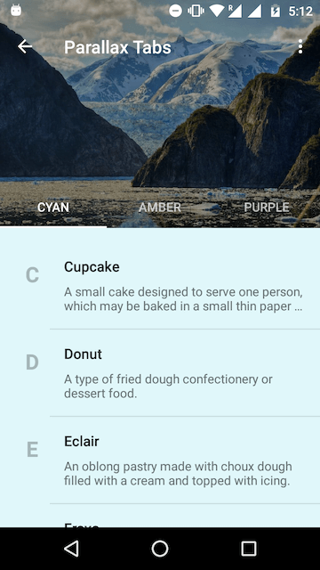
Parallax scrolling Tabs with Header
Parallax Scrolling Tabs in Android
Have you read the android tutorial for creating the Flexible Space with Image Pattern? If you have, then you would immediately recognise that all this needs is a TabLayout. For those who haven’t read it, don’t worry. I’ll walk you through everything in this article.
But wait, hold your horses! I just threw in the TabLayout and this is what I got.
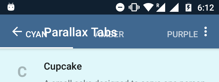
Toolbar and Tabs overlap on collapse
Unlike the typical Material Design Tabs attached to the Toolbar, Tabs here are transparent. Here is the layout. So clearly, the plug and play doesn’t work. It looks like some tweaks are required.
So before I straight away paste the entire code here, let’s look at the layout skeleton.
<android.support.design.widget.CoordinatorLayout>
   <android.support.design.widget.AppBarLayout>

      <android.support.design.widget.CollapsingToolbarLayout>
         <ImageView />
         <android.support.v7.widget.Toolbar />
         <android.support.design.widget.TabLayout />
      </android.support.design.widget.CollapsingToolbarLayout>

   </android.support.design.widget.AppBarLayout>
</android.support.design.widget.CoordinatorLayout>
The CollapsingToolbarLayout is like a super FrameLayout. So take note of the ordering of elements inside. Whatever element you place last, is what appears on the top. This positioning is important to get the parallax scrolling to work.
So now that you have an idea of the layout structure, behold the full XML layout code!
Layout Breakdown
Some of the attributes here make the parallax scroll work. So let me walk you through them.
21. The total height that we want our collapsible header View to have.
25. This is not the Flexible Space with Image pattern. We don’t want the Toolbar title to collapse. We want it fixed. So disable the title.
34. The flag that triggers the parallax effect upon scrolling.
36 – 41 Scrim that makes Tab text more readable against the busy header background.
47. Remember that CollapsingToolbarLayout is an extension of FrameLayout. So this attribute ensures the Toolbar stays on top.
48. TabLayout by default has a height of 48dp. Telling our Toolbar to have a bottom margin of the same, avoids the overlap issue I showed you above.
49. Makes sure the Toolbar consistently is pinned to the top. Otherwise when you start scrolling, the Toolbar scrolls off screen.
56. Ensures the TabLayout sticks to the bottom of the header.
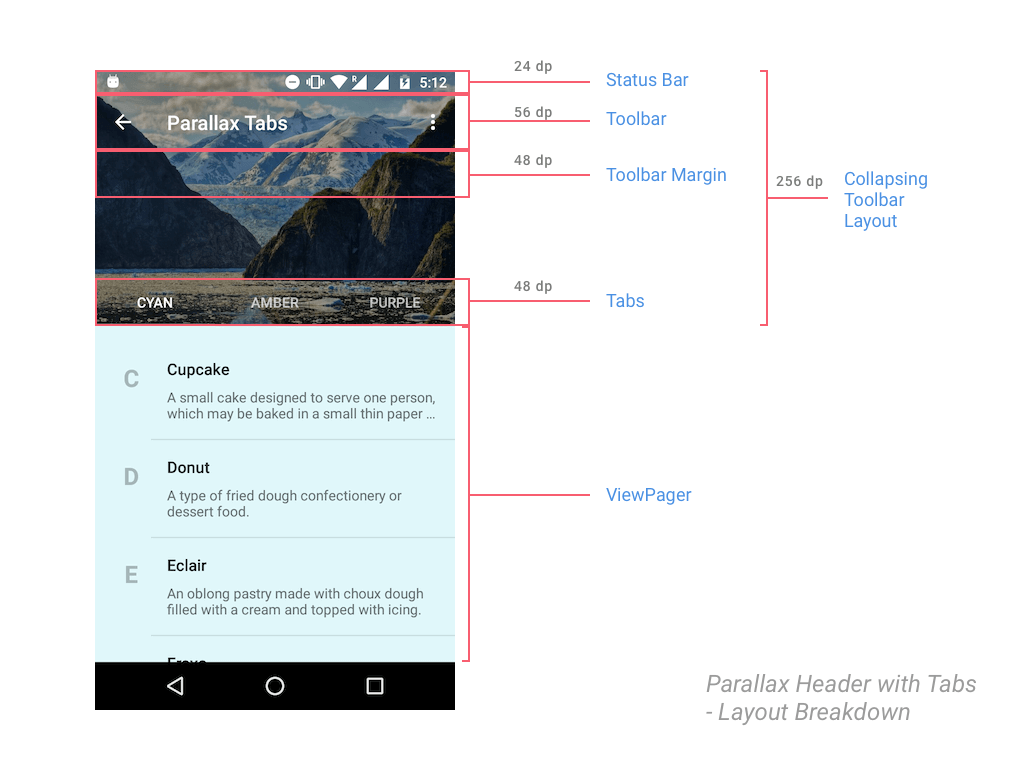
Breakdown of layout metrics
Setting up ViewPager in Activity.java
In case you forgot, the Tabs need a ViewPager to work with, so let’s take care of that in our Activity.java.
Let’s start by creating a dummy Fragment. For the sake of displaying some content, the Fragment will display a RecyclerView. Additionally, it’s background color will change depending on it’s position in the ViewPager.
public static class DummyFragment extends Fragment {

      public DummyFragment() {
      }

      @Override
      public View onCreateView(LayoutInflater inflater, ViewGroup container, Bundle savedInstanceState) {
          View view = inflater.inflate(R.layout.dummy_fragment, container, false);
          ...
          RecyclerView recyclerView = (RecyclerView) view.findViewById(R.id.dummyfrag_scrollableview);

          LinearLayoutManager linearLayoutManager = new LinearLayoutManager(getActivity().getBaseContext());
          recyclerView.setLayoutManager(linearLayoutManager);

          SimpleRecyclerAdapter adapter = new SimpleRecyclerAdapter(list);
          recyclerView.setAdapter(adapter);
          ...
          return view;
      }
  }
Note that DummyFragment is just a placeholder which I’m using with a different background color for each of my Tabs. You on the other hand must define a Fragment accordingly for each of your Tabs.
ViewPager Adapter
A minimal Adapter for our ViewPager. (To hold 3 Fragments)
static class ViewPagerAdapter extends FragmentPagerAdapter {
        private final List<Fragment> mmFragmentTitleList FragmentList = new ArrayList<>();
        private final List<String> = new ArrayList<>();

        public ViewPagerAdapter(FragmentManager manager) {
            super(manager);
        }

        @Override
        public Fragment getItem(int position) {
            return mFragmentList.get(position);
        }

        @Override
        public int getCount() {
            return mFragmentList.size();
        }

        public void addFrag(Fragment fragment, String title) {
            mFragmentList.add(fragment);
            mFragmentTitleList.add(title);
        }

        @Override
        public CharSequence getPageTitle(int position) {
            return mFragmentTitleList.get(position);
        }
    }
Hooking up ViewPager with TabLayout
Finally we’ll attach the ViewPager to our TabLayout in the Activity’s onCreate() method.
...
TabLayout tabLayout = (TabLayout) findViewById(R.id.htab_tabs);
        tabLayout.setupWithViewPager(viewPager);

 tabLayout.setOnTabSelectedListener(new TabLayout.OnTabSelectedListener() {
            @Override
            public void onTabSelected(TabLayout.Tab tab) {

                viewPager.setCurrentItem(tab.getPosition());

                switch (tab.getPosition()) {
                    case 0:
                        showToast("One");
                        break;
                    case 1:
                        showToast("Two");
                        ...
                  }
               }

  private void setupViewPager(ViewPager viewPager) {
        ViewPagerAdapter adapter = new ViewPagerAdapter(getSupportFragmentManager());
        adapter.addFrag(new DummyFragment(getResources().getColor(R.color.accent_material_light)), "CAT");
        adapter.addFrag(new DummyFragment(getResources().getColor(R.color.ripple_material_light)), "DOG");
        adapter.addFrag(new DummyFragment(getResources().getColor(R.color.button_material_dark)), "MOUSE");
        viewPager.setAdapter(adapter);
    }
...
The setupViewPager() method simply initializes my Fragment and adds them to the ViewPager.
Nothing out of the ordinary here. The Material Design Tabs post does the same thing, which is why this has minimal explanation. However if you get stuck anywhere, below is a link to the source code (GitHub) which you can refer to 🙂
Dynamic Tab color with Palette API
The color you see the Toolbar + TabLayout take, is picked from the header image. Courtesy of the Palette API.
Using this, we’ll set colors for the Toolbar, TabLayout and Status Bar. This is easily done by the following code snippet:
try {
    Bitmap bitmap = BitmapFactory.decodeResource(getResources(), R.drawable.header);
    Palette.from(bitmap).generate(new Palette.PaletteAsyncListener() {
        @SuppressWarnings("ResourceType")
        @Override
        public void onGenerated(Palette palette) {

            int vibrantColor = palette.getVibrantColor(R.color.primary_500);
            int vibrantDarkColor = palette.getDarkVibrantColor(R.color.primary_700);
            collapsingToolbarLayout.setContentScrimColor(vibrantColor);
            collapsingToolbarLayout.setStatusBarScrimColor(vibrantDarkColor);
        }
    });

} catch (Exception e) {
    // if Bitmap fetch fails, fallback to primary colors
    Log.e(TAG, "onCreate: failed to create bitmap from background", e.fillInStackTrace());
    collapsingToolbarLayout.setContentScrimColor(
            ContextCompat.getColor(this, R.color.primary_500)
    );
    collapsingToolbarLayout.setStatusBarScrimColor(
            ContextCompat.getColor(this, R.color.primary_700)
    );
}
Notice that the actual Palette API calls reside in the try block. But it is good practice to always handle the fail case. Here, the Palette API can fail if we’re unable to get a Bitmap. So as a fallback, we resort to using our app’s primary colors.
Final Output
With everything in place, run your app and scroll down and watch that beautiful parallax scrolling.

Parallax scrolling Tabs output
We have a neat TabLayout that plays nice with our Toolbar. Our header image scrolls nicely and fades into our image’s primary vibrant color.
As you can see this is a neat pattern in use which many of you would have seen. A perfect use case for this would be in apps that have categories (sub divisions) like the Play Store app, and also require a neat header image (Master Detail being the perfect example).
SOURCE CODE:
Find the source code for this project on GitHub.
Alternate Library:
If you’re not satisfied with the parallax scrolling the Design Support Library provides, or desire a greater degree of control and flexibility, you can use MaterialViewPager by florent37 on GitHub.
Do share the post if you liked it!
Cheers.


Hi, I implemented this but I am facing an issue where in the second fragment, the parallax is not working. this is happening only in the second fragment. Got any idea?
Hi Pradeep,
I’m afraid I won’t be able to help unless I can see your code. Could you post your issue on Stack Overflow?
Don’t forget to link it here so I can take a look.
I got it working, i was using a scroll view in the second fragment. Changed it to NestedScrollview. Thanks btw 🙂
Hi Pradeep,
That’s awesome! Glad it worked for you.
Great tutorial!
But I’m experiencing a problem 🙁
I started my project using the navigation drawer template and I’m trying to implement the parallax tabs on my first fragment which would be “Home”. However I want to keep the main app toolbar for the other fragments and only show the parallax tabs in my home fragment. How can I accomplish this? Thanks in advance
Hi Jeremy,
This is how I would do it:
Let the Toolbar + Tabs remain in the Activity. So all fragments would have it.
But let the Tabs remain visible ONLY for the 1st fragment.
You will also have to programmatically fix the collapsible property for the other Fragments.
Good luck.
Hi. as is done to launch a second fragment adapter?
Hi ! nice tutorial but I have a question.I want to make an app like whatsapp. As you know In whatsapp when we open profile any person then collapsing toolbar layout is open by default height and after we expand this and see full pic.Similarly I want to done this in our app.So plz help me …. thanks in Advance
Hi there,
Personally, I haven’t tried this. But I would go about writing a custom Behavior.
Here’s an excellent guide that help you on the same: https://guides.codepath.com/android/Handling-Scrolls-with-CoordinatorLayout#custom-behaviors
could you please send me GitHub sample project
url
Hi Nikita,
Link’s at the post end. https://github.com/Suleiman19/Android-Material-Design-for-pre-Lollipop/blob/master/MaterialSample/app/src/main/java/com/suleiman/material/activities/TabsHeaderActivity.java
May I look at source code? Share the link please:)
Source code’s always available at the end of post.
Great tutorial. How to add Search in Toolbar using SearchView?
Hi Pavitra,
This should help: http://stackoverflow.com/questions/27378981/how-to-use-searchview-in-toolbar-android
Got it. Thanks.
I’m having an issue with the title placement. The title is overlapping the tabs and it’s moving with the collapse motion. When collapsing, it settles in a final resting position of about 2 inches below the back button and still overlaps the tabs 🙁 I’m using support library v7 23.2.0. I’ve also tried defining a custom layout for the toolbar as a linear layout with a textview inside with gravity set to top, but the same thing happens.
Have you taken a look at my GitHub source? I’ve adjusted the title’s position accordingly in the XML layout.
Can confirm adding the following line fixed this:
final CollapsingToolbarLayout collapsingToolbarLayout = (CollapsingToolbarLayout) findViewById(R.id.htab_collapse_toolbar);
collapsingToolbarLayout.setTitleEnabled(false);
However, I’m using a scrollview instead of a recycler like you are, and scrolling in my scrollview does NOT cause the toolbar to collapse, only when dragging the toolbar up directly does it collapse. Are the two motions supposed to be linked? If not, can you think of any reason why they wouldn’t be for me, because that functionality would be great to have. Any help would be appreciated, thanks…
I cross checked it with your XML and adding the following lines fixed it:
// Disable collapsing toolbar title (fixes positioning)
final CollapsingToolbarLayout collapsingToolbarLayout = (CollapsingToolbarLayout) findViewById(R.id.htab_collapse_toolbar);
collapsingToolbarLayout.setTitleEnabled(false);
However, I’m using a scrollview with linear layout instead of a recyclerview and when I scroll in the scrollview, the toolbar does not collapse, how can I link these two actions?
You must use either a NestedScrollView or a RecyclerView for it to work.
hii,i followed your tutorial and stuck at one point..i.e in my first fragment i add a scrollbar and it dosent scroll upwards when i scroll from viewpager..but i works when scroll with tabs.
I have a similar issue using scrollview
Hi Jay,
Please use either a NestedScrollView or a RecyclerView.
@suleiman19:disqus Hi!
Is this possible add buttons to Header Tab?
Hi,
You can add it to the Toolbar, but not to the TabLayout.